Home »
CSS
Change the perspective of an element in CSS
In this article, we will learn how to change the perspective of an element in CSS? The perspective property defines how many pixels a 3D element is placed from the view.
Submitted by Abhishek Pathak, on October 27, 2017
CSS is the tool of modern designers. Gone are the days when CSS was just used to change the color and apply borders to element. CSS is a lot more than it and it is extremely powerful when it comes to designing. With the new transform properties in CSS, the web design industry has got some new standards.
Webpages can now be designed to produce 3D effects. This is possible because of the new perspective property in CSS. The perspective property defines how many pixels a 3D element is placed from the view. This property allows you to change the perspective on how 3D elements are viewed. This property is extremely useful to build small design elements such as flipping page aur rotating clocks, etc. This is the syntax of new property.
Code - CSS
.element {
	-webkit-perspective: 300px; //For Google Chrome
	perspective: 300px; //For other browsers
}
The value of this property is in pixels, which denotes the pixels a 3D element is placed from view. In this article, we will show you how perspective property along with transform property can change the looks of page by giving it a 3D depth effect. Here's a simple example to show these properties in action.
HTML with CSS
<!DOCTYPE html>
<html>
	<head>
	<style>
		#div-outer {
			position: relative;
			height: 200px;
			width: 200px;
			margin: 50px;
			padding: 10px;
			border: 1px solid black;
			-webkit-perspective: 150px; /* Chrome, Safari, Opera  */
			perspective: 150px;
		}

		#div-inner {
			padding: 50px;
			position: absolute;
			top: 20px;
			left: 20px;
			border: 1px solid black;
			background-color: #3498db;
			-webkit-transform: rotateX(15deg) rotateY(25deg);
			transform: rotateX(15deg) rotateY(25deg);
		}
	</style>
	</head>
	<body>

		<div id="div-outer">
		<div id="div-inner">Perspective</div>
		</div>

	</body>
</html>
Output
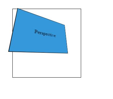
In this code, we have two divs, div-outer and div-inner. Note that when we apply perspective property on parent element, its child elements are affected, not the parent element as you can see the outer box is not affected.
In the CSS code, we have defined the dimensions for outer div and applied a perspective property set to 150px. Then in the div-inner element properties we apply the transform rotateX and rotateY properties to show how these work and create a 3D depth effect.
DEMO
Hope you like the article. Share your thoughts in the comments below.
CSS Tutorial & Examples »