Home »
CSS
Custom Radio Button Styling with CSS
In this article, we will learn how to customize radio button styling using CSS (Cascading Style Sheet)?
Submitted by Abhishek Pathak, on June 24, 2017
Forms have been the most useful part of the Web. Booking movie tickets or reserving flights are common uses of HTML forms. Default forms are not very good looking, they just provide functionality.
Using CSS, we can customize the forms into something amazing. But limiting today's discussion to just radio buttons, we can get a brief how the form styling is achieved.
CSS code to customize radio buttons
input[type="radio"]{
  display: none;
}
input[type="radio"] + label span {
  display: inline-block;
  width: 10px;
  height: 10px;
  background: transparent;
  vertical-align: middle;
  border: 2px solid #f56;
  border-radius: 50%;
  padding: 2px;
  margin:0 5px;
}
input[type="radio"]:checked + label span {
  width: 10px;
  height: 10px;
  background: #f56;
  background-clip: content-box;
}
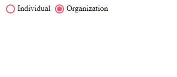
So, the basic HTML form, with two radio input buttons having same name, since only one will be passed to the server. This is the default styling provided by the user agent stylesheet.
Now comes our magic ingredient, the CSS. I will keep the CSS brief and to the point. The first thing is to hide the radio buttons. You must be thinking how would radio buttons will work if they are hidden. You’ll notice a label tag next to each radio button. What it does is selects the option when you’ll click on text. The label forattribute uses the id of the radio button to determine the corresponding label. That is why we can safely hide radio buttons since there is a text that can be clicked.
Using the +operator, we select the sibling element in CSS. Inside the label tag we create a span element where our custom radio button will be. Selecting the selector using input[type="radio"] + label span we can define properties for the radio button.
The width, height are for the dimensions. The display: inline-block property makes it a block level element that behaves as inline. Next we set background to transparent, because we are using borders for the circle. The border-radius 50% property turns it into circle.
The :checked selector is for radio and checkbox buttons to denote their checked state. Now, we will simply give it a background colour for the little circle. The background-clip property clips the background to the content only, since we want the padding to show it like a dot in the circle.
So, this is how you build a stylish form. Experiment with your own radio buttons and do share a link of your work in the comments below.
HTML code with CSS
<!DOCTYPE html>
<html>
<head>
  <meta charset="utf-8">
  <meta name="viewport" content="width=device-width">
  <title>Custom radio button styling</title>

  <style>
    input[type="radio"]{
      display: none;
    }
    input[type="radio"] + label span {
      display: inline-block;
      width: 10px;
      height: 10px;
      background: transparent;
      vertical-align: middle;
      border: 2px solid #f56;
      border-radius: 50%;
      padding: 2px;
      margin:0 5px;
    }
    input[type="radio"]:checked + label span {
      width: 10px;
      height: 10px;
      background: #f56;
      background-clip: content-box;
    }
  </style>

</head>
<body>


    <input id="individual" type="radio" name="user" value="Individual">
    <label for="individual"><span></span>Individual</label>

    <input id="organization" type="radio" name="user" value="Organization">
    <label for="organization"><span></span>Organization</label>


</body>
</html>
DEMO
CSS Tutorial & Examples »