Home »
CSS
Flip an image element using CSS
In this article, we will learn how to flip an image using CSS techniques? It is achieved through a special property known as 'transform' which transforms the element. The transform property has a 'scale()' function, which will flip the image.
Submitted by Abhishek Pathak, on October 24, 2017
CSS is the ultimate toolset for modern web designers, who love to bring reality to their web pages. CSS provides lots of customization options that are enough for transforming a boring text based webpage to a fully fledged webpage with intuitive design and amazing interactions.
A good example of it can be a flipped image when hovered on it. In this article, we will build a simple webpage that shows this functionality using the CSS techniques. It is achieved through a special property known as transform which transforms the element. The transform property has a scale() function, which will flip the image, when provided with negative value.
Code - CSS
.elementZoomed {
	transform: scale(2);
}

.elementFlipped {
	transform: scale(-1);
}
The positive value on scale function will increase the size keeping the image orientation same. But when negative value is supplied, the image is scaled reverse and it gives the effect of flipped image. If you want to flip only horizontally, we need to use, scaleX() with negative value and same goes for scaleY() for vertical flip.
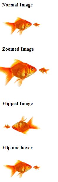
Here is a demo of webpage that uses flipping in a live example,
<!DOCTYPE html>
<html>
	<head>
		<meta charset="utf-8">
		<meta name="viewport" content="width=device-width">
		<title>JS Bin</title>
		<style>
			.image {
				width: 150px;
				height: auto;
			}
			.zoomed {
				margin: 10px auto 30px;
				transform: scale(1.5);
			}
			.flipped {
				transform: scale(-1);
			}

			.flip {
				transition: transform .5s;
			}
			.flip:hover {
				transform: scaleX(-1);
			}
		</style>
	</head>
	<body>
		<h3>Normal Image</h3>
		<img src="https://s-media-cache-ak0.pinimg.com/originals/dd/63/94/dd63945fb45f4e9b9f06e9c516867ddd.jpg" alt="" class="image" />

		<h3>Zoomed Image</h3>
		<img src="https://s-media-cache-ak0.pinimg.com/originals/dd/63/94/dd63945fb45f4e9b9f06e9c516867ddd.jpg" alt="" class="image zoomed" />

		<h3>Flipped Image</h3>
		<img src="https://s-media-cache-ak0.pinimg.com/originals/dd/63/94/dd63945fb45f4e9b9f06e9c516867ddd.jpg" class="image flipped" />

		<h3>Flip one hover</h3>
		<img src="https://s-media-cache-ak0.pinimg.com/originals/dd/63/94/dd63945fb45f4e9b9f06e9c516867ddd.jpg" class="image flip">

	</body>
</html>
Output
Here is live DEMO
DEMO
Share your thoughts in the comments below.
CSS Tutorial & Examples »