Home »
CSS
How to scale a picture size in CSS?
In this article, we will learn how to scale a picture size in CSS? CSS gives you transform properties to change the properties of the image (or any element).
Submitted by Abhishek Pathak, on October 12, 2017
It must be many times you upload an image on your webpage and find it either too big or small to fir in the page. You try reducing the width and the height to adjust it, but with CSS3 you don't have to do maths calculations.
If you have an image, CSS gives you transform properties to change the properties of the image (or any element).
The transform property in CSS has four properties, scale, rotate, skew, transform. These properties are used to transform the element's display properties.
Let's take an example, you have the image element in HTML as,
<img src='abc.jpg' class='image' />
We have given this element a class so that we can modify its CSS properties in external CSS codes as well. Now, let's write CSS code for it.
.image {
	width: 100px;
	height: 100px;
	transform: scale(1.5);
}
The width and height properties give it an initial dimension and relative to it, we scale the picture. Note, that scale() is a transform property's value. A value greater than 1 means increase the size by that ratio and less than 1 means decrease the scale by this ratio.
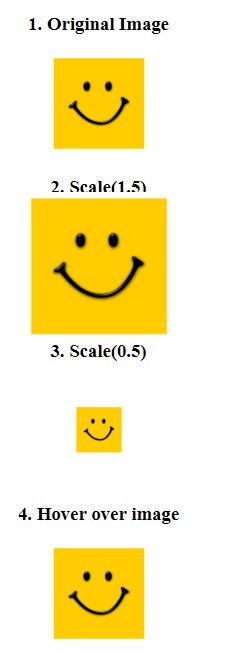
Suppose we provide the value 1.5, it will increase the size to 150% of original image. A ratio of 0.5 will decrease the size to 50% of the original image.
Where do we need it?
Scale transformations are generally seen on ecommerce websites where image is enlarged when mouse is hovered over it. The image transforms to expand and zoom the image, making the product look detailed. Here is and demo example to show you.
DEMO
Output
HTML code with CSS
<html lang="en">
<head>
  <meta charset="UTF-8">
  <title>CSS center elements example</title>

  <!-- CSS code below -->
  <style>

    body {
      text-align: center;
    }

    .img {
      width: 100px;
      height: 100px;
    }
    .zoom {
      transform: scale(1.5);
    }
    .shrink {
      transform: scale(0.5);
    }
    .effect {
      transition: transform .2s;
      /* Transition property for smooth animation */
    }
    .effect:hover {
      transform: scale(1.5);
    }

  </style>

</head>
<body>

 <h2>CSS Scaling an image</h2>
 <h3>1. Original Image</h3>
 <img src="http://2.bp.blogspot.com/-zVBRqQVVtNE/Vq7zpHgYG1I/AAAAAAAALhM/iBNycn84_nk/s1600/Square-Smiley.jpg" alt="" class="img">

 <h3>2. Scale(1.5)</h3>
 <img src="http://2.bp.blogspot.com/-zVBRqQVVtNE/Vq7zpHgYG1I/AAAAAAAALhM/iBNycn84_nk/s1600/Square-Smiley.jpg" alt="" class="img zoom">

 <h3>3. Scale(0.5)</h3>
 <img src="http://2.bp.blogspot.com/-zVBRqQVVtNE/Vq7zpHgYG1I/AAAAAAAALhM/iBNycn84_nk/s1600/Square-Smiley.jpg" alt="" class="img shrink">

 <h3>4. Hover over image</h3>
 <img src="http://2.bp.blogspot.com/-zVBRqQVVtNE/Vq7zpHgYG1I/AAAAAAAALhM/iBNycn84_nk/s1600/Square-Smiley.jpg" alt="" class="img effect">


</body>
</html>
Hope you like this little CSS trick. If you have used it on your webpage, let us know in the comments.
CSS Tutorial & Examples »