Home »
CSS
Creating Gradients with CSS3
Learn how to create amazing gradients with CSS3 and use them in your webpage? No image and JavaScript, just pure CSS3.
Submitted by Abhishek Pathak, on October 16, 2017
Web isn't about text anymore. Users need something eye catching. That is why images are being used in every webpage, but nowadays, images cost on loading speed of the webpage. More detailed background image, more the loading time. While users don't focus on the image, but they notice the absence of it.
That's why we have something called Gradients. Gradients are the color transitions between 2 or more colors that produce a smooth looking image. Gradients are in fashion and many websites are using them. The good thing about them is they replace image. They improve the boring design while making page loads fast, because it is all code and the browser has to render it at the client side, so no request send and waiting problem.
CSS provides us with a lot of gradient options to choose from. Gradients are not limited to backgrounds, but they can be applied on borders, text with some hack. But in this article, we will learn about creating gradients.
There are 2 types of gradients:
- Linear Gradient
- Radial Gradient
1) Linear Gradient
The linear gradient follows a straight line along which color transition occurs. Here is a simple CSS code to add a gradient to background.
Code
.background {
	background-image: linear-gradient(#0098E5, #8700C6);
}
The background-image property adds the gradient effect, as gradients are also images. We can also add multiple color stops and append it after one another.
Code
.background {
	background-image: linear-gradient(#0098E5, #8700C6, #00CCB4);
}
By default, this gradient will be from top to bottom. That is, the color first mentioned will be at the top and last color at the bottom. But it can be changed to another direction using the following keywords at beginning, to top, to bottom, to left, to right. The to direction is used to tell the direction which should be followed. Like, to right means, starting from left move towards right.
Code
.background {
	background-image: linear-gradient(to top, #0098E5, #8700C6);
}
This code will render gradient from top to bottom.
2) Radial Gradient
The radial gradients produce color transitions beginning from center of the element towards the edge, giving it a more balanced effect. To create radial gradients, simply change the property to radial-gradient() and give the colors.
.background {
	background-image: radial-gradient(#0098E5, #8700C6);
}
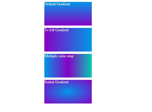
There you go. Nice and easy way to create gradients. Here is demo for all the above gradients.
DEMO
HTML with CSS
<!DOCTYPE html>
<html>
	<head>
		<title>Gradients DEMO</title>
		<style id="jsbin-css">
			.box {
				width: 200px;
				height: 100px;
				margin: 10px auto;
				color: #fff;
			}

			.box1 {
				background-image: linear-gradient(#0098E5, #8700C6);
			}
			.box2 {
				background-image: linear-gradient(to left, #0098E5, #8700C6);
			}
			.box3 {
				background-image: linear-gradient(to right, #0098E5, #8700C6, #00CCB4);
			}
			.box4 {
				background-image: radial-gradient(#0098E5, #8700C6);
			}
		</style>
	</head>

	<body>
		<div class="box box1">Default Gradient</div>
		<div class="box box2">To left Gradient</div>
		<div class="box box3">Multiple color stop</div>
		<div class="box box4">Radial Gradient</div>
	</body>
</html>
Output
If you like the article, let us know your thoughts in the comments below.
CSS Tutorial & Examples »