Home »
MCQs
Data Analytics and Visualization MCQs
Data analytics is the process of analyzing data sets to make decisions based on the information available, which is increasingly being done with the help of specialized applications and systems. Data visualization is a graphical representation of data.
Data Analytics and Visualization MCQs: This section contains multiple-choice questions and answers on data analytics and visualization. It will help the students to test their skills and prepare well for their exams.
List of Data Analytics and Visualization MCQs
1. A probability distribution is a ___.
- Library function
- Statistical function
- Physical property
- None of the mentioned above
Answer: B) Statistical function
Explanation:
Uncertainty distributions are statistical functions that describe all of the different possible values and likelihoods that a random variable can take within a given range of values. This range will be restricted to the range between the minimum and maximum possible values, but the precise location of the possible value on the probability distribution will depend on a variety of factors, including the probability distribution itself. The mean (average), standard deviation, skewness, and kurtosis of a distribution are among the variables to consider.
Discuss this Question
2. Following chart is an example of,
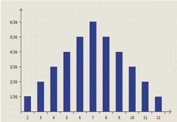
- Probability Distribution Chart
- Line chart
- Pie chart
- All of the mentioned above
Answer: A) Probability Distribution Chart
Explanation:
A probability distribution is, in essence, a bar chart that depicts the likelihood of an event occurring in the future. It's a quick way to see what's going on and how likely it is that something will happen. In the field of statistics, probability distribution charts can become quite complicated. The normal distribution, also known as the "bell curve," is perhaps the most widely used probability distribution, although there are several other distributions that are also widely used.
Discuss this Question
3. Amongst which of the following is / are the types of Probability Distribution?
- Normal distribution, Binomial distribution
- Bernoulli distribution
- Uniform distribution, Poisson distribution
- All of the mentioned above
Answer: D) All of the mentioned above
Explanation:
The Normal distribution, the Binomial distribution, the Bernoulli distribution, the Uniform distribution, and the Poisson distribution are the most commonly encountered Probability Distribution functions in statistics.
Discuss this Question
4. Binomial distribution is a discrete distribution?
- True
- False
Answer: A) True
Explanation:
It is a discrete distribution when it is a binomial distribution. A discrete distribution is a type of probability distribution that describes the probability of occurrence of each value of a discrete random variable occurring. If you have 6 apples in your refrigerator, and only 1 of them has spoiled, you have an example of a discrete probability distribution. In a discrete probability distribution, each possible value of a discrete random variable can be associated with a non-zero probability of occurring in the future. In the case of a given success probability p in each trial, a binomial distribution is used to represent the probability of x success in each trial.
Discuss this Question
5. Continuous Probability Distribution includes ___.
- Normal distribution
- Uniform distribution
- Both A and B
- None of the mentioned above
Answer: C) Both A and B
Explanation:
The Normal distribution and the Uniform distribution are both examples of Continuous Probability Distribution. When it comes to probability distributions, a continuous probability distribution is one in which the random variable X can have any value (is continuous). Because there are an infinite number of possible values for X to take on, the probability of X taking on any specific value is equal to zero.
- Normal distribution- A normal distribution is defined as one in which the parameters (also known as the mean) and s2 (also known as the variance) have a range of -8 to +8. The following are the characteristics of its continuous probability distribution:
f(x;µ, s)= (1/ s p) exp(-0.5 (x-µ)2/ s2).
- Uniform distribution - When it comes to distribution functions, uniform distribution is one in which every possible result is equally likely to occur; that is, the probability of each occurrence is the same.
Discuss this Question
6. The Bernoulli random variable's expected value is p, it is also known as the ___.
- Bernoulli distribution's path
- Bernoulli distribution's function
- Bernoulli distribution's parameter
- None of the mentioned above
Answer: C) Bernoulli distribution's parameter
Explanation:
The expected value of a Bernoulli random variable is p, which is also referred to as the Bernoulli distribution's parameter in some circles. In this experiment, the outcome can be either a value of zero or one. Bernoulli random variables can have values of 0 or 1, depending on the situation.
Discuss this Question
7. A Poisson distribution is a probability distribution used in statistics to show how many times an event is likely to happen over a given period of time?
- True
- False
Answer: A) True
Explanation:
When it comes to statistics, a probability distribution known as a Poisson distribution is used to show how many times an event is likely to occur over a given period of time. When a constant rate of independent events occurs at a constant rate over a given time interval, the Poisson distribution is frequently used to comprehend the events.
Discuss this Question
8. The ___ function applies one or more conditions in the specified range of data and returns only those which fulfill all of the conditions.
- COUNTIFS
- COUNT
- IF
- None of the mentioned above
Answer: A) COUNTIFS
Explanation:
The COUNTIFS function applies one or more conditions in the specified range of data and returns only those which fulfill all of the conditions.
Discuss this Question
9. Amongst which of the following is / are related to Standard Deviation Function?
- Standard Deviation is one of the ways to quantify dispersion
- It is a measure of how widely values are dispersed from the average value
- STDEV.P function which is used to calculate standard deviation based on the entire population given as arguments
- All of the mentioned above
Answer: D) All of the mentioned above
Explanation:
If you use a sample of the population (STDEV) or a biassed sample of the population (STDEV), then the statistical standard deviation of all values in the set will be returned by the standard deviation function (STDEVP). The standard deviation is useful for measuring variance within a data set and, in the context of statistical results, for assessing confidence in those results. To quantify dispersion, one of the methods used is to calculate the standard deviation. In other words, it is a measure of how widely values are dispersed from the mean value.
Discuss this Question
10. STDEV.P function which is used to calculate standard deviation based on the entire population?
- True
- False
Answer: A) True
Explanation:
When the entire population is given as arguments, the STDEV.P function is used to calculate the standard deviation. The STDEV.P function makes the assumption that the arguments it receives represent the entire population. In a sample set of data, the standard deviation is calculated using the STDEV.S() function. When a large sample size is used, the standard deviations of the population and the samples will have values that are very close to one another.
Discuss this Question
11. Amongst which of the following is best fitted to Tableau?
- Tableau is a powerful and fastest growing data visualization tool used in the Business Intelligence Industry
- Tableau is a people in Business Intelligence Industry
- Tableau is suitable for factory industry only
- Tableau is a new alternative for data programming
Answer: A) Tableau is a powerful and fastest growing data visualization tool used in the Business Intelligence Industry
Explanation:
Tableau is a powerful and fastest growing data visualization tool used in the Business Intelligence Industry. Tableau is a visual analytics platform that is revolutionizing the way we use data to solve problems. It is enabling individuals and organizations to make the most of their information.
Discuss this Question
12. Tableau displays measures over time as a ___.
- Bar
- Line
- Histogram
- Scatter Plots
Answer: B) Line
Explanation:
As a series of Lines, the tableau displays the progression of measurements over time. Tableau categorizes data into two types: dimensions and measures. Dimensions are the dimensions of the data, while measures are the measures of the data. In most cases, dimensions are fields that cannot be aggregated; measures, on the other hand, are those fields that can be measured, aggregated, or used in mathematical operations, as the name suggests.
Discuss this Question
13. Amongst which of the following is / are the file extensions in Tableau?
- .twb
- .twbx
- .tds
- All of the mentioned above
Answer: D) All of the mentioned above
Explanation:
TWB (Tableau Workbook), TDS(Tableau Data Source), TDE(Tableau Data Extract), TWBX(Tableau Packaged Workbook), TDSX(Tableau Packaged Data Source), TBM(Tableau Bookmark), TDC(Tableau Data source Connection) , TMS(Tableau Map Source), and TPS(Tableau Preferences) are some of the file extensions in Tableau.
Discuss this Question
14. Amongst which of the following is / are the components of an interactive Dashboard in Tableau?
- Vertical
- Horizontal
- Image Extract
- All of the mentioned above
Answer: D) All of the mentioned above
Explanation:
Vertical, Horizontal and Image Extract are the common components of an interactive Dashboard in Tableau?
Discuss this Question
15. Amongst which of the following is not a Pattern Line display?
- Binomial Pattern Line
- Multiple Pattern Line
- Straight directed Pattern Line
- None of the mentioned above
Answer: A) Binomial Pattern Line
Explanation:
Binomial Pattern Line is not a Pattern Line display. Generally, trend lines can be displayed in a visualization to draw attention to patterns in our data. In order to edit a view that contains trend lines on the web, we can publish the view with trend lines and then add trend lines to the view as we wish. When we add trend lines to a view, we have the ability to specify how they should appear and behave.
Discuss this Question
16. Sets can be made on Measures?
- Yes
- No
Answer: B) No
Explanation:
No, sets can be made on measures. It is possible to compare and ask questions about a subset of data when using sets. The term "set" refers to a custom field that defines a subset of data based on a set of conditions. Set Actions allow us to make sets more dynamic and interactive by incorporating them into our program. When our audience interacts directly with a visualization or dashboard, they can control various aspects of their investigation. When a user selects marks in the view, set actions can be executed, which can change the values in the set.
Discuss this Question
17. A bullet graph is a variation of a bar graph developed to replace dashboard gauges and meters?
- True
- False
Answer: A) True
Explanation:
Bullet graphs are a type of bar graph that was created to replace dashboard gauges and meters. When comparing the performance of a major metric to one or more additional measures, a bullet graph is beneficial.
Discuss this Question
18. Tableau displays data source connections and data fields for the workbook in the ___ on the left side of the workspace.
- Data pane
- Basic Expression
- LoD Expression
- None of the above
Answer: A) Data pane
Explanation:
In the Data pane on the left side of the workspace, Tableau displays data source connections and data fields for the worksheet. The data source connections and fields display on the left side of the worksheet in the Data pane once we connect to our data and set up the data source using Tableau. The top of the Data pane displays the current data source connections. If there are many connections available, choose one to pick it and begin working with the data.
Discuss this Question
19. Dimensions can be aggregated?
- True
- False
Answer: B) False
Explanation:
We may aggregate measurements or dimensions in Tableau; however aggregate measures are more popular. By default, when we add a measure to our view, we apply an aggregation to that measure. Depending on the context of the view, the type of aggregate used differs.
Discuss this Question
20. Which of the following is NOT a Tableau field data type?
- String
- Number
- Float
- Boolean
Answer: C) Float
Explanation:
Float is not a Tableau field data type. The common data types are:
- String values
- Number/Integer values
- Date values
- Date & Time values
- Boolean values
- Geographic values
- Cluster or mixed values
Discuss this Question
21. This data type consists of both integer type and floating type.
- Numeric Data type
- Date and Time Data type
- Boolean Data type
- None of the mentioned above
Answer: D) None of the mentioned above
Explanation:
Numeric Data type consists of both integer type and floating type. Integer types are preferred over floating types by users because it is difficult to accumulate the decimal point over a certain limit. It also has a method called Round() that may be used to round up float numbers.
Discuss this Question
22. Can Tableau be installed on MacOS?
- Yes
- No
Answer: A) Yes
Explanation:
Tableau can be installed on MacOS. Tableau Desktop licences may be installed on up to two PCs, so we could use one for Windows at work and another for our Mac at home. Tableau Desktop for Windows files will work on Tableau Desktop for Mac, and vice versa.
Discuss this Question
23. Default aggregation used for tree map.
- Avg
- Sum
- Count
- Countd
Answer: B) Sum
Explanation:
Sum is a default aggregation used for tree map. We may aggregate measurements or dimensions in Tableau, however aggregate measures are more popular. By default, when we add a measure to our view, we apply an aggregation to that measure. Depending on the context of the view, the type of aggregate used differs.
Discuss this Question
24. Which of the following allows tableau publicly accessible?
- Tableau Reader
- Tableau Desktop
- Tableau Public
- None of Above
Answer: C) Tableau Public
Explanation:
Tableau Public allows it publicly accessible. Tableau Public is a free online platform for exploring, creating, and sharing data visualizations. Tableau Public makes learning data skills simple by providing access to the world's biggest archive of data representations.
Discuss this Question
25. A sheet cannot be used within a story directly. Either sheets should be used within a dashboard, or a dashboard should be used within a story.
- True
- False
Answer: B) False
Explanation:
Tableau uses a workbook and sheet file structure, much like Microsoft Excel. Tableau follows Microsoft Excel's workbook and sheet file structure. Sheets are included in a workbook. A story is made up of a series of worksheets or dashboards that provide information. In the sidebar, you'll find the story and Layout windows.
Discuss this Question
26. Which one is not the best fitted for Tableau?
- Self Service BI
- Mobile enablement
- Big Data connectivity
- Enterprise Deployment
Answer: D) Enterprise Deployment
Explanation:
Tableau is a Business Intelligence solution that allows users to visualize data. Users can construct and share an interactive and shareable dashboard that displays the data's trends, variances, and density in graphs and charts. To acquire and process data, Tableau may connect to files, relational databases, and Big Data sources.
Discuss this Question
27. Which type of chart is not available in Tableau V8?
- Pie Chart
- Speed Dial
- Bullet Chart
- Bubble Chart
Answer: B) Speed Dial
Explanation:
Speed Dial chart is not available in Tableau V8.
Discuss this Question
28. Tableau Desktop is a ___ application and anyone can use it.
- Spark based
- Business analytics
- Traditional based
- None of the mentioned above
Answer: B) Business analytics
Explanation:
Anyone may use Tableau Desktop, which is a business analytics solution. Tableau Desktop is a data visualization tool that allows us to quickly explore almost any type of structured data and create highly interactive, stunning graphs, dashboards, and reports.
Discuss this Question
29. Tableau Server is a ___ that offers ___ anyone can utilize.
- Business intelligence application, browser-based analytics
- Application development, customer oriented
- Runs on browser, server development and control system devices
- All of the mentioned above
Answer: A) Business intelligence application, browser-based analytics
Explanation:
Tableau Server is a business intelligence program that provides anyone with browser-based analytics. It's a lightning-fast alternative to typical business intelligence tools. It is a web-based tool for sharing, distributing, and collaborating on Tableau material.
Discuss this Question
30. What makes Tableau different?
- There is no scripting required
- Everyone can use it and grow to be an analytics expert
- Get quick insights from data with interactive visualization
- All of the mentioned above
Answer: D) All of the mentioned above
Explanation:
Tableau is different from other applications because in this; there is no scripting required. Everyone can use it and grow to be an analytics expert; we can get quick insights from data with interactive visualization.
Discuss this Question
31. Amongst which of the following is / are true about Tableau Online?
- Tableau Online is a secure, cloud-based solution
- It can be used for sharing, distributing, and collaborating on Tableau views
- We can create interactive Tableau dashboards.
- All of the mentioned above
Answer: D) All of the mentioned above
Explanation:
Tableau Online is a cloud-based, secure solution. Tableau views can be shared, distributed, and collaborated on using this tool. Tableau dashboards may be made interactive. Tableau Online is a powerful cloud-based data visualization tool that allows us to operate without the need for servers, server software, or IT help. It makes rapid-fire business analytics more accessible than ever before. In minutes, share dashboards with team members, customers, and partners.
Discuss this Question
32. Tableau Public is a ___ to facilitate users to create interactive data visualizations.
- Freeware application
- Paid application
- Not Secure application
- None of the mentioned above
Answer: A) Freeware application
Explanation:
Tableau Public is a free software program that allows users to create interactive data representations. It is provided as a service, allowing the user to be up and running the next day. Users can create great interactive graphics and publish them rapidly using Tableau Public, without the need for programmers or IT. It's made for businesses who want to add interactive data visualizations to their websites.
Discuss this Question
33. A worksheet contains a single view along with shelves, cards, legends, and the Data?
- True
- False
Answer: A) True
Explanation:
A worksheet's side bar comprises a single view, as well as shelves, cards, legends, and the Data and Analytics panes. In the Tableau screen, the worksheet is where we develop the data analysis views. When we make a connection to a data source, Tableau creates three blank worksheets by default. We can continue to add worksheets to examine different data views in the same screen, one after the other.
Discuss this Question
34. Data extraction in Tableau creates a subset of data from the ___.
- Data view
- Data source
- Data pane
- None of the mentioned above
Answer: B) Data source
Explanation:
Tableau creates a subset of data from the data source by extracting it. This is useful for enhancing performance through the usage of filters. It also aids in the application of Tableau capabilities to data that may not be present in the data source, such as discovering distinct values in the data. The data extract function, on the other hand, is most commonly used to create an extract that can be saved to the local drive and accessed by Tableau offline.
Discuss this Question
35. A dashboard is a collection of ___.
- Views
- Hash function
- Both A and B
- None of the mentioned above
Answer: A) Views
Explanation:
A dashboard is a visual representation of numerous worksheet views. In the sidebar, we can find the Dashboard and Layout panes.
Discuss this Question
36. We can aggregate a dimension in the view as Minimum, Maximum, Count, or Count?
- True
- False
Answer: A) True
Explanation:
In the view, we can aggregate a dimension as Minimum, Maximum, Count, or Count. When we aggregate a dimension, we establish a new temporary measure column, which gives the dimension measure-like features.
Discuss this Question
37. Dimensions are displayed above the gray line and measures below the gray line?
- True
- False
Answer: A) True
Explanation:
For each table or folder, the dimensions are presented above the grey line, and the measurements are displayed below the grey line. A table or folder may have only dimensions or measures to begin with in some situations. If all of the input fields for calculated fields come from the same table, they are listed with their originating field.
The table with the originating field is used to list the sets. Parameters are displayed in the Parameters box and are global to the workbook. Fields that do not belong to a certain table are displayed below the tables in the general section. Calculations that use fields from various tables, Measure Names, and Measure Values are examples of these.
Discuss this Question
38. A bullet chart is a variation of?
- Bar chart
- Pie Chart
- Gantt Chart
- None of the mentioned above
Answer: A) Bar chart
Explanation:
A bullet chart is a variation of Bar chart. A bar chart shows data as rectangular bars, with the length of each bar proportional to the variable's value. When you drag a dimension to the Row shelf and a measure to the Column shelf, Tableau automatically creates a bar chart. The bar chart option in the Show Me button can also be used. This option will be automatically greyed out if the data is not suitable for a bar chart.
Discuss this Question
39. In Tableau, a crosstab chart is also known as ___.
- Text table
- Field table
- Both A and B
- None of the mentioned above
Answer: A) Text table
Explanation:
In Tableau, a crosstab chart is also known as a Text table because it displays data in textual format. One or more dimensions and one or more metrics make up the chart. This chart can also display other calculations on the measure field's data, such as a running total, % total, and so on.
Discuss this Question
40. A ___ represents the frequencies of values of a variable bucketed into ranges.
- Histogram
- Gantt Chart
- Box Plot
- None of the mentioned above
Answer: A) Histogram
Explanation:
The frequency of values of a variable bucketed into ranges is represented by a histogram. Similar to a bar chart, a histogram arranges values into continuous ranges. The height of each bar in a histogram represents the number of items present in that range. Tableau generates a histogram from a single metric. It adds a bin field for the measure that was used to make the histogram.
Discuss this Question
41. Amongst which of the following is / are true about Tableau story?
- To tell a data narrative
- Demonstrate how decisions relate to outcomes
- To make a compelling case
- All of the mentioned above
Answer: D) All of the mentioned above
Explanation:
A story in Tableau is a collection of graphics that work together to convey data. We can use stories to communicate a data storey, provide context, show how decisions affect results, or simply make a strong argument. A storey is a sheet, the same techniques that we use to create, identify, and manage worksheets and dashboards apply to tales as well. A story is also a collection of sheets that are placed in a specific order. A storey point is the name given to each individual sheet in a storey.
Discuss this Question
42. ___, connects several distinct data points, presenting them as one continuous evolution.
- Scatter Plot
- Pie Chart
- The line chart or line graph
- All of the mentioned above
Answer: C) The line chart or line graph
Explanation:
The line chart, also known as a line graph, joins multiple data points to portray them as a single continuous progression. Line charts are used to visualise data trends, usually across time. As a result, there's a simple, plain way to see how one value changes in relation to another.
Discuss this Question
43. Bar charts are one of the most common data visualizations?
- True
- False
Answer: A) True
Explanation:
One of the most used data visualizations is bar charts. We may use them to easily compare data across categories, highlight discrepancies, disclose historical highs and lows, and identify trends and outliers. When we have data that can be divided into several categories, bar charts are very useful.
Discuss this Question
44. ___ are a powerful and compact way to visualize hierarchical and part-to-whole relationships.
- Histogram
- Treemaps
- Bar charts
- None of the mentioned above
Answer: B) Treemaps
Explanation:
Treemaps are a great technique to represent hierarchical and part-to-whole relationships in a small space. Each tree branch is shown as a rectangle, with the size of each branch proportional to a defined data metric. Many people prefer treemaps because they're visually appealing, so knowing how to use colour is advantageous. In a treemap, colour is frequently used to indicate dimensions; heat maps are useful for displaying a spectrum.
Discuss this Question
45. ___ plot the number of occurrences of a given variable in a set of data.
- Treemaps
- Histograms
- Pie charts
- None of the mentioned above
Answer: B) Histograms
Explanation:
The number of occurrences of a specific variable in a collection of data is plotted in a histogram. They're a terrific way to get a quick overview of a variable's complete distribution, and they look like a bar chart.
Discuss this Question
46. Amongst which of the following shows in Box plot?
- First quartile
- Median
- Outliers
- All of the mentioned above
Answer: D) All of the mentioned above
Explanation:
A box plot or box-and-whisker plot is a diagram of a distribution of data best known to highlight first quartile, median, third quartile, whiskers, and outlier’s values. Box plots are excellent for comparing sets of data, particularly data fluctuations. They're a statistician's favorite and are frequently utilized in statistical analytics. Tableau can display hundreds of thousands of rows per second, allowing it to convey far more data than a traditional box plot.
Discuss this Question
47. ___ is a simple and compelling way to show how location correlates with trends in our data.
- Map
- Treemaps
- Histograms
- None of the mentioned above
Answer: A) Map
Explanation:
Maps are a simple and engaging approach to display how location connects with patterns in our data if we have geographic information connected with our data. Whether it's postal codes, state abbreviations, country names, or our own unique geocoding, maps are a no-brainer for showing any kind of location information.
Discuss this Question
48. Gantt charts display a project schedule or show changes in activity over time?
- True
- False
Answer: A) True
Explanation:
Gantt charts are used to indicate variations in activity over time or to display a project timeline. A Gantt chart depicts the actions that must be accomplished before others can begin, as well as the distribution of resources.
Discuss this Question
49. Word clouds are like bubble charts in that words are sized according to some numerical measure?
- True
- False
Answer: A) True
Explanation:
Word clouds are similar to bubble charts in that words are sized using a numerical scale and crammed into a certain area. They're great for presenting information on, you guessed it, words. While word clouds aren't ideal for correct interpretation, they can help a dashboard stand out and inspire more people to interact with the data.
Discuss this Question
50. Density maps reveal ___.
- Data storage
- Patterns
- Data demonstration
- None of the mentioned above
Answer: B) Patterns
Explanation:
Density maps let us discover locations with more or fewer data points by revealing patterns or relative concentrations that could otherwise be buried owing to an overlapping mark on a map. When working with a data set comprising many data points in a small geographic area, density maps are most useful.
Discuss this Question
Advertisement
Advertisement