Home »
CSS
CSS Shadow Effects
Shadow Effects in CSS: Here, we are going to learn about the shadow effects in CSS like text shadow effects, box shadow effects, etc.
Submitted by Anjali Singh, on December 17, 2019
Shadow Effects in CSS
It is always good to make our web pages stylish and beautiful, web pages that would catch users eyes instantly but one gets confused as to how to style his or her web page. The confusion is quite legit too as there is an abundance of styling techniques that one can apply on their web page. Therefore, this section is about one such styling method, that is shadows in CSS.
Using CSS shadow property you can create shadows for text and boxes. Now that we are aware of what this property is, let us discuss some of its properties as well.
The text-shadow Property
The very first and quite easy property is text-shadow property. As the name suggests, using text-shadow property you can apply shadows to the text. Making your text smoky and stylish. The values of this property are mentioned below
text-shadow property can take up to four values to further make the implication easy,
- Horizontal shadow
- Vertical shadow
- Blur effect
- Color
Syntax:
Element {
    text-shadow: 3px 2px 2px #000000;
}
Normal Text Shadow
The Normal Text Shadow effect helps you add shadow to your text in a very basic method with not that much coding and easy implementing. This could be better understand with the help of an example.
Example:
<!DOCTYPE html>

<html>

<head>
    <style>
        h1 {
            color: #f40;
            text-shadow: 3px 4px 4px #0011f3;
        }
    </style>
</head>

<body>
    <h1>Text-shadow effect!</h1>
</body>

</html>
Output
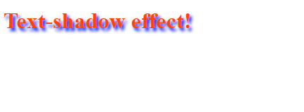
As you can see, in the above example, the normal text-shadow effect is applied and voila!
Glowing Text Effect Shadow
It would be great if we could make our text glow as well. So, why wait and let us move forward with the Glowing text effect shadow property, this property is specifically for making the text to glow.
An example can surely help you understand better.
Example:
<!DOCTYPE html>

<html>

<head>
    <style>
        h1 {
            color: #f40;
            text-shadow: 0 0 4px #00FF9C;
        }
    </style>
</head>

<body>
    <h1>Text-shadow effect!</h1>
</body>

</html>
Output
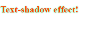
So, you can see, in the above example, the glowing effect text-shadow is applied.
Box Shadow Property
Next, what if someone wants to apply this property to elements is the HTML? Well, Box Shadow Property has got you covered. This property is used to apply the shadow to elements in CSS. Even further the Box Shadow Property has its own set of values.
Values:
The box-shadow property can take one to six values,
- inset keyword (it changes the shadow to one inside of the frame)
- horizontal shadow
- vertical shadow
- blur effect
- spreading
- color
Syntax:
Element {
    box-shadow: 10px 10px;
}
Example:
<!DOCTYPE html>

<html>

<head>
    <style>
        div {
            border: 1px solid;
            padding: 30px;
            box-shadow: 5px 10px 8px 10px #006969;
        }
    </style>
</head>

<body>
    <div>
        <p>Box shadow effect.</p>
    </div>
</body>

</html>
Output
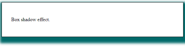
Therefore the above example shows the implementation of box-shadow property which has been applied to the div element.
CSS Tutorial & Examples »