Home »
CSS
Media Queries in CSS
CSS | Media Queries: In this tutorial, we are going to learn about the Media Queries in CSS (Cascading Style Sheet).
Submitted by Anjali Singh, on December 02, 2019
CSS | Media Queries
Creating a web page is not an easy task as it requires loads of content and data so that it becomes strongly responsive to the users. To do that various contents are even added e.g.: resources, informative content, blogs, line of codes, etc. but most importantly the factor that attracts users to any web page is media.
Trivia:
On that note let us talk about media queries. Media queries are the tools to implement media on your web page. For example, the @media rule which was introduced in CSS2 helped in making it possible to define style rules for different media types.
But CSS2's idea did not get much support as it got obsolete. So CSS3 came into play by extending the CSS2 media type ideas. In this idea, they did not focus on the type of device but its capability.
Purpose:
Media Queries are used to check many things also,
- Width as well as the height of the viewport
- Width and height of the device as well orientation (whether the tablet/phone is in landscape or portrait mode?)
- Resolution of the device
In fact, using media queries is a great practice in order to deliver tailored style desktops, laptops, phones, etc.
Media Queries come in with a media type and can have one or more expressions like true or false.
Ways to implement:
There are various ways to implement Media Queries,
One way is to have a backup CSS section right underneath your style sheet.
So if someone wishes to include Media type files into your web page then one must opt for Media Queries.
It is an enhanced version of @media that was earlier used in CSS2. So this property might come in handy to one and all who wish to create responsive and presentable web pages.
No one wishes to stick to the olde tools for so long, so why not adapt to something better?
And, that better is Media Queries.
There are various CSS3 Media Types and with the help of the table mentioned below, it can be easily understood.
Syntax:
@media not | only mediatype and(expressions) {
    //CSS CODE
}
Example:
<!DOCTYPE html>
<html>

<head>
    <style>
        body {
            background-color: green;
        }

        @media screen and (min-width: 520px) {
            body {
                background-color: pink;
            }
        }
    </style>
</head>

<body>
    <p>Media query will only if the media type is screen and viewport is 520px wide or wider.</p>
</body>

</html>
Output
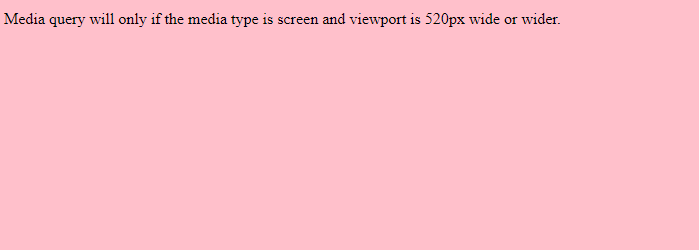
In the above example, the media type is screen and min width is 520px.
Other values,
| Value |
Description |
| all |
It is for all media type devices |
| print |
It is for printers |
| screen |
It is for computer screens, tablets, smart-phones etc. |
| speech |
It is for screen readers that "reads" the page out. |
CSS Tutorial & Examples »
Advertisement
Advertisement