Home »
CSS
CSS Grid Container
CSS | Grid Containers: Here, we are going to learn about the grid container in CSS with some of the examples.
Submitted by Anjali Singh, on December 13, 2019
CSS | Grid Containers
There are numerous ways to display our list items or elements. For instance, we can display them in the navigation bar, in a menu bar and whatnot. Well, it would be right to say that there are many more such methods to imply to our web page. Besides, it is solely the developers' choice of what kind of styling or formatting they want to use for their list items. But let us discuss one such method which is used very often and also helps in making your web page much versatile and responsive, CSS Grid Container.
Grid container is not a tough method to use to display the elements of your web page. Well, what is the grid container is the first place? So, grid containers comprise of grid items and those same items are placed or inserted inside columns and rows. We all have come across various grids in our daily life, so imagine one such empty grid and start placing items inside that grid's rows and columns and there you are, that is a grid container and the same thing is possible in CSS as well.
Implementation:
With the definition of a grid container in mind, let us now understand how to make an element behave like a grid container. This again is not a tough task, all you gotta do is modify the display property a little bit. To make an element behave like a grid container, you will have to set your display property to grid or inline-grid. This way your HTML element will start behaving like a grid container.
Syntax:
Element {
    display: grid/inline-grid;
}
Properties:
Now let us look at some of the grid container's properties:
1) The grid-template-columns property
The fundamental use of grid-template-columns-property is to specify the total number of columns in the grid layout and it can also be used to specify the width of those columns.
The values of this property are space-separated lists where each value would define the length of every column.
For instance, if you wish to add 4 columns in your grid layout, just specify the width of the 4 columns or just type in auto for every column to have the same width.
Syntax:
Element {
    display: grid;
    grid-template-columns: auto auto auto auto;
}
Example:
<!DOCTYPE html>
<html>

<head>
    <style>
        .grid {
            display: grid;
            grid-template-columns: auto auto auto auto;
            grid-gap: 15px;
            background-color: red;
            padding: 10px;
        }

        .grid> div {
            background-color: pink;
            text-align: center;
            padding: 20px 0;
            font-size: 30px;
        }
    </style>
</head>

<body>
    <h1>CSS Grid container</h1>
    </br>
    <div class="grid">
        <div>1</div>
        <div>2</div>
        <div>3</div>
        <div>4</div>
    </div>
</body>

</html>
Output
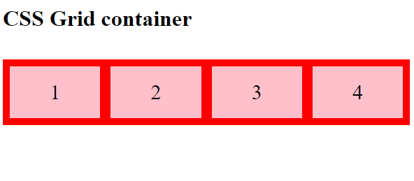
Note: One thing to keep in mind here is that if you have more than 4 elements in a 4 column grid, then the grid will create a new row itself to fit in the items.
2) The grid-template-rows property
This property is the opposite of column property, in this, you can define the height of each row in the grid.
Syntax:
Element {
    grid-template-rows: 50px 100px;
}
Example:
<!DOCTYPE html>
<html>

<head>
    <style>
        .grid {
            display: grid;
            grid-template-columns: auto auto auto;
            grid-template-rows: 80px 150px;
            grid-gap: 10px;
            background-color: red;
            padding: 10px;
        }

        .grid > div {
            background-color: pink;
            text-align: center;
            padding: 20px 0;
            font-size: 30px;
        }
    </style>
</head>

<body>
    <h1>CSS Grid container</h1>
    <div class="grid">
        <div>1</div>
        <div>2</div>
        <div>3</div>
        <div>4</div>
        <div>5</div>
    </div>

</body>

</html>
Output
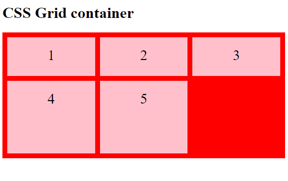
In the above example both rows are set by property grid-template-rows to 80px and 150px.
3) The justify-content property
To fit in the entire grid within the container justify-content property is used.
Syntax:
Element {
    justify-content: space-evenly;
}
Example:
<!DOCTYPE html>
<html>

<head>
    <style>
        .grid {
            display: grid;
            justify-content: space-evenly;
            grid-template-columns: 40px 60px 70px;
            grid-gap: 10px;
            background-color: pink;
            padding: 10px;
        }

        .grid> div {
            background-color: red;
            text-align: center;
            padding: 20px 0;
            font-size: 30px;
        }
    </style>
</head>

<body>
    <h1>CSS Grid container</h1>
    <div class="grid">
        <div>1</div>
        <div>2</div>
        <div>3</div>
        <div>4</div>
        <div>5</div>
    </div>
</body>

</html>
Output
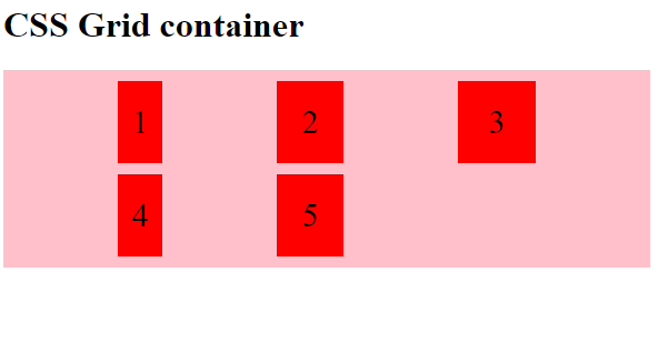
Note: For this property to actually work, make sure that the grid's entire width should be less than that of the container's width.
4) The align-content property
To align the entire grid vertically inside the container this property is used.
Syntax:
Element {
    align-content: center;
}
Example:
<!DOCTYPE html>
<html>

<head>
    <style>
        .grid {
            display: grid;
            height: 400px;
            align-content: center;
            grid-gap: 15px;
            grid-template-columns: auto auto auto;
            background-color: pink;
            padding: 10px;
        }

        .grid > div {
            background-color: red;
            text-align: center;
            padding: 20px 0;
            font-size: 40px;
        }
    </style>
</head>

<body>
    <h1>CSS Grid container</h1>
    <div class="grid">
        <div>1</div>
        <div>2</div>
        <div>3</div>
        <div>4</div>
        <div>5</div>
        <div>6</div>
    </div>
</body>

</html>
Output
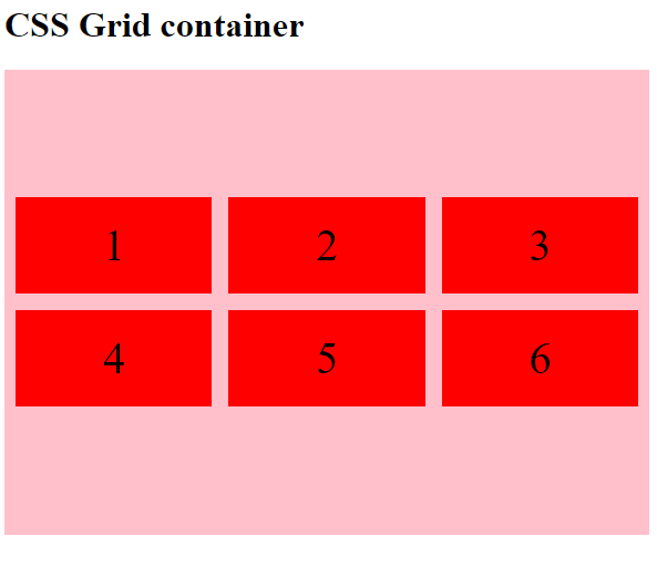
Note: For this property to actually work, make sure that the grid's entire height should be less than that of the container's height.
CSS Tutorial & Examples »