Home »
CSS
Rotate fix an image on page with CSS
In this article, we are going to learn about the rotation of the images using CSS? CSS turn them in the right direction and you will have a nice picture. No more cropping and straightening from other sources, because CSS will render it same across all devices.
Submitted by Abhishek Pathak, on October 13, 2017
Modern websites not just contain text, but also beautiful images in a coherent manner with the text. Even blogs have lots of images with text. Some pictures that you might be using may not be perfectly straight.
But with CSS, turn them in the right direction and you will have a nice picture. No more cropping and straightening from other sources, because CSS will render it same across all devices. That's the power of CSS.
So, let's say we have this image,
<img src='abc.jpg' class='image' />
Now, in CSS, we need to select this image through a class selector. In this particular image, we have image as our class. In CSS, we will style our image as follows,
Code
.image {
	width: 200px;
	height: auto;
	transform: rotate(2deg); /* Can be negative as well */
}
With .image we have targeted the image element in our document. We give it a width of 200px and height auto. We have given height as auto because it will have an automatic height for corresponding width, so that image proportion remains same always. This is a nice trick for changing image size but not proportions.
Now, the transform property rotates the image in clockwise direction by 2 degrees. Changing the value to negative would rotate in anti-clockwise direction. The degrees can be in decimal as well, for precise orientation.
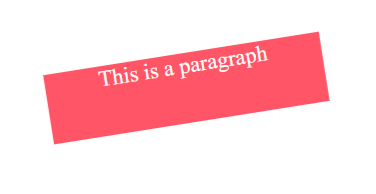
The same transform property can be used to rotate any element. Consider this code:
Code
<div style="transform: rotate(10deg);">
	<p>This is rotated paragraph</p>
</div>
This effect can be extended to produce nice effects, when user interacts, like hover mouse on image. Take a look at the demo to see the effect.
DEMO
HTML code with CSS:
<html lang="en">
<head>
  <meta charset="UTF-8">
  <title>CSS center elements example</title>

  <!-- CSS code below -->
  <style>

    body {
      text-align: center;
    }

    .img {
      width: 200px;
      height: auto;
    }
    .rotate {
      transform: rotate(-9deg);
    }
    .shrink {
      transform: scale(0.5);
    }
    .effect {
      transition: transform .2s;
      /* Transition property for smooth animation */
    }
    .effect:hover {
      transform: rotate(-9deg);
    }

  </style>

</head>
<body>

 <h2>CSS Rotation</h2>

 <h3>1. Original Image</h3>
 <img src="https://ak2.picdn.net/shutterstock/videos/4028182/thumb/2.jpg?i10c=img.resize(height:160)" alt="" class="img">

 <h3>2. Rotated Image</h3>
 <img src="https://ak2.picdn.net/shutterstock/videos/4028182/thumb/2.jpg?i10c=img.resize(height:160)" alt="" class="img rotate">

 <h3>3. Hover over image</h3>
 <img src="https://ak2.picdn.net/shutterstock/videos/4028182/thumb/2.jpg?i10c=img.resize(height:160)" alt="" class="img effect">


</body>
</html>
Hope you like this cool CSS trick. Have thoughts, share in the comments.
CSS Tutorial & Examples »