Home »
Web programming »
Bootstrap
Use of Responsive, Nesting Columns and Offset Columns in Grid System | Bootstrap
In this article, we will learn about how Responsive column, Nesting Columns and Offset Columns works and how to use them?
Submitted by Bharti Parmar, on August 19, 2018
Introduction
In the previous article, we have learnt what is grid and grid system and how it works? Now, we will learn about how Responsive column, Nesting Columns and Offset Columns works and how to use them? If you have any doubt, feel free to ask in the comment section.
Responsive Columns
We know that we have four grid classes (xs, sm, md, lg). So, in these Responsive columns, we use one or all four grid for layout, according to the device or viewport size. It’s up to you in how many columns you want to divide Grid individually in your page; on different devices and how many columns group you want on different devices.
Example:
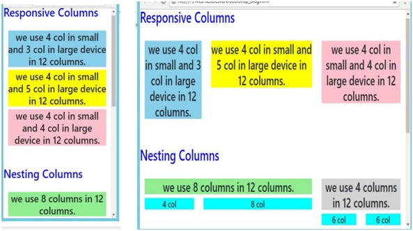
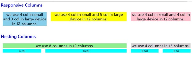
In the following example, the layout has been divided into two grid class (sm & md) for different device viewport. We are dividing here columns for small devices as .col-sm-4, .col-sm-4, .col-sm-4 and for large device.col-md-4 .col-md-3, .col-md-5.
<! ---------- Responsive columns ---------->
<h2 style="color:blue;">Responsive Columns</h2><br />

<div class="container-fluid">
	<div class="row">
		<div class="col-sm-4 col-md-3">
			<h3 style="background-color:skyblue;text-align:center;">
				we use 4 col in small and 3 col in large device in 12 columns.
			</h3>
		</div>

		<div class="col-sm-4 col-md-5">
		<h3 style="background-color:yellow;text-align:center;">
			we use 4 col in small and 5 col in large device in 12 columns.
		</h3>
		</div>
		<div class="col-sm-4 col-md-4">
		<h3 style="background-color:pink;text-align:center;">
			we use 4 col in small and 4 col in large device in 12 columns.
		</h3>
		</div>
	</div>
</div>
Nesting Columns
It is similar to something we have already used, that is; the nested loop and conditional statement in programming languages (In C, C++ & other). To test your content, you have to add a row and col-*-* class within an existing col-*-* class.
Note: The nested row should include scales up to 12 columns as the device or viewport.
Example:
In the following example, layout has been divided into two columns .col-sm-8 and .col-sm-4 both are split into two parts, In which first one is split into .col-sm-4 and .col-sm-8 & second is split into .col-sm-6 and .col-sm-6.
<!----------- Nesting Columns --------------->
<h2 style="color:blue;">Nesting Columns</h2><br />

<div class="container-fluid">
	<div class="row">
		<div class="col-sm-8">
			<h3 style="background-color:lightgreen;text-align:center;">
				we use 8 columns in 12 columns.
			</h3>
			<div class="row">
				<div class="col-sm-4">
					<h5 style="background-color:Aqua;text-align:center;">4 col</h5>
				</div>
				<div class="col-sm-8">
					<h5 style="background-color:Aqua;text-align:center;">8 col</h5> </div>
				</div>
		</div>

		<div class="col-sm-4">
			<h3 style="background-color:lightgrey;text-align:center;">
				we use 4 columns in 12 columns.
			</h3>
			<div class="row">
				<div class="col-sm-6">
					<h5 style="background-color:Aqua;text-align:center;">6 col</h5>
				</div>
				<div class="col-sm-6">
					<h5 style="background-color:Aqua;text-align:center;">6 col</h5>
				</div>
			</div>
		</div>
	</div>
</div>
Mobile and tablet view for Both Responsive and Nesting columns:
Desktop view for Both Responsive and Nesting columns:
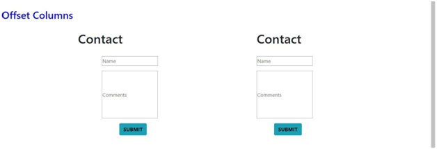
Offset Columns
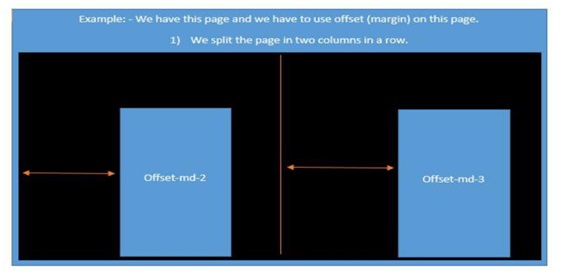
You can also use offset grid columns. It provides a specialized layout. It also has four grid classes. For this, we have to use offset -*-*. These classes are used to increase the left margin of columns where columns can move an only right side and we increase left margin to the columns by using offset -*-* and it ranges from 1-11. Margins are more useful for quick layouts where the variable is the width of the offsets.
Example:
In the following example, specialized layout is used and divided into two columns (col-md-4 col-sm-4 col-lg-4) and (col-md-4 col-sm-4 col-lg-4). Here, we use offset in both the splitted columns offset-md-2 & offset-md-1 as you can see in the example. Under this spitted two columns we again use offset in contact; we use offset for margin where offset-md-2 & offset-md-0 moves over columns col-md-4 col-sm-4 col-lg-4 offset-md-2 & col-md-4 col-sm-4 col-lg-4 offset-md-1.
<!----------- Offset Columns --------------->
<h2 style="color:blue;">Offset Columns</h2>
<br />
<div class="container-fluid">
<div class="row">
<div class= "col-md-4 col-sm-4 col-lg-4 offset-md-2">
<h1>Contact</h1>
<br>
<div class="row">
   <div class="col-sm-8 col-lg-5 offset-md-2">
      <form action="" target="_blank">
         <p><input type="text" placeholder="Name" class="box" required name="Name"></p>
         <p><input	type="text"
            placeholder="Comments"	required	name="Comment"	class="box"
            style=" height:150px;"></p>
         <p><button style="color:black; margin-left:35%" class="btn btn-info" type="submit"><b>SUBMIT</b></button></p>
      </form>
   </div>
</div>
<div class= "col-md-4 col-sm-4 col-lg-4 offset-md-1">
   <h1>Contact</h1>
   <br>
   <div class="col-md-5 col-lg-5 offset-md-0">
      <form action="" target="_blank">
         <p><input type="text" placeholder="Name" class="box" required name="Name"></p>
         <p><input	type="text"
            placeholder="Comments"	required	name="Comment"	class="box"
            style=" height:150px;"></p>
         <p><button style="color:black; margin-left:35%" class="btn btn-info" type="submit"><b>SUBMIT</b></button></p>
      </form>
   </div>
</div>
Mobile and tablet view for Offset columns:
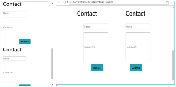
Desktop view for Offset columns:
Conclusion:
So, Let’s conclude with what we have learnt here.like-what is Responsive columns, Nesting columns, Offset Columns and how to use them, with examples. I hope now, you gained an insight into how can we use these different amazing classes for creating a responsive page. Stay tuned for the next article. We will dig deeper and discover more about Bootstrap. See you in the next Article! Happy Learning!