Home »
CSS
A Complete Guide to CSS Flexbox
Learn what is CSS Flexbox, how it works, and working examples of CSS Flexbox.
Submitted by Shahnail Khan, on March 03, 2022
One of the highest paying careers in India where everyone craves is Web Developer. Not everyone who knows the basic HTML can excel in web development. You also need to style your code so that you stand out from your competitors. We use a very popular style sheet language, namely, CSS to design our website. Many CSS properties are available to make the website responsive, well designed, and functional. In this article, we've got you covered the basic concepts of CSS Flexbox, one of the CSS properties.
What is CSS Flexbox?
CSS Flexbox is a flexible web layout model which is mainly used in making websites responsive, i.e., the contents in the web page adjust by the screen resolution of the device with proper spacing. Flexbox has two components: one is the parent div class ="container" and the other one is items inside the container class.
<!DOCTYPE html>
<html lang="en">
   <head>
      <meta charset="UTF-8">
      <meta http-equiv="X-UA-Compatible" content="IE=edge">
      <meta name="viewport" content="width=device-width, initial-scale=1.0">
      <title>Flexbox Tutorial</title>
   </head>
   <style>
      .container{
      display: flex;
      }
   </style>
   <body>
      <div class="container">
         <!--Parent class container-->
         <div>Item1</div>
         <!--items inside container-->
         <div>Item2</div>
         <div>Item3</div>
      </div>
   </body>
</html>
Output:
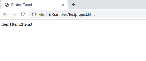
The most important thing to note here is before you use flex container properties, you need to set the display property to "flex" first in Style CSS3.
.container {
	display: flex;
}
Flex Container Properties
The flex container properties which are available are:
- flex-direction- It is used to pile up the flex items in a particular direction. Values accepted by flex-direction are row, row-reverse, column and column-reverse. The default value is row.
- flex-wrap - As the name suggests, it will bundle the flex items. Values accepted by flex-wrap are nowrap, wrap and wrap-reverse. The default value is nowrap.
- flex-flow - It's a shorthand property of flex-direction and flex-wrap. The default value is row-wrap.
- justify-content - It is used in aligning the flex items inside the container. Values accepted by justify-content are flex-start, flex-end, center, space-between, space-around. The default value is flex-start.
- align-content - It is used in aligning the flex lines. Values accepted are stretch, flex-start, flex-end, center, space-between, space-around. The default value is stretch.
Let's take an example to demonstrate the use of CSS Flexbox properties through a code.
<!DOCTYPE html>
<html lang="en">
   <head>
      <meta charset="UTF-8">
      <meta http-equiv="X-UA-Compatible" content="IE=edge">
      <meta name="viewport" content="width=device-width, initial-scale=1.0">
      <title>Flexbox</title>
   </head>
   <link rel="stylesheet" href="">
   <style>
      .container{
      display: flex;
      flex-wrap: wrap;
      flex-direction: row;
      align-items:center ;
      flex-flow: row;
      justify-content: start;
      }
      .Biodata{
      padding: 23px;
      border: 45px;
      background-color: blueviolet;
      margin: 40px;
      }
   </style>
   <body>
      <div class="container">
         <div class="Biodata" class id="data1">Name</div>
         <div class="Biodata" class id="data2">Age</div>
         <div class="Biodata" class id="data3"> Gender</div>
      </div>
   </body>
</html>
Output:
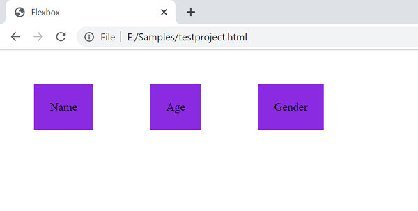
In this code, we have created a parent class "container" and flexbox properties are used. Always remember to set display:flex in the parent class only. In the container class, we have one class "Biodata" with three different class id "data1", "data2", "data". We gave styling to this class so that the flex properties will be visible. Never forget to give background color to the items inside the parent class.
CSS Tutorial & Examples »