Home »
CSS
How to Create a Triangle Using CSS clip-path?
In this tutorial, we will learn how to create a triangle using the CSS clip-path?
By Apurva Mathur Last updated : July 24, 2023
Creating a Triangle Using CSS clip-path
To create a triangle using CSS clip-path, you have to use this property with the polygon() by specifying fill-rule, and lengths in percentage. You can also set the other properties to style the triangle.
CSS clip-path property
In simple terms, this property means cutting some specific shape from the given area. Just like we used to do in our childhood, cutting the shapes like circles, triangles, etc.
The clip-path property does the same, it display the shape from the provided value. The clip-path property has 4 geometric values that you can set it with.
- Inset: The value of the inset clip-path property is somewhat similar to the margin padding property (Top, Right, Bottom, Left)
- Circle: This value requires 2 parameters. The first one is the radius of the circle and the second one is the coordinate of the center to the top left corner.
- Polygon: This value can take any number of parameters. Each parameter consists of the x coordinate and the y coordinate. The units applied as the parameter can be anything as we apply in the margin, and padding properties.
- Ellipse: It is similar to the circle value, but here two values of the radius will be provided instead of one.
Syntax to create triangle
Use the following code statement to create a triangle using the clip-path property:
clip-path: polygon(50% 0, 100% 100%, 0% 100%);
Steps to Create a Triangle Using CSS clip-path
The steps to create a triangle using the CSS clip-path are:
- Open a div tag and write any content inside the tag. Here, div tag is used you can also use img tag if you want to style any image in a particular geometric shape.
- Give some padding to the div as it will help our element's content to fit inside the shape.
- clip-path: polygon(50% 0, 100% 100%, 0% 100%); This is the fixed value we use to get the perfect triangle, try to change the coordinates and you'll get different types of triangles every time.
- Rest you can apply any basic properties to make it look attractive.
- Run the code on the browser.
Example to Create a Triangle Using CSS clip-path
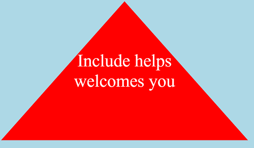
Consider the below-given example in which we are creating a triangle with the help of CSS clip-path and polygon().
<!DOCTYPE html>

<html>
   <head>
      <style>
         div {
         padding:10%;
         clip-path: polygon(50% 0, 100% 100%, 0% 100%);
         background-color: red;
         color: white;
         margin-right: 50%;
         text-align: center;
         font-size: 45px;
         }
      </style>
   </head>
   <body style="background-color:lightblue">
      <div>Include helps welcomes you</div>
   </body>
   </html
The output of the above example is:
CSS Examples »