Home »
CSS
How to set image as border in using CSS?
CSS | border-image property: In this tutorial, we will learn how can we create border images using CSS?
By Apurva Mathur Last updated : July 25, 2023
We have always applied borders to the images but never applied the image to the border, in this article we'll find out how we can create border images in CSS?
Setting image as border in using CSS
To set an image as the border, you can simply use CSS border-image property by providing the values of the image path (URL), image slice, and image repeat. The CSS border-image property is complicated but at the same time if this property is used with proper creativity can make your website look surprisingly exclusive. It works exactly like our "image property; the only difference is that this property has 2 extra parameters.
Syntax to set an image as border
Below is the syntax of CSS border-image property that is used for setting an image as the border:
border-image: (url (""), value your image to be sliced in, Round/stretch/repeat)
Parameter(s)
The three parameters are:
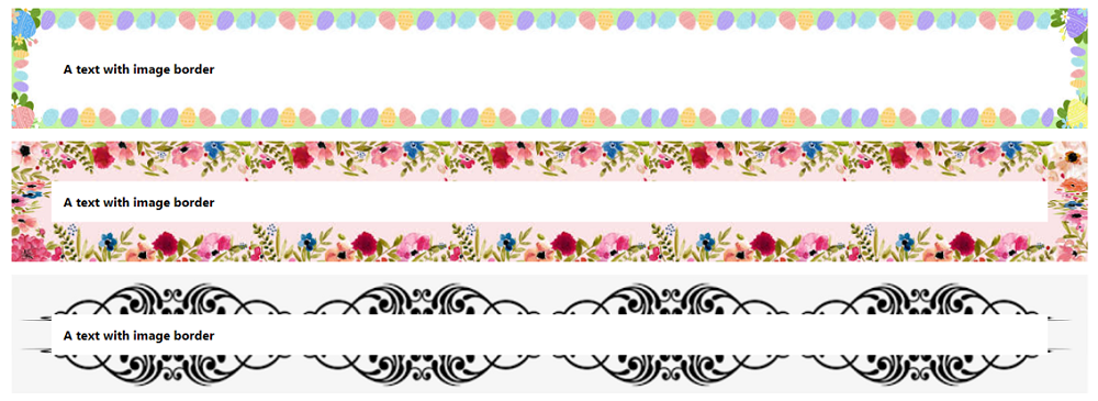
Example to set an image as the border using CSS
In this example, we have three elements (p) on which we are applying images as the border.
<!DOCTYPE html>

<html>
   <head>
      <style>
         body {
         font-family: "Segoe UI", Tahoma, Geneva, Verdana, sans-serif;
         }
         .type1 {
         border: 50px solid transparent;
         padding: 15px;
         border-image: url("https://encrypted-tbn0.gstatic.com/images?q=tbn:ANd9GcQHOqwXSzoP9FwqgpLkF76HW0xgiwe3K-CHRQ&usqp=CAU")25% round;
         font-weight: bolder;
         }
         .type2 {
         border: 50px solid transparent;
         padding: 15px;
         border-image: url("https://encrypted-tbn0.gstatic.com/images?q=tbn:ANd9GcSU10ZPWLvnErKZEzLgEcXi5b9IUBm3KBwMJA&usqp=CAU")40 round;
         font-weight: bolder;
         }
         .type3 {
         border: 50px solid transparent;
         padding: 15px;
         border-image: url("https://encrypted-tbn0.gstatic.com/images?q=tbn:ANd9GcSE99zFm_BzKjv2w56bPAEAFPEWaJZFdPYawg&usqp=CAU") 30 round;
         font-weight: bolder;
         }
      </style>
   </head>

   <body>
      <p class="type1">A text with image border</p>
      <p class="type2">A text with image border</p>
      <p class="type3">A text with image border</p>
   </body>

</html>
The output of the above example is:
CSS Examples »
Advertisement
Advertisement