Home »
CSS
How to make the main content div fill the height of the screen with HTML and CSS?
In this tutorial, we will learn how to make the main content div fill the height of the screen with HTML and CSS?
By Shahnail Khan Last updated : July 12, 2023
Make the main content div fill the height of the screen
Customizing a web page is not as easy as it seems to be. You need to make sure all the elements in the webpage are properly aligned. We define various CSS properties which serve different purposes. In this article, we'll get to know all the CSS properties we can apply so that our main content div fills the height of the screen.
By default, div fills the width of the screen, adapting itself when the browser is resized. But it doesn't fill the height of the screen. We need to apply CSS properties so that whenever our browser is resized, the height of the main content div elements is adjusted accordingly with the screen size.
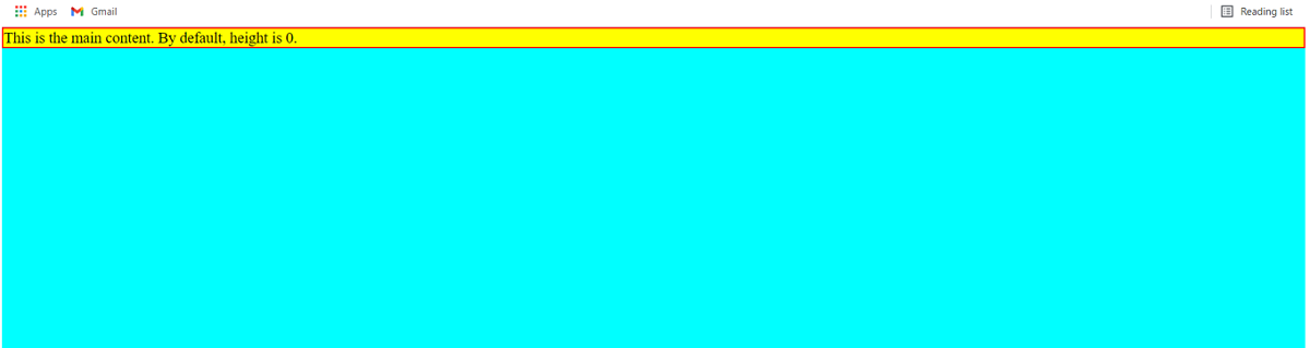
As you can see in the webpage displayed below, the main content div didn't fill the height of the screen. This is where you are stuck, right?
Let's code to solve this problem:
Example
<!DOCTYPE html>
<html lang="en">
   <head>
      <meta charset="UTF-8">
      <meta http-equiv="X-UA-Compatible" content="IE=edge">
      <meta name="viewport" content="width=device-width, initial-scale=1.0">
      <title>tutorial</title>
   </head>

   <style>
      body {
      background-color: aqua;
      margin: 0;
      }
      .maincontent {
      background: yellow;
      font-size: large;
      height: 100vh;/*vh stands for viewport height*/
      width: 100vw;
      }
   </style>

   <body>
      <div class="maincontent">
         This is the main content. By default, height is 0.
      </div>
   </body>
</html>
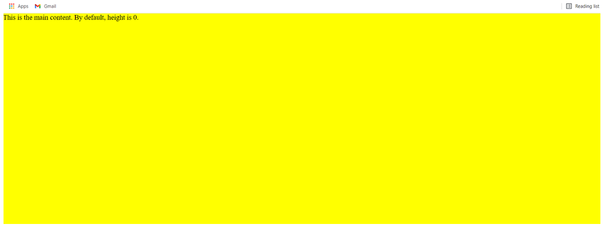
Output
Example
CSS properties that hold significance here are:
- margin - Set margin of body elements to
- height - Set the height of the main content class to
For those of you who don't know about vh, it stands for viewport height. 100vh specifies the full height of the screen.
- width - Set width of the main content class to Here, 100vw specifies the full width of the screen. You can skip this property here if you want, but for responsive design, it's quite useful.
CSS Examples »