Home »
CSS
Border Images in CSS
CSS | Border Images: In this tutorial, we are going to learn about the border image properties in CSS (Cascading Style Sheet) with examples.
Submitted by Anjali Singh, on December 04, 2019
CSS | Border Images
The border-image property in CSS allows us to add an image as a border around an element. You can use this property to make your element more fancy and attractive.
Element {
    border-image: source slice width outset repeat;
}
The border-image Property
There are few border-image properties which we are going to discuss in detail,
- border-image-source property
- border-image-width property
- border-image-outset property
- border-image-repeat property
- border-image-slice property
Note: In the below examples, we are using an image named "border.png". So, while working using these examples, you need to change the name and location of your image file.
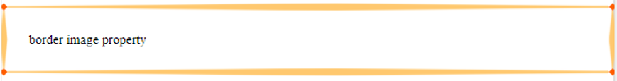
1) border-image-source property
This property is used to specify the path of the image that we intend to use as a border of the element.
Syntax:
Element{
	border-image-source: url(source location);
}
Example:
<!DOCTYPE html>

<html>

<head>
    <style>
        p {
            border: 10px solid transparent;
            padding: 15px;
            border-image-source: url(border.png);
            border-image-slice: 30;
        }
    </style>
</head>

<body>
    <p>border image property</p>
</body>

</html>
Output
In the above example, the location is used for source image.
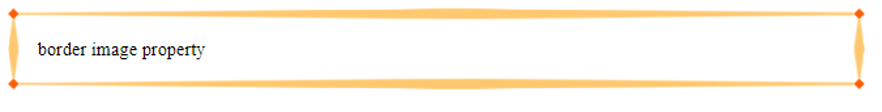
2) border-image-width property
This property is used to set the width of the border used around an element.
Syntax:
Element {
    border-image-width: 30px;
}
Example:
<!DOCTYPE html>

<html>

<head>
    <style>
        p {
            border: 10px solid transparent;
            padding: 15px;
            border-image-source: url(border.png);
            border-image-slice: 30;
            border-image-width: 20px;
        }
    </style>
</head>

<body>
    <p>border image property</p>
</body>

</html>
Output
In the above example, the width of the border image is 30px.
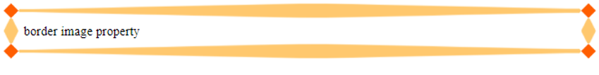
3) border-image-outset property
This property specifies the distance by which an element border image is set out from its border-box. The border-image-outset can take from 1 to 4 values (left, right, top and bottom sides).
Syntax:
Element {
    border-image-outset: 10px;
}
Example:
<!DOCTYPE html>

<html>

<head>
    <style>
        p {
            border: 10px solid transparent;
            padding: 15px;
            border-image-source: url(border.png);
            border-image-slice: 30;
            border-image-outset: 10px;
        }
    </style>
</head>

<body>
    <p>border image property</p>
</body>

</html>
Output
In the above example, 10px border-image-outset value is applied.
4) border-image-repeat property
This property specifies how the edge regions of the image are adjusted to fit the dimensions of an element's border-image.
Value stretch is the default value.
border-image-repeat can take the following set of values,
- repeat - It repeats the source image to fill the area.
- stretch - It stretches the source image to fill the area.
- round - The image is rescaled so it fits if it does not fill the area with a whole number of tiles.
- space - An extra space is distributed around the tiles if it does not fill the area with a whole number of tiles.
Syntax:
Element {
    border-image-repeat: repeat;
}
Example:
<!DOCTYPE html>

<html>

<head>
    <style>
        p {
            border: 10px solid transparent;
            padding: 15px;
            border-image-source: url(border.png);
            border-image-slice: 30;
            border-image-repeat: repeat;
        }
    </style>
</head>

<body>
    <p>border image property</p>
</body>

</html>
Output
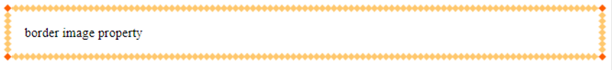
In the above example, repeat value is applied for border-image-repeat property.
5) border-image-slice property
This property is used to divide the source image specified by the border-image-source property.
It divides the source image into,
- 9 regions
- 4 corners
- 4 edges
- A middle region
Syntax:
Element {
    border-image-slice: 30px;
}
Example:
<!DOCTYPE html>

<html>

<head>
    <style>
        p {
            border: 10px solid transparent;
            padding: 15px;
            border-image-source: url(border.png);
            border-image-slice: 30;
        }
    </style>
</head>

<body>
    <p>border image property</p>
</body>

</html>
Output
Note: Remove the border-image-slice property to see the difference.
In the above example, 30px value is applied to the border-image-slice property.
CSS Tutorial & Examples »
Advertisement
Advertisement