Home »
CSS
Measurement Units in CSS
CSS | Measurement Units: In this tutorial, we are going to learn about the different measurement units in CSS (Cascading Style Sheet).
Submitted by Anjali Singh, on December 02, 2019
CSS | Measurement Units
The distance measurement in CSS is a number immediately followed by a length unit. CSS supports several length measurement units. They are,
- Absolute length
- Relative length
1) Absolute length
The absolute length units are fixed and cannot be changed.
It is not preferable to use absolute length for use on-screen as the screen may vary depending on the device used for that page. It is recommended to use it where the output medium is known.
Absolute length units,
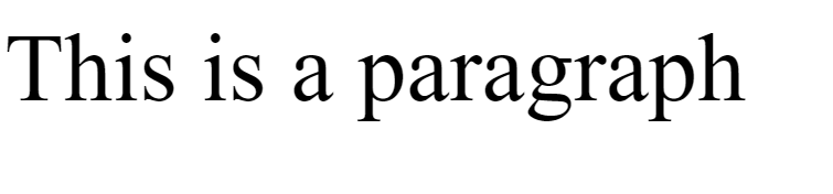
1) cm (centimeter)
It is used to define the length in terms of cm.
Syntax:
Element {
    font-size: 15cm;
}
Example:
<!DOCTYPE html>

<html>

<head>
    <style>
        p {
            font-size: 2cm;
        }
    </style>
</head>

<body>
    <p>This is a paragraph</p>
</body>

</html>
Output
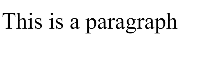
In the above example, cm unit length is used.
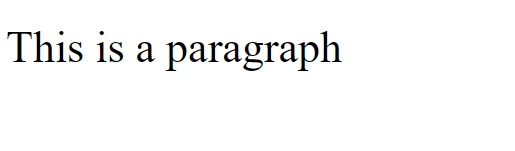
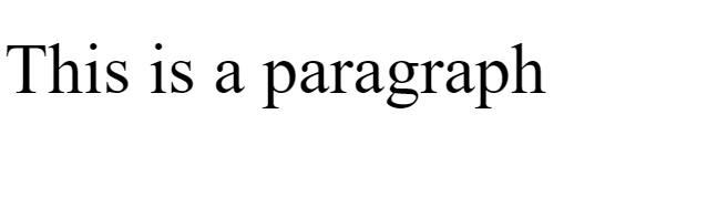
2) mm (millimeter)
It is used to define the length in terms of mm.
Syntax:
Element {
    font-size: 10mm;
}
Example:
<!DOCTYPE html>

<html>

<head>
    <style>
        p {
            font-size: 6mm;
        }
    </style>
</head>

<body>
    <p>This is a paragraph</p>
</body>

</html>
Output
In the above example, mm unit length is used.
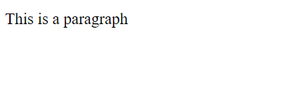
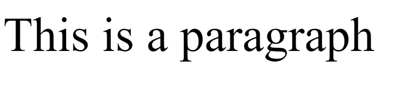
3) in (inches)
It is used to define the size of element in terms of inches.
Note: 1in = 96px = 2.54cm
Syntax:
Element {
    font-size: 3in;
}
Example:
<!DOCTYPE html>

<html>

<head>
    <style>
        p {
            font-size: 0.5in;
        }
    </style>
</head>

<body>
    <p>This is a paragraph</p>
</body>

</html>
Output
In the above example, in unit length is used.
4) px (pixels)
It is used to define the length in terms of pixels.
Note: 1px = 1/96th of 1in
Syntax:
Element {
    font-size: 10px;
}
Example:
<!DOCTYPE html>

<html>

<head>
    <style>
        p {
            font-size: 44px;
        }
    </style>
</head>

<body>
    <p>This is a paragraph</p>
</body>

</html>
Output
In the above example, px unit length is used.
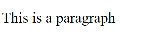
5) pt (points)
It is used to define the length in terms of points.
Note: 1pt = 1/72 of 1in
Syntax:
Element {
    font-size: 10pt;
}
Example:
<!DOCTYPE html>

<html>

<head>
    <style>
        p {
            font-size: 66pt;
        }
    </style>
</head>

<body>
    <p>This is a paragraph</p>
</body>

</html>
Output
In the above example, pt unit length is used.
6) pc (picas)
It is used to define the length in terms of picas.
Note: 1pc = 12 pt
Syntax:
Element {
    font-size: 3pc;
}
Example:
<!DOCTYPE html>

<html>

<head>
    <style>
        p {
            font-size: 4pc;
        }
    </style>
</head>

<body>
    <p>This is a paragraph</p>
</body>

</html>
Output
In the above example, pc unit length is used.
2) Relative length
Relative unit length is good for use on-screen as if screen size varies depending on the device then these relative length units also change with the different rendering mediums.
Relative unit lengths,
1) em
It is relative to the font size of that element. (n em means n times the size of the current font)
Syntax:
Element {
    font-size: 2em;
}
Example:
<!DOCTYPE html>

<html>

<head>
    <style>
        p {
            font-size: 6em;
        }
    </style>
</head>

<body>
    <p>This is a paragraph</p>
</body>

</html>
Output
In the above example, em unit length is used.
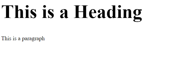
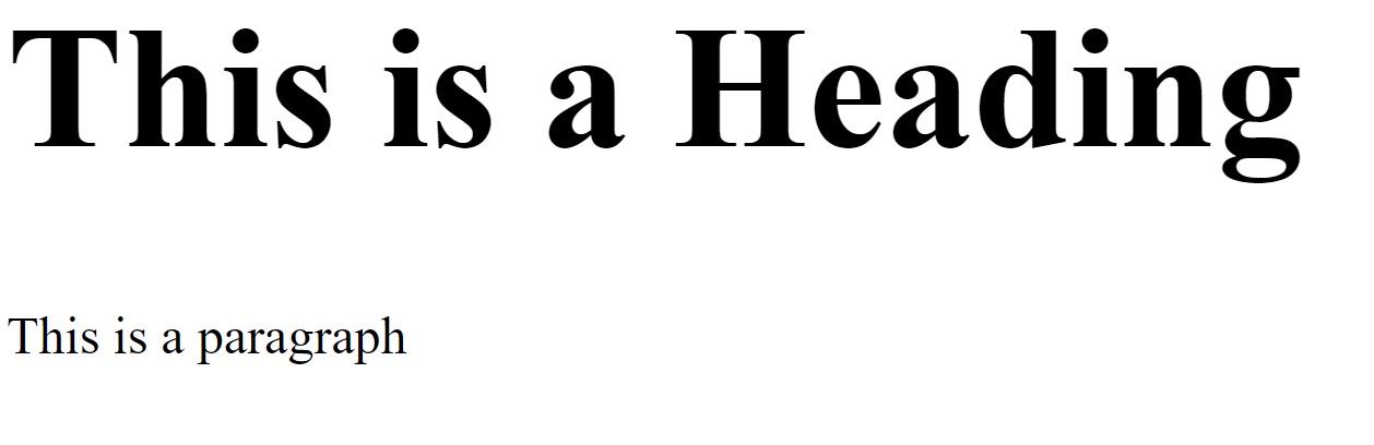
2) % (percentage)
It is relative to the parent element.
Syntax:
Element {
    font-size: 40%;
}
Example:
<!DOCTYPE html>

<html>

<head>
    <style>
        h1 {
            font-size: 300%;
        }

        p {
            font-size: 150%;
        }
    </style>
</head>

<body>
    <h1>This is a Heading</h1>
    <p>This is a paragraph</p>
</body>

</html>
Output
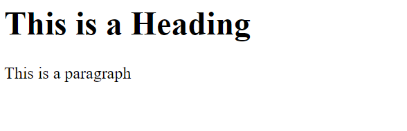
In the above example, % unit length is used.
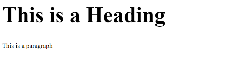
3) vmax
It is relative to 1% of the viewport's larger dimension.
Syntax:
Element {
    font-size: 20vmax;
}
Example:
<!DOCTYPE html>

<html>

<head>
    <style>
        h1 {
            font-size: 10vmax;
        }

        p {
            font-size: 3vmax;
        }
    </style>
</head>

<body>
    <h1>This is a Heading</h1>
    <p>This is a paragraph</p>
</body>

</html>
Output
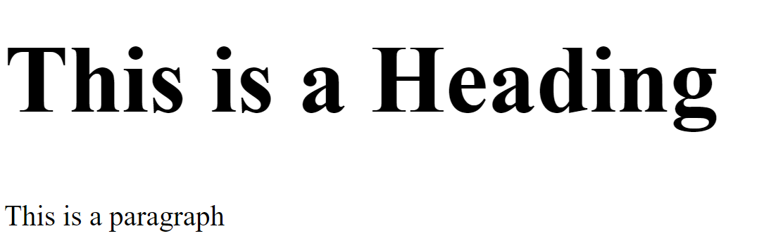
In the above example, vmax unit length is used.
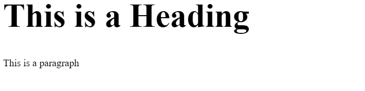
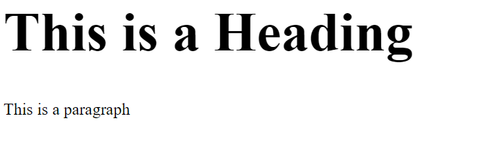
4) vmin
It is relative to 1% of the viewport's smaller dimension.
Syntax:
Element {
    font-size: 10vmin;
}
Example:
<!DOCTYPE html>

<html>

<head>
    <style>
        h1 {
            font-size: 10vmin;
        }

        p {
            font-size: 3vmin;
        }
    </style>
</head>

<body>
    <h1>This is a Heading</h1>
    <p>This is a paragraph</p>
</body>

</html>
Output
In the above example, vmin unit length is used.
5) vh
It is relative to 1% of the height of the viewport.
Syntax:
Element {
    font-size: 10vh;
}
Example:
<!DOCTYPE html>

<html>

<head>
    <style>
        h1 {
            font-size: 10vh;
        }

        p {
            font-size: 3vh;
        }
    </style>
</head>

<body>
    <h1>This is a Heading</h1>
    <p>This is a paragraph</p>
</body>

</html>
Output
In the above example, vh unit length is used.
6) vw
It is relative to 1% of the width of the viewport.
Syntax:
Element {
    font-size: 10vw;
}
Example:
<!DOCTYPE html>

<html>

<head>
    <style>
        h1 {
            font-size: 10vw;
        }

        p {
            font-size: 3vw;
        }
    </style>
</head>

<body>
    <h1>This is a Heading</h1>
    <p>This is a paragraph</p>
</body>

</html>
Output
In the above example, vw unit length is used.
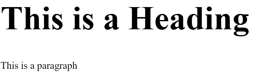
7) rem
It is relative to the browser base font-size.
Syntax:
Element {
    font-size: 10rem;
}
Example:
<!DOCTYPE html>

<html>

<head>
    <style>
        h1 {
            font-size: 10rem;
        }

        p {
            font-size: 3rem;
        }
    </style>
</head>

<body>
    <h1>This is a Heading</h1>
    <p>This is a paragraph</p>
</body>

</html>
Output
In the above example, rem unit length is used.
8) ex
It is relative to the X (axis)-height of the current font.
Syntax:
Element {
    font-size: 6ex;
}
Example:
<!DOCTYPE html>

<html>

<head>
    <style>
        h1 {
            font-size: 10ex;
        }

        p {
            font-size: 3ex;
        }
    </style>
</head>

<body>
    <h1>This is a Heading</h1>
    <p>This is a paragraph</p>
</body>

</html>
Output
In the above example, ex unit length is used.
9) ch
It is relative to the width of the 0.
Syntax:
Element {
    font-size: 2ch;
}
Example:
<!DOCTYPE html>

<html>

<head>
    <style>
        h1 {
            font-size: 10ch;
        }

        p {
            font-size: 3ch;
        }
    </style>
</head>

<body>
    <h1>This is a Heading</h1>
    <p>This is a paragraph</p>
</body>

</html>
Output
In the above example, ch unit length is used.
CSS Tutorial & Examples »
Advertisement
Advertisement