Home »
CSS
Navigation Bar using CSS
CSS | Navigation Bar: Here, we are going to learn how to create a navigation bar using CSS? This tutorial contains navigation examples using HTML and CSS.
Submitted by Anjali Singh, on November 24, 2019
CSS | Navigation Bar
Developing websites is great but developing a user-friendly website is even greater. So how does one design a user-friendly website? What tools to use? Well, there are many tools to mention which are quite helpful in making a website user-friendly. So let's discuss one such tool which is Navigation Bar.
Navigation Bar, what is the first thought that comes into mind after listening to this term. Quite simply though, a menu option for navigating throughout that particular page or site. The navigation bar also lets people move from one page to another. The navigation bar works as a guide for the user to surf through the pages.
The navigation bar is created with the help of menu items taken together. Like an ordered list or unordered list, these list items can be arranged into various positions like horizontally, vertically, right-aligned, etc. Therefore one should be clear in mind about the type of navigation bar he/she wants to use on the webpage.
Besides being aware of the navigation bar, one should also make sure that the links provided in the navigation bar are correct otherwise the user may access the wrong page without even being aware and that creates problems.
let's talk about some type of navigation bars in detail,
- Vertical navigation bar
- Horizontal navigation bar
- Fixed navigation bar
1) Vertical Navigation Bar
The vertical navigation bar is used to display the menu options vertically. You can use the display property and set it to block. By using display property and setting it to block means that the entire block consisting of your menu item will become clickable. You can also set the width of these blocks as well.
CSS Syntax:
    Element
    {
        display: block;
        width: 50px;
    }
Example:
<!DOCTYPE html>
<html>

<head>
    <style>
        li a {
            display: block;
            width: 90px;
            background-color: #dddddd;
        }
    </style>
</head>

<body>
    <ul>
        <li><a href="#student">student</a></li>
        <li><a href="#staff">staff</a></li>
        <li><a href="#dean">dean</a></li>
    </ul>
</body>

</html>
Output
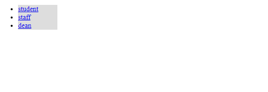
In the above example, displaying the links as block elements makes the whole link area clickable.
2) Horizontal Navigation Bar
In a horizontal navigation bar as the name suggests the elements can be arranged horizontally. Now, this can be done in two ways, first, using inline property and second is by using the floating property.
1) inline
In "inline property" the elements are by default block items, the line break is removed from before and after of each list item so that they can be shown in one line.
Syntax for inline:
    Element{
        display: inline;
    }
Example:
<!DOCTYPE html>
<html>

<head>
    <style>
        li {
            display: inline;
        }
    </style>
</head>

<body>
    <ul>
        <li><a href="#student">student</a></li>
        <li><a href="#staff">staff</a></li>
        <li><a href="#dean">dean</a></li>
    </ul>
</body>

</html>
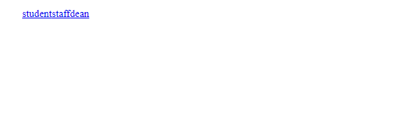
Output

In the above example, the elements are displayed in a single line.
2) floating:
"floating property" is used to adjust elements next to each other.
Syntax for floating:
    element{
        float: left;
    }
Example:
<!DOCTYPE html>
<html>

<head>
    <style>
        li {
            display: block;
            float: left;
        }
    </style>
</head>

<body>
    <ul>
        <li><a href="#student">student</a></li>
        <li><a href="#staff">staff</a></li>
        <li><a href="#dean">dean</a></li>
    </ul>
</body>

</html>
Output
In the above example, the elements are displayed next to each other without any space.
3) Fixed position navigation bar
These types of navigation bar stay fixed to their positions be it top or bottom even when the user scrolls down or up the page.
CSS Syntax:
    Element{
        // for fixed top
        position: fixed;
        // To fix the bar at the top
        top: 0;
        // for fixed bottom
        // To fix the bar at the bottom
        bottom: 0;
    }
Example:
<!DOCTYPE html>
<html>

<head>
    <meta name="viewport" content="width=device-width, initial-scale=1">
    <style>
        .topnav {
            overflow: hidden;
            background-color: #333;
        }

        .topnav a {
            float: left;
            color: #f2f2f2;
            text-align: center;
            padding: 14px 16px;
            text-decoration: none;
            font-size: 17px;
        }

        .topnav a:hover {
            background-color: #ddd;
            color: black;
        }
    </style>
</head>

<body>
    <div class="topnav">
        <a class="active" href="#student">student</a>
        <a href="#staff">staff</a>
        <a href="#dean">dean</a>
    </div>
    <div style="padding-left:16px">
        <p>Some content..</p>
    </div>
</body>

</html>
Output
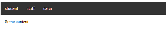
In the above example, the navigation stays at top even when we scroll the page.
CSS Tutorial & Examples »
Advertisement
Advertisement