Home »
CSS
The object-fit Property in CSS
CSS | object-fit Property: Here, we are going to learn about the object-fit Property with syntax, examples in CSS (Cascading Style Sheet).
Submitted by Anjali Singh, on January 07, 2020
CSS | object-fit Property
Introduction:
Videos and Images are sure to make any website or web page attractive to the users. It is very smart to include images and videos on your website or web page as it makes your website or web page very responsive and user-interactive. Although, it is a good practice to indulge your users with the videos and images to deal with those images and videos is equally important.
So, to deal with those images and videos, there are certain properties and one should keep learning about such new properties, therefore this article is also about one such property known as object-fit Property in CSS. Let us have a look at the explanation below for better understanding.
Definition:
The CSS object-fit property is used to declare how an image or video is resized to fit its required area. Very simple and easy to use the property but should be used very wisely as well.
Syntax:
    Element{
        object-fit : fill|contain|cover|scale-down|none;
    }
There are following object-fit property's values in CSS,
- fill
- contain
- cover
- scale-down
- none
Let's look at each property one by one....
object-fit : fill
It is also the default value. The replaced image or video is stretched or squashed to fit the required area if necessary. The replaced image will fill the area heedless of its aspect ratio.
Syntax:
    Element{
        object-fit : fill;
    }
Example:
<!DOCTYPE html>

<html>

<head>
    <style>
        img {
            width: 200px;
            height: 400px;
            object-fit: fill;
        }
    </style>
</head>

<body>
    <h1>Object-fit Property</h1>
    <img src="img_forest.jpg" width="667" height="184">
</body>

</html>
Output
In the above example, the replaced image is stretched in order to fit the content box.
object-fit : contain
The contain value of the object-fit property is used to scale the replaced content to maintain its aspect ratio while fitting in a elements content-box. The entire object is made to fill the content box.
Syntax:
    Element{
        object-fit : contain;
    }
Example:
<!DOCTYPE html>

<html>

<head>
    <style>
        img {
            width: 200px;
            height: 400px;
            object-fit: contain;
        }
    </style>
</head>

<body>
    <h1>Object-fit Property</h1>
    <img src="img_forest.jpg" width="667" height="184">
</body>

</html>
Output
In the above example, the replaced image is scaled to maintain its aspect ratio.
object-fit : cover
The cover value of the object-fit property is used to resize the replaced content to maintain its aspect ratio while filling the content box.
If the object aspect ratio does not match the aspect ratio of its box the object is cropped to fit.
Syntax:
    Element{
        object-fit : cover;
    }
Example:
<!DOCTYPE html>

<html>

<head>
    <style>
        img {
            width: 200px;
            height: 400px;
            object-fit: cover;
        }
    </style>
</head>

<body>
    <h1>Object-fit Property</h1>
    <img src="img_forest.jpg" width="667" height="184">
</body>

</html>
Output
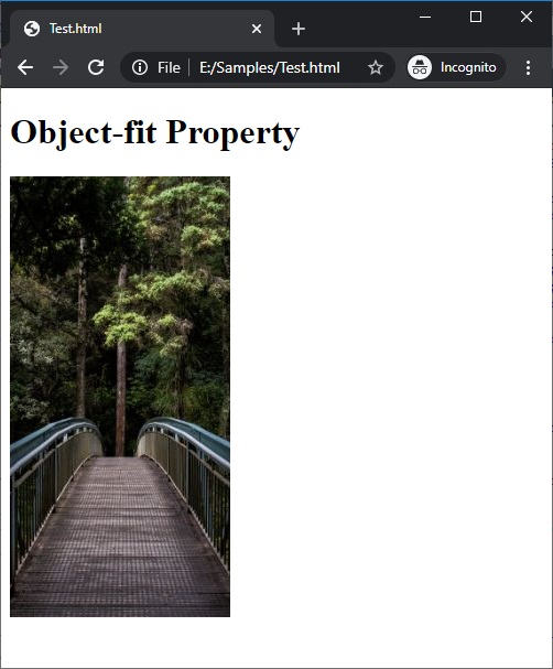
In the above example, the replaced image fits the content-box perfectly hence it is not cropped.
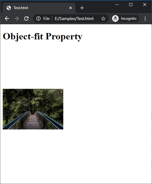
object-fit : scale-down
As its name suggests in the scale-down value of the object-fit property the replaced content is resized as if the none or contain were specified and results to the smallest object size.
Syntax:
    Element{
        object-fit : scale-down;
    }
Example:
<!DOCTYPE html>

<html>

<head>
    <style>
        img {
            width: 200px;
            height: 400px;
            object-fit: scale-down;
        }
    </style>
</head>

<body>
    <h1>Object-fit Property</h1>
    <img src="img_forest.jpg" width="667" height="184">
</body>

</html>
Output

In the above example, the replaced image is scaled as if none.
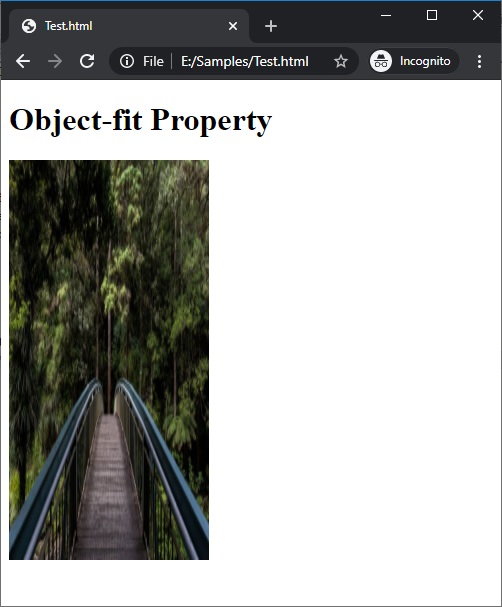
object-fit : none
As its name suggests in the none value of the object-fit property the replaced content will ignore aspect ratio of the actual image. Hence, it is not resized.
Syntax:
    Element{
        object-fit : none;
    }
Example:
<!DOCTYPE html>

<html>

<head>
    <style>
        img {
            width: 200px;
            height: 400px;
            object-fit: none;
        }
    </style>
</head>

<body>
    <h1>Object-fit Property</h1>
    <img src="img_forest.jpg" width="667" height="184">
</body>

</html>
Output

In the above example, the replaced image has ignored all the aspects ratio.
CSS Tutorial & Examples »
Advertisement
Advertisement