Home »
Data Science
Data Visualization
In this tutorial, we are going to learn about the data visualization, significances and its types.
Submitted by Palkesh Jain, on March 11, 2021
"The graphical representation of information is known as data visualization. Data visualization tools offer an accessible way of seeing and interpreting trends, outliers, and patterns in data by using visual elements such as charts, graphs, and maps."
Hence, Data visualization is the representation of data in the form of a graph, map, or other visual formats of data or information. It communicates the data's connections with photos. This is critical because it allows for better viewing of trends and patterns. We need to be able to view exponentially bigger batches of data with the emergence of big data on us. Machine learning makes analyses such as predictive analysis easier to perform, which can then serve as useful visualizations to present.
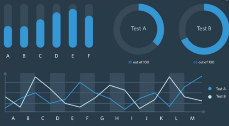
The following image shows data visualization,
In the business world, large information being collected through data analysis, in this manner, it is important to have some solutions for data interpretation. Data visualization gives us a clear idea of what the information is, which means giving it visual context through maps or graphs. This makes the data more natural for the human to comprehend and therefore makes it easier to identify trends, patterns, and outliers within large data sets.
Why Data Visualization is Important?
Data visualization helps by presenting data in the most effective approach of graphical representation. Data visualization takes the raw data, models it, and delivers the data as one of the key steps in the business intelligence process so that conclusions can be drawn. Data scientists are designing machine learning algorithms in advanced analytics to help compile important data into visualizations that are simpler to understand and interpret. We need data visualization because it is easier to recognize patterns and trends with a visual overview of data than to look at thousands of rows on a spreadsheet.
The aim of data analysis is to gain knowledge, when it is visualized, information is far more valuable. Even if a data analyst can pull information from data without visualization, it would be more difficult to express the context without visualization. Charts and graphs make it easier to convey data results even though you can recognize the patterns without them.
Example - Students are also taught the value of presenting data results through visualization schemes in business schools. It may be challenging for the viewer to understand the true significance of the results without a visual depiction of the insights.
Advantages of Data Visualization
Visualization of data positively impacts the decision-making process of an enterprise through immersive visual representations of data. Data can be more easily identify patterns and they can perceive details in graphical or pictorial ways.
The following highlighted points are showing the advantages of Data Visualization:
- Correlations in relationships: It is difficult to define the correlations between the interactions of independent variables without data visualization. We can make informed decisions by making sense of certain independent variables.
- Trends over Time: This shows the use of data visualization of data trends over a certain period. It is one of the most useful applications of data visualization techniques. Without getting the requisite knowledge from the past and present, it is difficult to make predictions. Over time, patterns tell us where we have been and where we might possibly go.
- Frequency: There is a frequency closely linked to patterns over time. By analyzing the pace or how much consumers purchase and when they buy, we get a better understanding of how potential new customers will behave and react to various strategies for marketing and customer acquisition.
- Business Analysis: Data visualization takes the data from various markets to give you insights into which audiences to concentrate your efforts on and which ones to stay away from. By showing this information on different charts and graphs, we get a better picture of the possibilities within those markets.
- Market Response: The ability to rapidly and accurately access information with data clearly presented on a functional dashboard enables organizations to act quickly and respond to findings and helps to avoid making mistakes.
Types of Data Visualization
The different types of data visualisation are as follows -
-
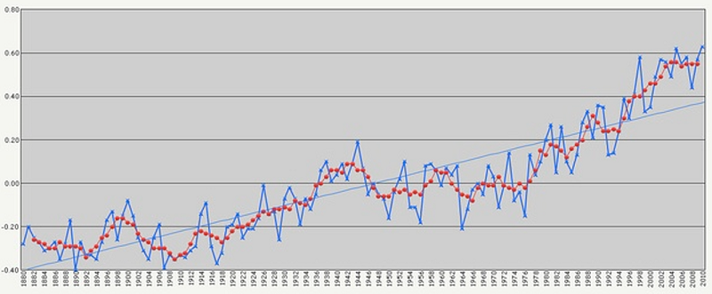
The Temporal: Temporal visualizations are similar to linear one-dimensional visualizations, but they vary because they have a time of beginning and end and objects that can overlap each other. In other words, we can say if they satisfy two conditions: that they are linear, and that they are one-dimensional, data visualizations belong to the temporal group. Temporary visualizations usually feature lines, with a start and end time that either stand-alone or overlap with each other. Some of the key aspects of temporal data visualization are as follows -
- Scatter plots
- Polar area diagrams
- Time series sequences
- Timelines
- Line graphs
For example -
-
Hierarchical: Those that order groups within larger groups are data visualizations that belong to the hierarchical category. If you are looking to show clusters of information, hierarchical visualizations are better suited, particularly if they flow from a single point of origin. The drawback to these graphs is that they tend to be more complicated and difficult to interpret, which is why the tree diagram is most commonly used, its linear path is the easiest to follow -
- Tree diagrams
- Ring charts
- Sunburst diagrams
For example -
-
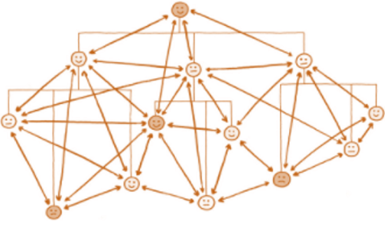
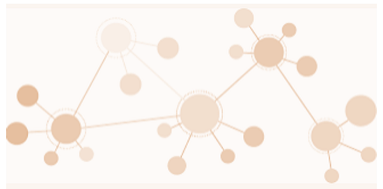
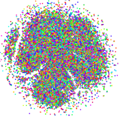
Network: Network data visualizations demonstrate how data sets are connected to one another within a network. Some of the key aspects of network data visualisation are as follows -
- Matrix charts
- Node-link diagrams
- Word clouds
- Alluvial diagrams
For example -
-
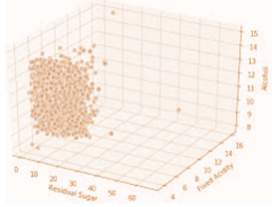
Multidimensional: Multidimensional data visualizations are those which have two or more dimensions. This category is general amongst the most common types of data visualization. Some of the key aspects of multidimensional data visualisation are as follows -
- Scatter plots
- Pie charts
- Venn diagrams
- Stacked bar graphs
- Histograms
For example -
-
2-D Area: Data visualization forms in the 2D area are typically geospatial, indicating that they refer to the relative location of objects on the surface of the earth. Some of the key aspects of multidimensional data visualisation are as follows -
- Chart of Flow
- Density Map
- Cartograms
For example -
-
Heat Map: The key and final stage in data analysis is efficient data visualization. Without it, it is possible to lose valuable observations and insights. It understands the value of visualization of data, which is; why it is included in our solution for Web Data Integration.
For example -
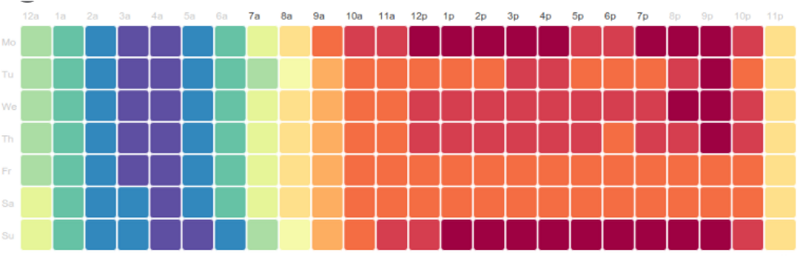
Web Data Integration not only gathers the information the company needs from anywhere on the web, it brings the data all the way through the planning, integration, and consumption data analysis process, providing to us easily consumable charts and graphs to gain insights.
Advertisement
Advertisement