Home »
MS PowerPoint
Adding Charts in a Microsoft PowerPoint Presentation
Here, we are going to learn how to add Charts in MS PowerPoint? These are objects which help us to make our presentation more attractive, interesting and professional. When we make a presentation, many elements can be added in PowerPoint like a chart.
Submitted by Abhay Bhadoria, on February 04, 2021
Adding a Chart
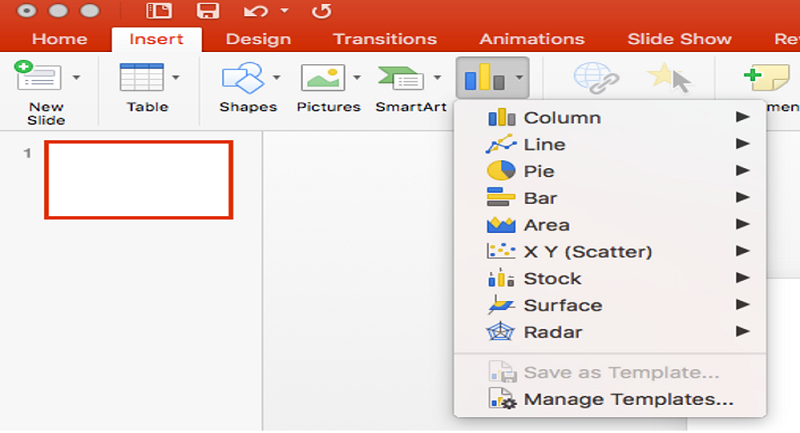
First, we can open our MS PowerPoint file and choose the slide where we want to insert the chart.
Go to Insert tab and click on the option of Charts.
Here, we can find different categories of charts select one of them according to our need.
Charts in MS PowerPoint
A chart is an object which can be used to display our data in graphical form. It is very helpful and easy to understand when we demonstrate something in front of multiple people which can be easily described. Showing charts in PowerPoint; allows our public to present in the tabular form, and it can be used to describe the comparison between two or more things.
Types of Charts
There are mainly 9 types of Charts in our MS PowerPoint presentation,
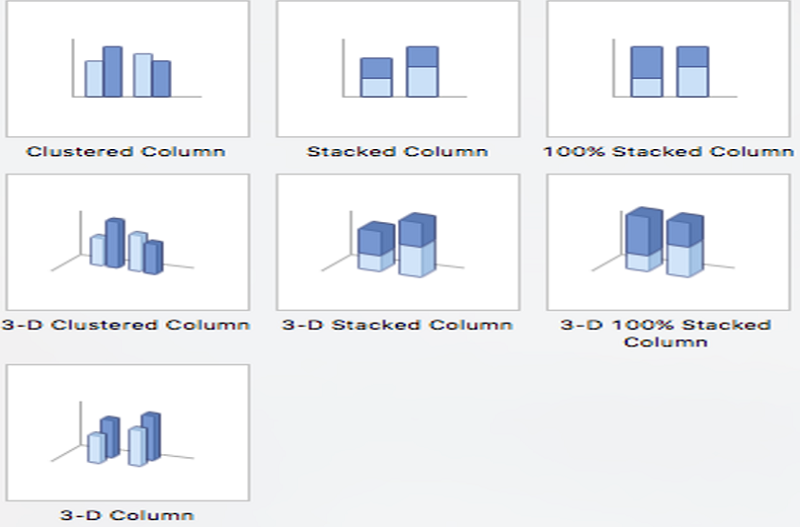
- Column Chart: In a column chart, we can visualize data, where each category of data is symbolized by a 3D rectangle, where the height of the rectangle is equal to the values being mapped.
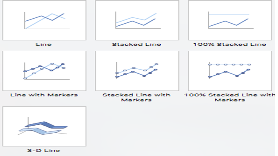
- Line Chart: The use of a line chart is to represent data over a continuous curve time. It is usually used to demonstrate the pattern of measurement over time. We plot line graphs using a set of points connected by straight lines.
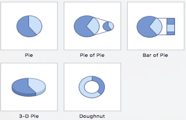
- Pie Chart: A pie chart is a chart in which we can represent data in a circular form. Pie chart divided into many slices of the chart. It is showing the comparative size of the data.
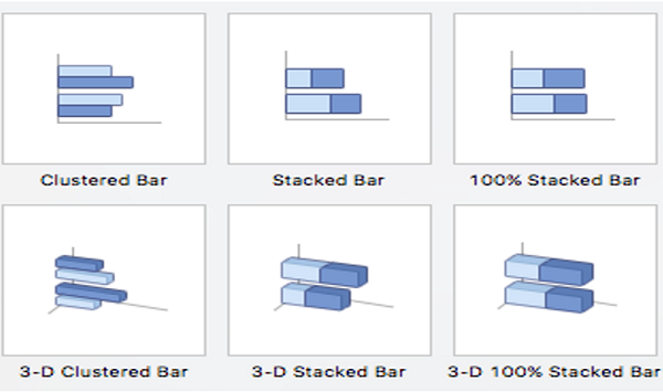
- Bar Chart: It is a type of chart that uses thin bands of different heights to show different amounts so that they can be compared to each other is known as Bar Chart.
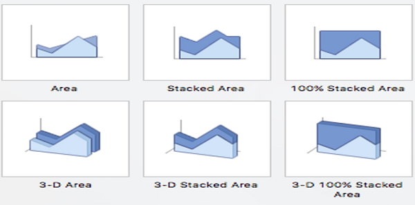
- Area Chart: In the Area chart we can convert tabular data into chart form where can measure areas. It is also like a line chart in terms of how data values are mapped on the chart and linked using line portions.
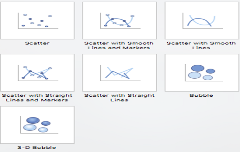
- X Y (Scatter) Chart: XY charts showing the relation between two sets of data. Each indicator represents a data point. Each of data divided into two pieces of data related to it: The naming of coordinates is the default (XY) its X coordinate and its Y coordinate. There one and more than one series in XY charts.
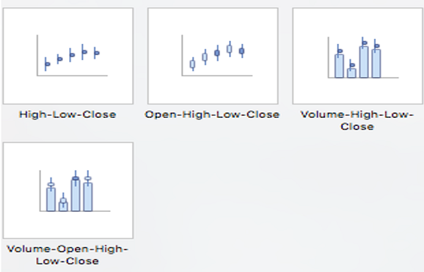
- Stock Chart: The stock chart is simply the type of price chart that shows a stock's price. The stock price plotted over some time in the MS PowerPoint presentation slide.
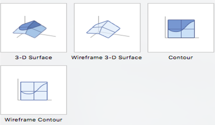
- Surface Chart: Surface Chart is a three-dimensional chart which shows 3D Surface Plot displays a set of three-dimensional data as a mesh surface in PowerPoint presentation.
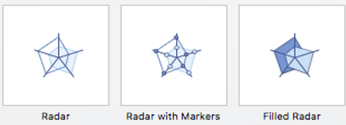
- Radar Chart: Radar charts are also known as a different name like - spider charts, polar charts, web charts, or star plots. In this type of Chart, we can see multiple variations in the data.
Advertisement
Advertisement