Home »
Python »
Python Data Visualization
Bar Distribution Plot in Python using Matplotlib
In this tutorial, we are going to learn how to create a bar distribution plot using matplotlib in Python?
Submitted by Anuj Singh, on August 12, 2020
These are single bar plots showing the distribution of a similar quantity among different classes. These are commonly used for showing distributions and are a good substitute for pie charts. It contains very few texts and is focused on visual quantitative analysis. Matplotlib allows us to implement such plots using the bar function, as shown in the below example.
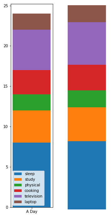
Python code for bar distribution plot using matplotlib
# Data Visualization using Python
# Bar Distribution Plot

import numpy as np
import matplotlib.pyplot as plt

N = 8

xx = np.array(['A Day'])
y = [8,4,2,3,5,2]
yy = [0,8,12,14,17,22]
labl = ['sleep', 'study', 'physical', 'cooking', 'television', 'laptop']

# example one
plt.figure(figsize=(2,10))
plt.bar(xx, y[0], bottom=yy[0], width=0.02, label=labl[0])
plt.bar(xx, y[1], bottom=yy[1], width=0.02, label=labl[1])
plt.bar(xx, y[2], bottom=yy[2], width=0.02, label=labl[2])
plt.bar(xx, y[3], bottom=yy[3], width=0.02, label=labl[3])
plt.bar(xx, y[4], bottom=yy[4], width=0.02, label=labl[4])
plt.bar(xx, y[5], bottom=yy[5], width=0.02, label=labl[5])
plt.legend()
plt.text(1, yy[4], labl[4])
plt.xlabel('Numbers')
plt.ylabel('Values')
plt.title('Bar Distribution Plot')
plt.show()

# example two
plt.figure(figsize=(2,10))
plt.bar(xx, y[0], bottom=yy[0], width=0.02)
plt.bar(xx, y[1], bottom=yy[1], width=0.02)
plt.bar(xx, y[2], bottom=yy[2], width=0.02)
plt.bar(xx, y[3], bottom=yy[3], width=0.02)
plt.bar(xx, y[4], bottom=yy[4], width=0.02)
plt.bar(xx, y[5], bottom=yy[5], width=0.02)
plt.axis(False)
plt.show()
Output:
Output is as Figure
Advertisement
Advertisement