Home »
Python »
Python Data Visualization
Python | Custom Axis Label in Matplotlib
In this article, we are going to set tick labels on the x and y axis for data visualization?
Submitted by Anuj Singh, on August 16, 2020
Sometimes, the axis ticks that are automatically generated are not useful or optimal according to our data presentation. Therefore, matplotlib allowed us to add the ticks manually (with our choice). Furthermore, we can custom labels to the ticks, and ultimately it provides us a freehand for well data visualization. Matplotlib have an inbuilt defined function matplotlib.pyplot.xticks() for x-axis labeling and matplotlib.pyplot.yticks() for y-axis labeling.
Illustrations:
Python code for custom axis label in matplotlib
import numpy as np
import matplotlib.pyplot as plt
x = np.arange(0.1, 5, 0.1)
y = np.sin(x)
yerr = 0.1 + 0.1 * np.sqrt(x)
xx = [0.0, 0.1, 0.2, 0.4, 0.7, 1]
labl = ['0.0', '0.1', '0.2', '0.4', '0.7', '1']
plt.figure()
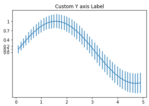
plt.errorbar(x, y, yerr=yerr)
plt.title('Custom Y axis Label')
plt.yticks(xx, labels=labl)
plt.show()
y = np.exp(-x)
xx = [0,4,5]
labl = ['0', '4', '5']
yerr = 0.1 + 0.1 * np.sqrt(x)
plt.figure()
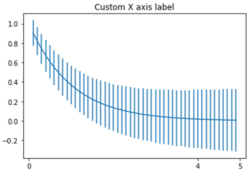
plt.errorbar(x, y, yerr=yerr)
plt.title('Custom X axis label')
plt.xticks(xx, labels=labl)
plt.show()
Output:
Output is as Figure
Advertisement
Advertisement