Home »
Python »
Python Data Visualization
Python | Grouped Bar Chart
Python | Grouped Bar Chart: Here, we will learn about the grouped bar chart and its Python implementation.
Submitted by Anuj Singh, on July 14, 2020
Grouped bar charts are very easy to visualize the comparison between two similar quantities such as marks comparison between two students. It is an extension of a simple bar graph and in this article, we are going to illustrate an example in which we plot marks of five different students from the same class in Mathematics and Science. Furthermore, we are going to change the color and width of the bars for a clear understanding of the usage of the Grouped Bar Chart.
Syntax:
plt.bar(x - width/2, math_means, width, label='Mathematics')
plt.bar(x + width/2, science_means, width, label='Science')
plt.bar(x - width/2, math_means, width, label='Mathematics', color='y')
plt.bar(x + width/2, science_means, width, label='Science', color='purple')
plt.bar(x - width/2, math_means, 0.8*width, label='Mathematics', color='y')
plt.bar(x + width/2, science_means, 0.8*width, label='Science', color='purple')
Python code for grouped bar chart
import matplotlib.pyplot as plt
import numpy as np
labels = ['Tom', 'Dick', 'Harry', 'Sally', 'Sue']
math_means = [20, 34, 30, 35, 27]
science_means = [25, 32, 34, 20, 25]
x = np.arange(len(labels)) # the label locations
width = 0.35 # the width of the bars
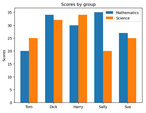
# Figure 1
plt.figure()
plt.bar(x - width/2, math_means, width, label='Mathematics')
plt.bar(x + width/2, science_means, width, label='Science')
# Add some text for labels, title and
# custom x-axis tick labels, etc.
plt.ylabel('Scores')
plt.title('Scores by group')
plt.xticks( np.arange(5), ('Tom', 'Dick', 'Harry', 'Sally', 'Sue') )
plt.legend()
plt.show()
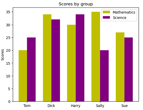
# Figure 2
plt.figure()
plt.bar(x - width/2, math_means, width, label='Mathematics', color='y')
plt.bar(x + width/2, science_means, width, label='Science', color='purple')
# Add some text for labels, title and
# custom x-axis tick labels, etc.
plt.ylabel('Scores')
plt.title('Scores by group')
plt.xticks( np.arange(5), ('Tom', 'Dick', 'Harry', 'Sally', 'Sue') )
plt.legend()
plt.show()
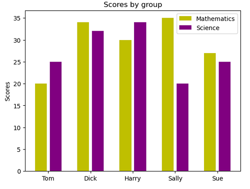
# Figure 2
plt.figure()
plt.bar(x - width/2, math_means, 0.8*width, label='Mathematics', color='y')
plt.bar(x + width/2, science_means, 0.8*width, label='Science', color='purple')
# Add some text for labels, title and
# custom x-axis tick labels, etc.
plt.ylabel('Scores')
plt.title('Scores by group')
plt.xticks( np.arange(5), ('Tom', 'Dick', 'Harry', 'Sally', 'Sue') )
plt.legend()
plt.show()
Output:
Output is as figure
Advertisement
Advertisement