Home »
Python »
Python Data Visualization
Python | Hist-Scatter Hybrid Plot
In this tutorial, we are going to learn how to hist-scatter plot using matplotlib in Python?
Submitted by Anuj Singh, on August 16, 2020
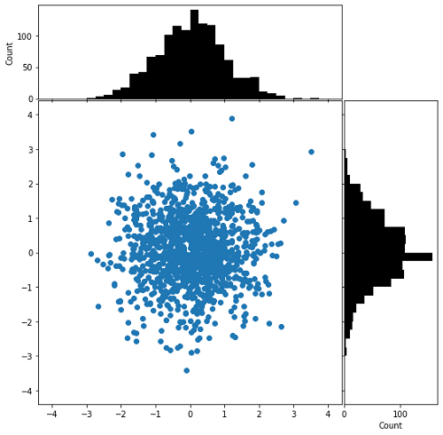
This is one of the most favored plots by data visualization experts. The scatter points and histograms are joined together and provide a complete picture of each data point. There are three different plots integrated into the complete figure. Following is an example of the implementation of a hist-scatter plot.
Illustrations:
Python code for hist-scatter hybrid plot
import numpy as np
import matplotlib.pyplot as plt

x = np.random.randn(1230)
y = np.random.randn(1230)

def scatter_hist(x, y, ax, ax_histx, ax_histy):
    ax_histx.tick_params(axis="x", labelbottom=False)
    ax_histy.tick_params(axis="y", labelleft=False)

    ax.scatter(x, y)

    binwidth = 0.25
    xymax = max(np.max(np.abs(x)), np.max(np.abs(y)))
    lim = (int(xymax/binwidth) + 1) * binwidth

    bins = np.arange(-lim, lim + binwidth, binwidth)
    ax_histx.hist(x, bins=bins, color='black')
    ax_histx.set_ylabel('Count')
    ax_histy.set_xlabel('Count')
    ax_histy.hist(y, bins=bins, orientation='horizontal', color='black')

# definitions for the axes
left, width = 0.1, 0.65
bottom, height = 0.1, 0.65
spacing = 0.005

rect_scatter = [left, bottom, width, height]
rect_histx = [left, bottom + height + spacing, width, 0.2]
rect_histy = [left + width + spacing, bottom, 0.2, height]

# start with a square Figure
fig = plt.figure(figsize=(8, 8))

ax = fig.add_axes(rect_scatter)
ax_histx = fig.add_axes(rect_histx, sharex=ax)
ax_histy = fig.add_axes(rect_histy, sharey=ax)

# use the previously defined function
scatter_hist(x, y, ax, ax_histx, ax_histy)

plt.show()
Output:
Output is as Figure
Advertisement
Advertisement