Home »
Python »
Python Data Visualization
Python | matplotlib.pyplot.cool() for Cool Color Map
In this tutorial, we are going to learn how to change the color map to Cool color map in a figure?
Submitted by Anuj Singh, on August 06, 2020
There is an inbuilt defined function i.e. matplotlib.pyplot.cool(), using which we can switch the color map of the figure into a cool color map. The following example shows us how to switch color map into cool in python using matplotlib.
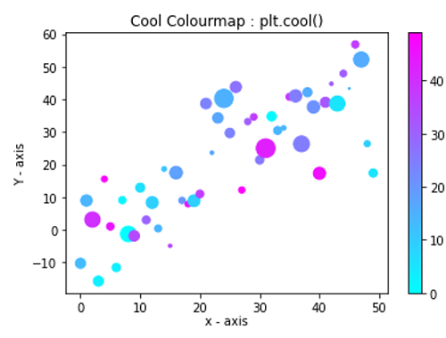
Illustration:
Python code for matplotlib.pyplot.cool() for cool color map
import numpy as np
import matplotlib.pyplot as plt

data = {'a': np.arange(50),
        'c': np.random.randint(0, 50, 50),
        'd': np.random.randn(50)}
data['b'] = data['a'] + 10 * np.random.randn(50)
data['d'] = np.abs(data['d']) * 100

plt.scatter('a', 'b', c='c', s='d', data=data)
plt.xlabel('x - axis', labelpad=1)
plt.ylabel('Y - axis')
plt.cool()
plt.title('Cool Colourmap : plt.cool()')
plt.colorbar()
plt.show()
Output:
Output is as figure
Advertisement
Advertisement