Home »
Python »
Python Programs
Pandas scatter plotting datetime
Learn, how to use matplotlib scatter plot?
By Pranit Sharma Last updated : October 06, 2023
Pandas is a special tool that allows us to perform complex manipulations of data effectively and efficiently. Inside pandas, we mostly deal with a dataset in the form of DataFrame. DataFrames are 2-dimensional data structures in pandas. DataFrames consist of rows, columns, and data.
One of the important processes of data analysis is data visualization. Data visualization is a process of representing statistical or categorical data in the form of charts, graphs, or any pictorial format.
Data visualization is an important process as far as data analysis is concerned because it allows us to understand the various kinds of patterns from the data so that we can draw some useful insights from it.
Some of the most important libraries used for data visualization are matplotlib, seaborn, plotly, bokeh, folium, plotnine etc.
Scatter plotting datetime
We can use the scatter() method to draw a scatter plot with pyplot. The scatter() method plots one dot for each observation. It needs two arrays/series of the same length, one for the values of the x-axis, and one for values on the y-axis.
Let us understand with the help of an example,
Python program for pandas scatter plotting datetime
# Importing important libraries
# sys
import sys
# matplotlib
import matplotlib
matplotlib.use('Agg')
# pyplot
import matplotlib.pyplot as plt
# numpy
import numpy as np
# Creating two arrays
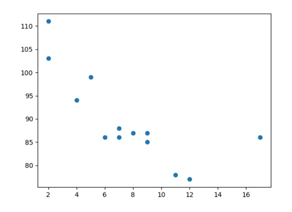
x = np.array([5,7,8,7,2,17,2,9,4,11,12,9,6])
y = np.array([99,86,87,88,111,86,103,87,94,78,77,85,86])
# Creating a scatter plot
plt.scatter(x, y)
# Display scatter plot
plt.show()
Output
The output of the above program is:
Python Pandas Programs »
Advertisement
Advertisement