Home »
CSS
2D Transformation using CSS
CSS | 2D Transformation: Here, we are going to learn about the 2D (Two-Dimensional) Transformation using CSS (Cascading Style Sheet).
Submitted by Anjali Singh, on December 13, 2019
CSS | 2D Transformation
2D transformation in CSS allows you to move, rotate, scale, and skew elements shape, size and position along the x-axis and y-axis.
In CSS, 2D transform property allows you to use the following 2D transformation methods,
- rotate()
- translate()
- scale()
- Skew()
- matrix()
Let's look at each method one by one.
1) rotate()
rotate() property defines a transformation that moves the element around a fixed point on the x-axis in either clockwise or anti-clockwise direction.
Syntax:
Element{
	transform:rotate(30deg);
}
Example:
<!DOCTYPE html>
<html>

<head>
    <style>
        div {
            width: 300px;
            height: 100px;
            background-color: pink;
            border: 1px solid black;
        }

        div#myDiv {
            transform: rotate(45deg);
        }
    </style>
</head>

<body>
    <div>
        this is div
    </div>
    <div id="myDiv">
        this div element is rotated clockwise 45 degrees.
    </div>
</body>

</html>
Output
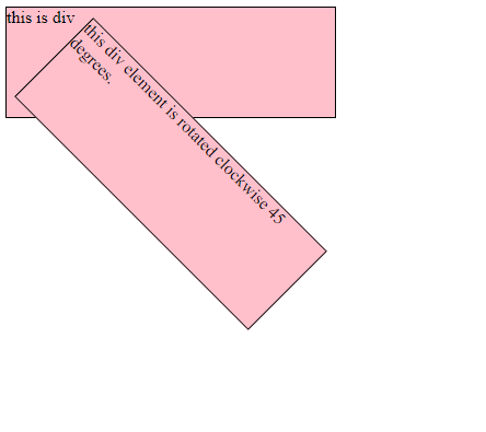
In the above example, the <div> element is rotated clockwise 45 degrees.
2) translate()
translate() property moves the position of the element from the current position on the X-axis and Y-axis.
- translateX() - Moves the position of the element on the X-axis.
- translateY() - Moves the position of the element on the Y-axis.
Syntax:
Element{
	transform:translate(30px,10px);
}
Example:
<!DOCTYPE html>

<html>
<head>
    <style>
        div {
            width: 300px;
            height: 100px;
            background-color: pink;
            border: 1px solid black;
            transform: translate(60px, 80px);
        }
    </style>
</head>

<body>
    <h1>2D transformation</h1>
    <div>
        This is a div element.
    </div>
</body>

</html>
Output
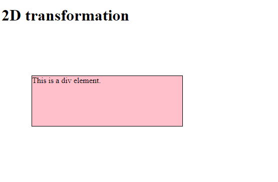
In the above example, <div> element 60 pixels to the right, and 80 pixels down from its current position.
3) scale()
scale() property modifies the size of the element on the X and Y-axis.
scaleX() - Modifies the size of the element on the X-axis. scaleY() - Modifies the size of the element on the Y-axis.
Syntax:
Element{
	transform:scale(2,3);
}
Example:
<!DOCTYPE html>

<html>

<head>
    <style>
        div {
            margin: 150px;
            width: 200px;
            height: 100px;
            background-color: pink;
            border: 1px solid black;
            transform: scale(2, 3);
        }
    </style>
</head>

<body>
    <h1>2D transformation</h1>
    <div>
        This is div element.
    </div>
</body>

</html>
Output
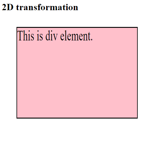
In the above example, element <div> increases to 3 times of its original height, and 2 times of its original width.
4) skew()
Shear mapping or skewing each point of an element by a certain angle along the X-axis or Y-axis.
- skewX() - Horizontally skewing each point of an element by a certain angle in the horizontal direction.
- skewY() - Vertically skewing each point of an element by a certain angle in the vertical direction.
Syntax:
Element{
	transform:skew(3,4);
}
Example:
<!DOCTYPE html>
<html>

<head>
    <style>
        div {
            margin: 150px;
            width: 200px;
            height: 100px;
            background-color: pink;
            border: 1px solid black;
            transform: scale(1, 2);
        }
    </style>
</head>

<body>
    <h1>2D transformation</h1>
    <div>
        This is div element.
    </div>
</body>

</html>
Output
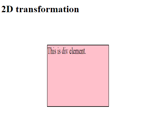
In the above example, skews the <div> element 1px along the X-axis, and 2px along the Y-axis.
5) matrix()
matrix() property defines a 2D transformation in the form of a transformation matrix. The method matrix() takes six parameters which allow you to rotate, scale, translate, and skew elements in respective order.
Syntax:
Element{
	transform:matrix(1, -0.3, 0, 1, 0, 0);
}
Example:
<!DOCTYPE html>
<html>

<head>
    <style>
        div {
            width: 300px;
            height: 100px;
            background-color: pink;
            border: 1px solid black;
            transform: matrix(1, -0.3, 0, 1, 0, 0);
        }
    </style>
</head>

<body>
    <h1>2D transformation</h1>
    <div>
        This a div element..
    </div>
</body>

</html>
Output
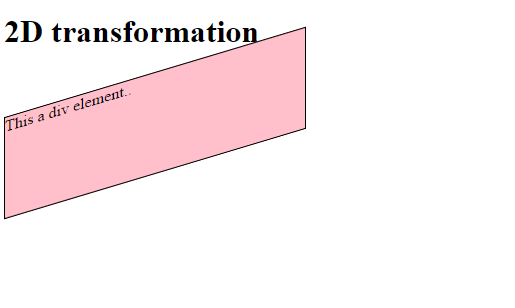
In the above example, matrix() property is used.
CSS Tutorial & Examples »
Advertisement
Advertisement