Home »
CSS
CSS Text Effects | How to add effects to text using CSS?
CSS | Text effects: Here, we are going to learn how to add various effects to the text using CSS (Cascading Style Sheet)?
Submitted by Anjali Singh, on December 13, 2019
CSS | Text Effects
Every web developer wants his or her web page to look extremely, one that would catch users' eyes in a second and for various formatting and editing is performed to develop the desired web page. But how does a developer do that? From where does a developer start? “Texts” is the answer. Text is the basic elemental thing of any website or web page. Therefore, in this section let us have a look at various effects that we can apply to our text using CSS.
Below are few properties used in CSS to add effects to text,
- text-overflow property
- word-wrap property
- word-break property
- writing-mode property
Now we will look at each text effect property more closely.
1) text-overflow property
The first and foremost property is the text-overflow property. A very useful property when it comes to dealing with overflowing content. This property is solely responsible to display the overflowed content which is not generally seen and how to signal that content to the user specifically.
There are two values,
- clip - It is the default value for this property. The clip will truncate the text at the limit of the content area, therefore the truncation can happen in the middle of a character.
- ellipsis - ellipsis is displayed inside the content area, decreasing the amount of text displayed. If the content exceeds the width of the box it is clipped and (...) is visible. Ellipsis only works on a single line of text.
Syntax:
Element {
    text-overflow: ellipsis;
}
Example:
<!DOCTYPE html>
<html>

<head>
    <style>
        p {
            white-space: nowrap;
            width: 200px;
            border: 1px solid #fff432;
            overflow: hidden;
            text-overflow: ellipsis;
        }
    </style>
</head>

<body>
    <h1>Text effects</h1>
    <p>This is text effect property.This is text effect property.This is text effect property. This is text effect property</p>
</body>

</html>
Output
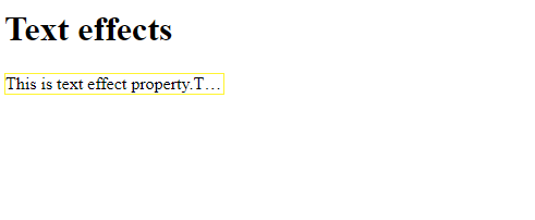
In the above example ellipsis property is applied so the overflow content is represented by (....).
2) word-wrap property
This property specifies if the browser is used to break the lines if the word is too long to fit in an area. Basically what word-wrap property doing is, it is wrapping the entire content in a confined area even if it leads to splitting up of some words from the middle and push the other broken part of the word to the next line, ensuring the text will not go out of that particular area. When we are writing a very big statement or line, this property will surely make your text look much more legible.
Syntax:
Element {
    word-wrap: break-word;
}
Example:
<!DOCTYPE html>
<html>

<head>
    <style>
        p {
            width: 200px;
            border: 1px solid #ff3433;
            word-wrap: break-word;
        }
    </style>
</head>

<body>
    <h1>The text Effect</h1>
    <p> This is word-wrap property.This is word-wrap property.This is word-wrap property.This is word-wrap property.This is word-wrap property.This is word-wrap property.</p>
</body>

</html>
Output
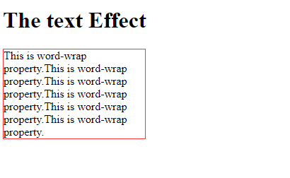
In the above example, the break-word property is applied.
3) word-break property
The word-break property is used for how you want to display your words which are being broken. In simple words, the Word-break property dictates the line breaking rules for that particular content area. You do not want your words splitting up in an ugly manner, that is why this property is used.
There are two values,
- keep-all: The keep-all value defines to break the word in the default manner.
- break-all: The break-all value is used to prevent the content overflow by inserting word-break between the characters of the text.
Syntax:
Element {
    word-break: keep-all |break-all;
}
Example:
<!DOCTYPE html>
<html>

<head>
    <style>
        p {
            width: 140px;
            border: 1px solid #000000;
            word-break: keep-all;
        }
    </style>
</head>

<body>
    <h1>The text effect</h1>
    <p>This is text effect property.This is text effect property.This is text effect property.This is text effect property.This is text effect property.</p>
</body>

</html>
Output
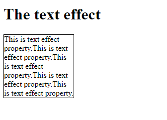
In the above example, the keep-all value is assigned to the word-break property.
4) writing-mode property
We have talked about preventing our content from overflowing. Now let us talk about the orientation of our texts. The writing-mode is simply made for that, it defines the orientation of our lines of text, whether it will be vertical or horizontal.
There are two values,
- horizontal-tb: This is the default value of the property i.e text is read from left to right and top to bottom. The next horizontal would be positioned below the line which was written earlier.
- vertical-rl: In this property, the text is read from right to left and top to bottom. The next vertical would be positioned to the left of the line which was written earlier.
Syntax:
Element {
    writing-mode: horizontal-tb | vertical-rl;
}
Example:
<!DOCTYPE html>
<html>

<head>
    <style>
        p {
            writing-mode: vertical-rl;
        }
    </style>
</head>

<body>
    <h1>The text effect</h1>
    <p>this is text effect property.</p>
</body>

</html>
Output
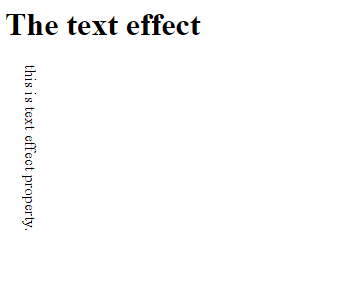
In the above example, the content is aligned vertically using the vertical-vl value of writing mode.
CSS Tutorial & Examples »
Advertisement
Advertisement