Home »
CSS
cubic-bezier() Function with Example in CSS
CSS | cubic-bezier() function: Here, we are going to learn about the cubic-bezier() function with its syntax, examples in CSS (Cascading Style Sheet).
Submitted by Anjali Singh, on February 19, 2020
Introduction:
How many times have we come across the word function? Well, it would not be wrong to say a lot. The fact that functions are used in web development while developing a website or web page is very important. There are numerous functions out there that can help you reduce the line of your codes and make your work easy and fast. Besides, if you wish to be a good coder then you must learn as many functions as you can. By learning those functions you will be able to write very efficient codes and that will also showcase your knowledge regarding web development.
This discussion brings us to a question: why are we talking so much about functions? Well, the answer is very clear as in this article we are going to learn about one very specific function known as cubic-bezier() function in CSS. Most of you might already know what this function is and what its behavior is and how it is helpful. But if you are not aware of this function even a bit, then this article is just for you. So, keep on reading and everything will be made clear to you about the cubic-bezier() function in CSS.
Description:
First and foremost, let us start with the definition of the cubic-bezier function and get a gist about it.
The cubic-bezier() function is used to denote a certain type of curve and that curve is known as the cubic-bezier curve. To plot this curve, it is mainly denoted by 4 points that could be P0, P1, P2 & P3. Here, the points P0 and P3 are representing the start and the end of the curve and these points will always be fixed.
Implementation:
Now, that we have understood the definition of this function, let us explore further: this function is majorly used with two properties and those properties are animation-timing-function property and transition-timing-function property.
With the help of the syntax, you will get a clear idea about the implementation of this function.
Syntax:
    element{
        transition : cubic-bezier(x1,y1,x2,y2);
    }
Example:
<!DOCTYPE html>

<html>

<head>
    <style>
        .cubic-bezier {
            transition: width 1.5s cubic-bezier(0.74, 0.15, 0.43, 1.5);
            background: pink;
            width: 180px;
            height: 150px;
            margin: 100px;
            text-align: center;
        }

        .cubic-bezier:hover {
            width: 70%;
        }
    </style>
</head>

<body>
    <div class="cubic-bezier">cubic-bezier() function</div>
</body>

</html>
Output
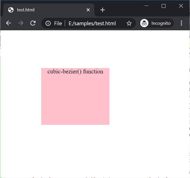
Hover over the div in the above example to see the effect of this function.
Conclusion:
This was all about the cubic-bezier() function in CSS. Make sure that you use this function wisely as this function can prove to be a very good tool for styling. So, go ahead and have fun with the new learned function. Make sure that you use the above-mentioned properties while using this function on your website or web page.
CSS Functions »
Advertisement
Advertisement