Home »
CSS
repeating-radial-gradient() Function with Example in CSS
CSS | repeating-radial-gradient() function: Here, we are going to learn about the repeating-radial-gradient() function with its syntax, examples in CSS (Cascading Style Sheet).
Submitted by Anjali Singh, on February 18, 2020
Introduction:
Dealing and implementing functions daily is the trait of a good and professional developer. You cannot call yourself a good developer if you know nothing about functions in web development. Functions are an indispensable part of web development for creating various websites or web pages. Well, if you do not know about functions, then don’t worry as articles and contents like these are always out there for your help and reference. Similarly, like all other functions, in this article, we will discuss a very interesting function known as repeating-radial-gradient() function in CSS. So, without much delay let us start to learn about this function.
Functions are always going to help you for creating really attractive and stylish websites or web pages. All you gotta do is learn as many functions as you can and use them in your codes. Functions not just help in building attractive websites or web pages but they also help in optimizing your code as when you will start using functions, then you will notice that the number of lines in your codes will be reduced to some extent. Therefore, functions help in avoiding long lethargic codes. So, try to learn about functions and their behavior. Now, let us start talking about the function we are interested in, the repeating-radial-gradient() function in CSS.
Definition:
The repeating-radial-gradient() function is not tough to understand and is very easy to implement. So, let us first look at the definition of repeating-radial function() in CSS.
The repeating-radial function() is nothing but a function built-in for CSS. The purpose of this function is to set the radial gradient as a type of background image that repeats over and over again.
So, you see how this function is so interesting and how it behaves. Now, let us look at the syntax of this function so that we can get a much clearer idea of this function.
Syntax:
    element{
	    background-image: repeating-radial-gradient(<shape> <size> at <position>, <color-stop-list>);
    }
Let's look at the values used in this syntax,
- <Shape>: You can choose shapes like circles and ellipse of the gradient. The default shape used is an ellipse when not specified.
- <Size>: It is used to define the size of the gradient. It takes four possible values which are farthest-corner, closest-side, closest-corner, and farthest-side where farthest-corner is the default value.
- <Position>: It is used to define the position of the gradient use. If you don't specify its position, its default value is center. You can use the positions like top-left top-right etc.
- <color-stop-list>: It is used to store the list of color values followed by its optional stop position.
Example:
<!DOCTYPE html>

<html>

<head>
    <style>
        div {
            height: 200px;
            width: 700px;
            background-image: repeating-radial-gradient(circle, pink, red 10%, yellow 20%);
            font-size: 40px;
            font-weight: bold;
            text-align: center;
        }
    </style>
</head>

<body>
    <div>This is Repeating-radial-gradient function() in CSS.</div>
</body>

</html>
Output
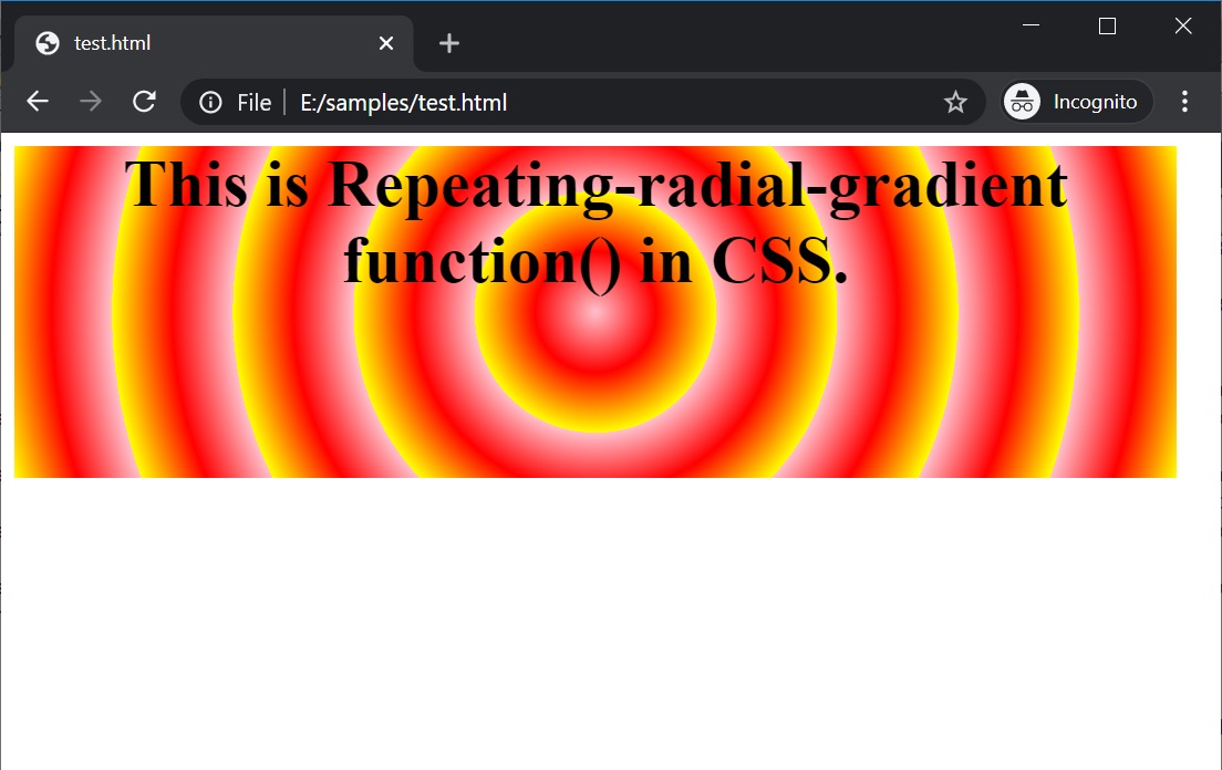
In the above example, three colors are used in the repeating-radial-gradient() function.
Conclusion:
That's all folks about the repeating-radial-gradient() function in CSS. Hope this article helped in imparting some knowledge for your web development experience. Go ahead and start playing around with this function and create attractive and stylish websites or web pages.
CSS Functions »
Advertisement
Advertisement