Home »
CSS
Multiple columns in CSS
CSS | Multiple Columns: In this tutorial, we are going to learn how to make multiple columns in HTML using CSS?
Submitted by Anjali Singh, on November 29, 2019
CSS | Multiple Columns
This CSS property allows to define column layout of contents and wrap them into multiple columns with gap and rules between them.
There are multiple column properties which are listed below,
- column-count
- column-gap
- column-rule-style
- column-rule-width
- column-rule-color
- column-rule
- column-span
- column-width
Let's discuss each property one by one.
1) column-count property
The column-count property is used to count the number of columns an element should be divided into.
Syntax:
Element {
    column-count: 4;
}
Example:
<!DOCTYPE html>
<html>

<head>
    <style>
        div {
            column-count: 4;
        }
    </style>
</head>

<body>
    <div>
        this is multiple column CSS property this is multiple column CSS property this is multiple column CSS property this is multiple column CSS property this is multiple column CSS property this is multiple column CSS property this is multiple column CSS property this is multiple column CSS property
    </div>
</body>

</html>
Output
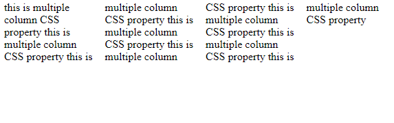
In the above example, the content is divided into 4 columns.
2) column-gap property
The column-gap property is used to specify the space or gap between the columns.
Syntax:
Element {
    column-gap: 30px;
}
Output
<!DOCTYPE html>
<html>

<head>
    <style>
        div {
            column-count: 3;
            column-gap: 30px;
        }
    </style>
</head>

<body>
    <div>
        this is multiple column CSS property this is multiple column CSS property this is multiple column CSS property this is multiple column CSS property this is multiple column CSS property this is multiple column CSS property this is multiple column CSS property this is multiple column CSS property
    </div>
</body>

</html>
Output
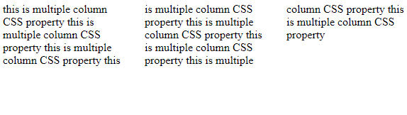
In the above example, the gap between different columns is 30px.
3) column-rule-style property
The column-rule-style property is used to specify the style between the columns.
Syntax:
Element {
    column-rule-style: solid;
}
Example:
<!DOCTYPE html>
<html>

<head>
    <style>
        div {
            column-count: 3;
            column-gap: 30px;
            column-rule-style: solid;
        }
    </style>
</head>

<body>
    <div>
        this is multiple column CSS property this is multiple column CSS property this is multiple column CSS property this is multiple column CSS property this is multiple column CSS property this is multiple column CSS property this is multiple column CSS property this is multiple column CSS property
    </div>
</body>

</html>
Output
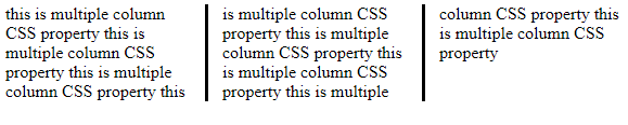
In the above example, the column-rule-style property is set to solid i.e. a solid line is set between the columns.
4) column-rule-width property
The column-rule-width property is used to specify the width of the rule which is set between the columns.
Syntax:
Element {
    column-rule-width: 2px;
}
Example:
<!DOCTYPE html>
<html>

<head>
    <style>
        div {
            column-count: 3;
            column-rule-style: solid;
            column-rule-width: 2px;
        }
    </style>
</head>

<body>
    <div>
        this is multiple column CSS property this is multiple column CSS property this is multiple column CSS property this is multiple column CSS property this is multiple column CSS property this is multiple column CSS property this is multiple column CSS property this is multiple column CSS property
    </div>
</body>

</html>
Output
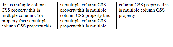
In the above example, the width of line between the columns is of 2px.
5) column-rule-color property
The column-rule-color property is used to specify the color of the rule used between the columns.
Syntax:
Element {
    column-rule-color: blue;
}
Example:
<!DOCTYPE html>
<html>

<head>
    <style>
        div {
            column-count: 3;
            column-rule-style: solid;
            column-rule-color: red;
        }
    </style>
</head>

<body>
    <div>
        this is multiple column CSS property this is multiple column CSS property this is multiple column CSS property this is multiple column CSS property this is multiple column CSS property this is multiple column CSS property this is multiple column CSS property this is multiple column CSS property
    </div>
</body>

</html>
Output
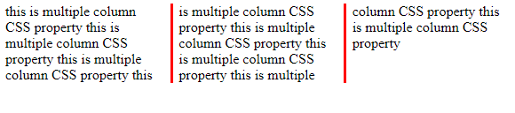
In the above example, the color of the line between the columns is set to red.
6) column-rule property
The column-rule property is used as shorthand of the column-rule-style, column-rule-width and column-rule-color properties altogether.
Syntax:
Element {
    column-rule: 1px solid green;
}
Example:
<!DOCTYPE html>
<html>

<head>
    <style>
        div {
            column-count: 3;
            column-rule: 4px solid green;
        }
    </style>
</head>

<body>
    <div>
        this is multiple column CSS property this is multiple column CSS property this is multiple column CSS property this is multiple column CSS property this is multiple column CSS property this is multiple column CSS property this is multiple column CSS property this is multiple column CSS property
    </div>
</body>

</html>
Output
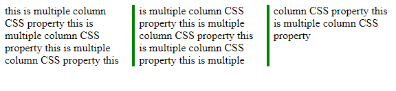
In the above example, the column-rule shorthand property is used.
7) column-span property
The column-span property specifies the number of columns an element should span across.
Syntax:
Element {
    column-span: all;
}
Example:
<!DOCTYPE html>
<html>

<head>
    <style>
        div {
            column-count: 3;
            column-rule: 4px solid green;
            column-span: all;
        }
    </style>
</head>

<body>
    <div>
        this is multiple column CSS property this is multiple column CSS property this is multiple column CSS property this is multiple column CSS property this is multiple column CSS property this is multiple column CSS property this is multiple column CSS property this is multiple column CSS property
    </div>
</body>

</html>
Output
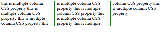
In the above example, the column-span is spanned across all the columns.
8) column-width property
The column-width property is used to specify the width of every column.
Syntax:
Element {
    column-width: 100px;
}
Example:
<!DOCTYPE html>
<html>

<head>
    <style>
        div {
            column-count: 2;
            column-width: 100px;
        }
    </style>
</head>

<body>
    <div>
        this is multiple column CSS property this is multiple column CSS property this is multiple column CSS property this is multiple column CSS property this is multiple column CSS property this is multiple column CSS property this is multiple column CSS property this is multiple column CSS property
    </div>
</body>

</html>
Output
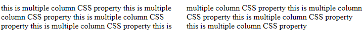
In the above example, the column-width of 100px is used.
CSS Tutorial & Examples »
Advertisement
Advertisement