Home »
CSS
Rounded Corners in CSS
CSS | Rounded Corners: In this tutorial, we are going to learn how to make rounded corners using CSS (Cascading Style Sheet)?
Submitted by Anjali Singh, on November 28, 2019
CSS | Rounded Corners
border-radius property is commonly used to convert box elements into circles. We can convert box elements into the circle element by setting the border-radius to half of the length of a square element.
Basic syntax:
Element {
    width: 150px;
    height: 150px;
    border-radius: 50%;
}
Example:
<!DOCTYPE html>
<html>

<head>
    <style>
        p {
            background: #73AD21;
            width: 200px;
            height: 150px;
            border-radius: 50%
        }
    </style>
</head>

<body>
    <h1>CSS Rounded Corners</h1>
    <p></p>
</body>

</html>
Output
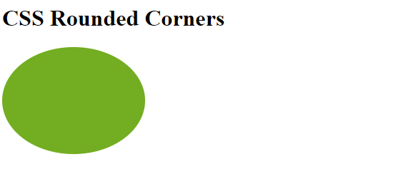
In the above example, 50% border-radius is applied to all the corners.
Rounded Corner properties
- border-radius
- border-top-left-radius
- border-top-right-radius
- border-bottom-left-radius
- border-bottom-right-radius
1) border-radius
This CSS property specifies the radius of the corners of the element. border-radius property can have values between one to four.
1) One value
The property takes a single value to the border-radius and that value is applied to all the four corners and the corners are rounded equally.
Syntax:
Element {
    border-radius: 15px;
}
2) Two values
This property takes two values to the border-radius. The first value is applied to top-left and bottom-right corners, the second value is applied to top-right and bottom-left corners.
Syntax:
Element {
    border-radius: 15px 10px;
}
3) Three values
This property takes three values to the border-radius.The first value is applied to the top-left corner and the second value is applied to top-right and bottom-left corners, and the third value is applied to the bottom-right corner.
Syntax:
Element {
    border-radius: 15px 10px 30px;
}
4) Four values
This property takes four values to the border-radius and applies four different values to each of the corners.The first value is applied to the top-left corner, the second value is applied to the top-right corner, the third value is applied to the bottom-right corner and the fourth value is applied to the bottom-left corner.
Syntax:
Element {
    border-radius: 15px 10px 20px 5px;
}
border-top-left-radius
This property specifies the radius of the top left corner. This property takes value in length and in % where % defines the shape of the top-left corner in %.
Syntax:
Element {
    border-top-left-radius: 50%
}
Example:
<!DOCTYPE html>
<html>

<head>
    <style>
        p {
            background: #a44170;
            width: 200px;
            height: 150px;
            border-top-left-radius: 15px;
        }
    </style>
</head>

<body>
    <h1>CSS Rounded Corners</h1>
    <p></p>
</body>

</html>
Output
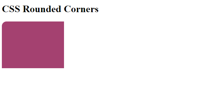
In the above example, the top-left corner is rounded.
border-top-right-radius
This property specifies the radius of the top right corner. This property takes values in length and in % where % defines the shape of the top-right corner in %.
Syntax:
Element {
    border-top-right-radius: 50%;
}
Example:
<!DOCTYPE html>
<html>

<head>
    <style>
        p {
            background: #a44170;
            width: 200px;
            height: 150px;
            border-top-right-radius: 15px;
        }
    </style>
</head>

<body>
    <h1>CSS Rounded Corners</h1>
    <p></p>
</body>

</html>
Output
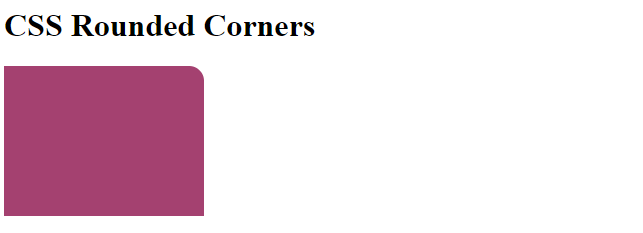
In the above example, the top right corner is rounded.
border-bottom-left-radius
This property specifies the radius of the bottom left corner. This property takes values in length and in % where % defines the shape of the bottom-left corner in %.
Syntax:
Element {
    border-bottom-left-radius: 50%;
}
Example:
<!DOCTYPE html>
<html>

<head>
    <style>
        p {
            background: #a44170;
            width: 200px;
            height: 150px;
            border-bottom-left-radius: 15px;
        }
    </style>
</head>

<body>
    <h1>CSS Rounded Corners</h1>
    <p></p>
</body>

</html>
Output
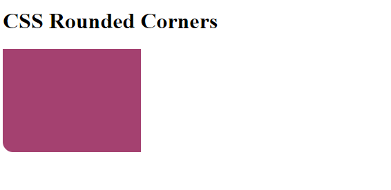
In the above example, the bottom left corner is rounded.
border-bottom-right-radius
This property specifies the radius of the bottom right corner. This property takes values in length and in % where % defines the shape of the bottom-right corner in %.
Syntax:
Element {
    border-bottom-right-radius: 50%;
}
Example:
<!DOCTYPE html>
<html>

<head>
    <style>
        p {
            background: #a44170;
            width: 200px;
            height: 150px;
            border-bottom-right-radius: 15px;
        }
    </style>
</head>

<body>
    <h1>CSS Rounded Corners</h1>
    <p></p>
</body>

</html>
Output
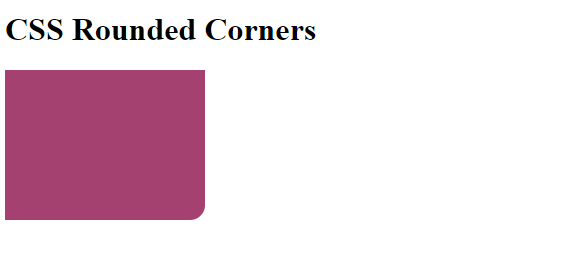
In the above example, the bottom right corner is rounded.
CSS Tutorial & Examples »
Advertisement
Advertisement