Home »
CSS
Overlap one element over another with CSS
In this article, we will learn how to overlap one element over another with CSS? We will look at the property and explain how it works?
Submitted by Abhishek Pathak, on October 22, 2017
CSS is also known as presentation layer. It very well goes with its name because it adds a styling over the webpage. With CSS3, we have even more powerful customization under our belt and designing almost everything is possible with this continuously improving technology.
Overlapping is quite common design pattern on the web. You'll see blocks overlap either partially or completely over another block or content section. This is achieved with CSS positioning and using a special property know as z-index. We will use the combination of them to produce a very good looking webpage. The z-index property in CSS is used to set the z-axis of the element in the order of integers. Greater the integer, above the element in z-axis layer.
Code - CSS
.element1 {
	z-index: 2;
}
.element2 {
	z-index: 10;
}
In this code, we can see that element2 has greater z-index, so it will be placed above the element1. By default the z-index of every element is 0 and if two of them have same index, then the element which is defined latter in the HTML file will overlap the former one.
The role of z-index is evident in top navigation menus. They overlap the content while scrolling. In this example, we will be building a simple navigation menu that maintains its position and content will scroll under it. It will use both position and z-index to work.
First we define HTML markup. We have two sections, one for navigation which contains the logo and other stuff and another section is the content section where main content resides. We have added the .navigation class to navigation section and .content class to main content section.
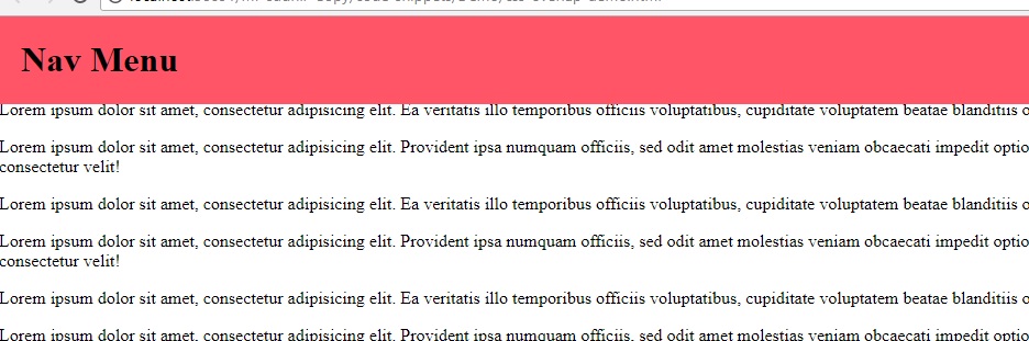
For the CSS part, we target .navigation class and apply position property fixed to make sure it remains in its original position when user scrolls. The top property makes sure it starts at the top of the page. We also define the 100% width and 80px height as dimensions of this navigation menu. The important, z-index property will make sure it remains at the top of all content. We have provided it the value of 100, though z-index: 1 also works fine, but as a measure that if any other element on the page also has z-index, so it will not render properly.
Next we select the .section class element and apply the position property on it, the relative position helps to move the element down by 80px using the top property. We have shifted the element by 80px which is the height of the navigation menu, so that content is visible after the menu. Here is a demo,
DEMO
HTML with CSS
<!DOCTYPE html>
<html>
	<head>
		<meta charset="utf-8">
		<meta name="viewport" content="width=device-width">
		<title>JS Bin</title>
		<style id="jsbin-css">
			body {
				margin: 0;
				padding: 0;
			}
			.navigation {
				position: fixed;
				top: 0;
				width: 100%;
				height: 80px;
				background: #f56;
				z-index: 100;
				padding: 0 20px;
			}
			.content {
				position: relative;
				top: 80px;
			}
		</style>
	</head>
	<body>
		<div class="navigation">
			<h1>Nav Menu</h1>
		</div>
		<div class="content">
			<p>Lorem ipsum dolor sit amet, consectetur adipisicing elit. Fugit excepturi ipsa inventore placeat error vitae voluptatum tenetur praesentium reiciendis cupiditate porro natus, suscipit fuga at pariatur omnis necessitatibus, recusandae ut voluptas saepe. Adipisci quo aut inventore at, iure aliquam repudiandae, atque nam ratione odit magni facilis odio labore, assumenda doloremque?</p>
			<p>Lorem ipsum dolor sit amet, consectetur adipisicing elit. Ea veritatis illo temporibus officiis voluptatibus, cupiditate voluptatem beatae blanditiis odio quae.</p>
			<p>Lorem ipsum dolor sit amet, consectetur adipisicing elit. Provident ipsa numquam officiis, sed odit amet molestias veniam obcaecati impedit optio iusto ipsam tempore mollitia voluptatibus, sint at magni consectetur velit!</p>
			<p>Lorem ipsum dolor sit amet, consectetur adipisicing elit. Ea veritatis illo temporibus officiis voluptatibus, cupiditate voluptatem beatae blanditiis odio quae. Lorem ipsum dolor sit amet, consectetur adipisicing elit. In perferendis animi eum tempore ipsum dolorum debitis placeat iste impedit recusandae laudantium voluptates accusantium aut, laborum nesciunt quibusdam dolores maxime odio quo. Molestias quae ducimus adipisci eaque, ratione odit. Ad, perspiciatis. Qui nulla expedita consequatur minus voluptas. Iure praesentium nobis voluptatem suscipit atque dolore dolorem tempora quis inventore, eius laborum sed enim! Nihil veritatis laborum voluptate, rerum cupiditate, beatae nisi obcaecati eius. Omnis veritatis temporibus a aliquid, expedita quidem facilis. Vero sequi cupiditate nam ut, officiis minima iure reiciendis atque dolores obcaecati fugiat quas delectus exercitationem unde placeat facere rem modi.</p>
			<p>Lorem ipsum dolor sit amet, consectetur adipisicing elit. Provident ipsa numquam officiis, sed odit amet molestias veniam obcaecati impedit optio iusto ipsam tempore mollitia voluptatibus, sint at magni consectetur velit!</p>
		</div>

	</body>
</html>
Output
Hope you like the article; please share your thoughts in the comments below.
CSS Tutorial & Examples »
Advertisement
Advertisement