Home »
React JS
How to use the Picker Component in React Native?
React Native | Picker Component: In this article, we will learn how to use the Picker Component in React Native?
Submitted by Godwill Tetah, on February 10, 2020
The picker in React native is a default component and is used to develop a dropdown box which pulls down several options when clicked and allows a user to choose a particular option.
From the term "Picker", the word simply means it provides a way to pick an item from several alternatives.
To add the picker component in your app is not complex but just to follow the rules and syntax.
Firstly, we always begin by importing the component from react-native, then calling it in the body of our code as seen below.
In your App.js File, type the following,
import * as React from 'react';
import { Text, View, StyleSheet, Picker } from 'react-native';

export default class App extends React.Component {
  state = {choice:' '};

  render (){
    return (
      <View style={styles.container}>
      <Text> Please select an item </Text>
      <Picker
  selectedValue={this.state.choice}
  mode = "dropdown"

    style={{height: 50, width: 100}}

  onValueChange={(itemValue, itemIndex) =>
    this.setState({choice: itemValue})
  }>
  <Picker.Item label="PETER" value="PETER" />
  <Picker.Item label="JOHN" value="JOHN" />
</Picker>

    <Text>{this.state.choice}</Text>

</View>
    );
  }
}
const styles = StyleSheet.create({
  container:{
    flex: 1,
    backgroundColor: 'skyblue',
    alignItems: 'center',
    justifyContent: 'center'
  }
});
Output
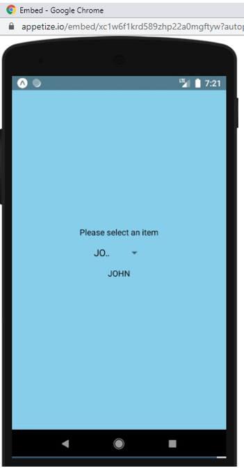
From the code above, the picker is called using the picker opening and closing tag. In this example, the picker was called with some attributes like style, which is used for styling and the attribute onValueChange which acts like the event which gets executed when an option is selected.
The onValueChange attribute takes 2 parameters which are,
- itemValue : which is the value property of the item selected.
- itemValue or itemPosition which is the index of the selected item (according to the documentation).
The function in the onValueChange attribute is called when a choice is picked in which it's setState in our case.
selectedValue attribute simply displays the item that is selected by default.
Mode attribute simply provides the mode of display when the picker is clicked.
Finally, Picker.label is used to display the various items or alternatives in the picker.
Thanks for coding with me! See you @ the next article. Feel free to drop a comment or question. God Bless You!
Advertisement
Advertisement