Home »
CSS
Applying Hue Rotation on Image using CSS3
In this tutorial, we will learn how to apply hue rotation on an image using CSS3?
By Apurva Mathur Last updated : July 26, 2023
Appearance is one of the most important aspects of a website. Visual appeal is what meets the eye. It's the colors, shapes, pictures, fonts, white space, and overall visual balance of a design. Whether a website appeal to us affects how we perceive it, how we use it, and how we remember it.
Appearance says a lot about your website that is the one thing that attracts the attention of the audience. This is key to getting visitors engaged with your website. We like to look at pretty things and if we have the choice, we always prefer an attractive design or image over an ugly or neutral one.
Hue Rotation on Image using CSS3
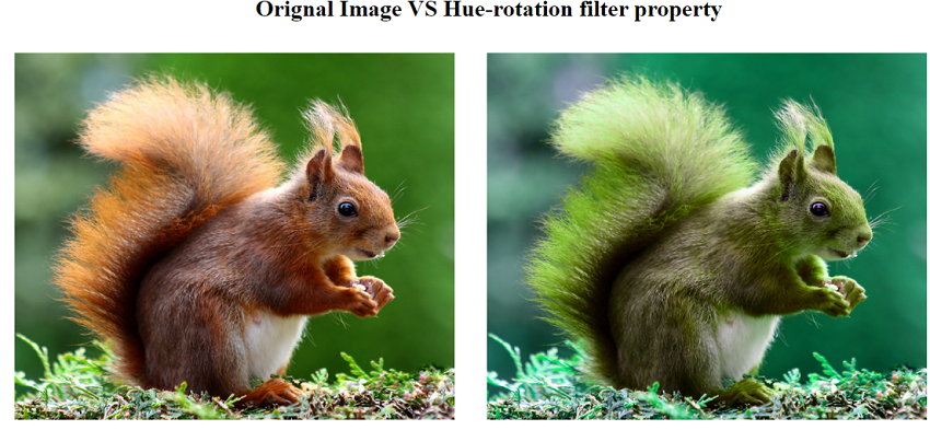
Hue rotation is often an easy way to change the appearance of a plot or figure without the need to create a new color bar. The value defines the number of degrees around the color circle the image samples will be adjusted. In CSS we apply hue-rotation on the image using the filter property. From many values of filter property, hue-rotation is one of the values.
Its value is always given in degree.
Syntax to apply hue-rotation with filter proper
Below is the syntax of CSS filter property with hue-rotation:
filter: hue-rotation (value deg);
Example to apply hue-rotation on image using CSS3
<!DOCTYPE html>
<html>
  <head>
    <meta name="viewport" content="width=device-width, initial-scale=1">
    <style>
      img{
      margin: 20px;
      }
      .normal{
      width: 600px;
      height: 500px;
      }
      img.hue-rotation {
      width: 600px;
      height: 500px;
      filter:hue-rotate(50deg);
      }
    </style>
  </head>
  <body>
    <span>
      <center>
        <h1>Orignal Image VS Hue-rotation filter property</h1>
      </center>
      <img class="normal" src="https://images.pexels.com/photos/47547/squirrel-animal-cute-rodents-47547.jpeg?cs=srgb&dl=pexels-pixabay-47547.jpg&fm=jpg">
      <img class="hue-rotation" src="https://images.pexels.com/photos/47547/squirrel-animal-cute-rodents-47547.jpeg?cs=srgb&dl=pexels-pixabay-47547.jpg&fm=jpg">
    </span>
  </body>
</html>
The output of the above example is:
CSS Examples »
Advertisement
Advertisement