Home »
CSS
How to right-align the flex item?
In this tutorial, we will learn how to right-align the flex item using CSS properties with examples?
By Apurva Mathur Last updated : July 28, 2023
CSS Flex Property
- A Complete Guide to CSS Flexbox
- It is the shorthand hand property (Shorthand properties allow us to write multiple properties in a single line and in a compact way. They are useful as they provide clean code and also decrease the LOC (Line of Code)).
- It is mobile-friendly and it gives responsive results.
- It is used to set the length of a flexible item.
- The order of any element can be easily changed without editing the HTML section.
- It only works on the flex items, so if the container's item is not a flex item, the flex property will not affect the corresponding item.
Syntax
flex: flex-grow flex-shrink flex-basis | auto | none | initial | inherit;
Values
- flex-grow: It specifies how much the item will grow compared to the other flexible items.
- flex-shrink: It specifies how much the item will shrink compared to the other flexible items.
- flex-basis: It is used to set the length of the flex item.
- auto: It is the same as the 1:1 auto.
- none: It doesn't have any effect on the item.
- initial: It sets the value to its default value.
- inherit: inherits the property from its parent value.
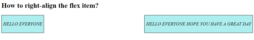
Right align the flex item using display:flex
To align right the flex item, you can use the display and justify-content properties with the values flex and space-between respectively in the parent container. Put child containers inside the parent container. In this way, you can align the items to the left and right.
Example
<!DOCTYPE html>
<html>
  <head>
    <style type="text/css">
      .div {
      display: flex;
      justify-content: space-between;
      }
      .subdiv1,
      .subdiv2 {
      background: paleturquoise;
      border: 1px solid black;
      padding:5px;
      }
    </style>
  </head>

  <body>
    <h2>How to right-align the flex item?</h2>
    <div class="div">
      <div class="subdiv1">
        <p><i>HELLO EVERYONE </i></p>
      </div>
      <div class="subdiv2">
        <p><i>HELLO EVERYONE HOPE YOU HAVE A GREAT DAY</i></p>
      </div>
    </div>
  </body>
</html>
The output of the above example is:
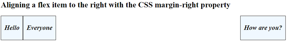
Right align the flex item using margin-right
If you have multiple flex items and want to shift one item to the right in that case, you can use display:flex property in the parent item/container and margin-right:auto property to the specific child item to shift it to the right.
<!DOCTYPE html>
<html>
  <head>
    <style type="text/css">
      .div {
      display: flex;
      }
      .subdiv2 {
      margin-right: auto;
      font-size: 20px;
      }
      .subdiv1,
      .subdiv2,
      .subdiv3 {
      background: aliceblue;
      border: 1px solid black;
      padding: 5px 10px;
      font-size: 20px;
      }
    </style>
  </head>

  <body>
    <h2>Aligning a flex item to the right with the CSS margin-right property</h2>
    <div class="div">
      <div class="subdiv1">
        <p><i><b>Hello</b></i></p>
      </div>
      <div class="subdiv2">
        <p><i><b>Everyone</b></i></p>
      </div>
      <div class="subdiv3">
        <p><i><b>How are you?</b></i></p>
      </div>
    </div>
  </body>
</html>
The output of the above example is:
CSS Examples »
Advertisement
Advertisement