Home »
CSS
How to style a checkbox using CSS?
In this tutorial, we will learn how to apply CSS styles on a checkbox or how to customize checkboxes using CSS?
By Apurva Mathur Last updated : July 28, 2023
HTML input type="checkbox"
- <input> elements of type checkbox are rendered by default as boxes that are checked (ticked) when activated as you might see in an official government paper form.
- Generally this is a square but it may have rounded corners. A checkbox allows you to select single values for submission in a form (or not).
- Checkboxes are used to let a user select one or more options of a limited number of choices.
- The <input type="checkbox"> creates a checkbox.
Example
<!DOCTYPE html>
<html>
<body style="background-color:lightgoldenrodyellow">
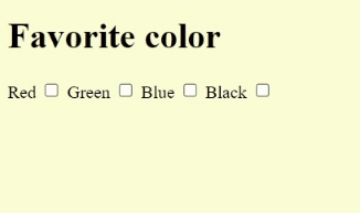
<h1>Favorite color</h1>
<label>Red
<input type="checkbox">
</label>
<label>Green
<input type="checkbox">
</label>
<label>Blue
<input type="checkbox">
</label>
<label>Black
<input type="checkbox">
</label>
</body>
</html>
The output of the above example is:
Customizing Checkboxes with CSS
This checkbox is extremely straightforward; no styling has been applied to this. Now let us try to customize this checkbox by applying some styling to it.
Example to Customize Checkboxes with CSS
<!DOCTYPE html>
<html>
<style type="text/css">
.form-control {
font-family: system-ui, sans-serif;
font-size: 2rem;
font-weight: bold;
line-height: 1.1;
display: grid;
grid-template-columns: 1em auto;
gap: 0.5em;
}
input[type="checkbox"] {
appearance: none;
background-color: #fff;
margin: 0;
font: inherit;
color: currentColor;
width: 1.15em;
height: 1.15em;
border: 0.15em solid currentColor;
border-radius: 0.15em;
transform: translateY(-0.075em);
}
.form-control {
margin-top: 1em;
}
input[type="checkbox"] {
/* ...existing styles */
display: grid;
place-content: center;
}
input[type="checkbox"]::before {
content: "";
width: 0.65em;
height: 0.65em;
transform: scale(0);
transition: 120ms transform ease-in-out;
}
input[type="checkbox"]:checked::before {
transform: scale(1);
}
input[type="checkbox"]::before {
/* ...existing styles */
/* Windows High Contrast Mode */
background-color: CanvasText;
}
</style>
<body style="background-color:lightgoldenrodyellow">
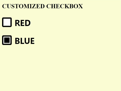
<h2>CUSTOMIZED CHECKBOX</h2>
<label class="form-control">
<input type="checkbox" name="checkbox" />
RED
</label>
<label class="form-control">
<input type="checkbox" name="checkbox-checked" checked />
BLUE
</label>
</body>
</html>
The output of the above example is:
CSS Examples »
Advertisement
Advertisement