Home »
Python »
Python programs
Python | Create a stacked bar using matplotlib.pyplot
Write a program to plot a stacked bar graph with two values for comparison, using different colors using matplotlib.pyplot library.
Submitted by Ayush Sharma, on November 19, 2018
Problem statement: Write a program in python (using matplotlib.pyplot) to create a scatter plot.
Use of scatter plot: Scatter plots are usually used to compare two variables (three if you are plotting in 3 dimensions), looking for correlation or groups.
Program:
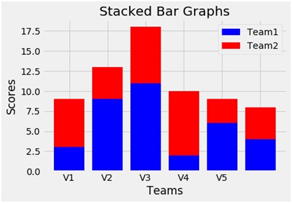
import matplotlib.pyplot as plt
import numpy as np

N=6

y1=[3,9,11,2,6,4]

y2=[6,4,7,8,3,4]

xvalues = np.arange(N)

plt.bar(xvalues,y1,color='b', label ='Team1')
plt.bar(xvalues,y2, color='r', bottom =y1, label = 'Team2')
plt.xticks(xvalues, ('V1', 'V2', 'V3', 'V4', 'V5'))

plt.xlabel('Teams')
plt.ylabel('Scores')
plt.title('Stacked Bar Graphs')
plt.legend()
Output
Explanation:
We use the data values y2 above y1. y1 and y2 are two random variables taken for the plot. For this we use the parameter bottom which indicates which value will be at the bottom. N is also a variable to assign the no of bars existing in the plot. Also we use the arrange method of numpy to evenly space the bars and assign its values to the x values variable. Xticks functions give the label to the evenly spaced xvalues. To name the axes xlabel and ylabel functions are used and to give the title to the plot the title function is used. To show the legend the legend function is used and finally to show the plot the show function.
Advertisement
Advertisement