Home »
Python »
Python Programs
Seaborn: countplot() with frequencies
Learn about the Seaborn: countplot() with frequencies in Python.
By Pranit Sharma Last updated : October 03, 2023
Pandas is a special tool that allows us to perform complex manipulations of data effectively and efficiently. Inside pandas, we mostly deal with a dataset in the form of DataFrame. DataFrames are 2-dimensional data structures in pandas. DataFrames consist of rows, columns, and data.
One of the important processes of data analysis is data visualization. Data visualization is a process of representing statistical or categorical data in the form of charts, graphs, or any pictorial format.
Data visualization is an important process as far as data analysis is concerned because it allows us to understand the various kinds of patterns from the data so that we can draw some useful insights from it.
countplot() with frequencies
Suppose we are given a DataFrame with a column called X. We need to use seaborn countplot() in such a way so that the left y-axis shows the frequency of the values occurring in the data and the right y-axis shows the actual counts and the x-axis shows the category for bar plot.
Let us understand with the help of an example,
Python program for Seaborn: countplot() with frequencies
# Importing pandas package
import pandas as pd

# Importing plot from matplotlib
import matplotlib.pyplot as plt

# Importing numpy package
import numpy as np

# Importing seaborn package
import seaborn as sns

# Importing ticker from matplotlib
import matplotlib.ticker as ticker

# Creating some random data
sran = pd.DataFrame({'X': np.random.normal(8, 2, 5000).astype(int)})
count = len(sran)

# Defining size of plot
plt.figure(figsize=(12,8))

# Creating axis for plot and giving it necessary markings
x1 = sns.countplot(x="X", data=sran, order=[3,4,5,6,7,8,9,10,11,12])
plt.xlabel('Number of X')

# Creating twin axis
x2=x1.twinx()

# Switching the axis so that count axis is on right and frequency on left
x2.yaxis.tick_left()
x1.yaxis.tick_right()

# Switching the labels
x1.yaxis.set_label_position('right')
x2.yaxis.set_label_position('left')

x2.set_ylabel('Frequency [%]')

# Calculating result
for p in x1.patches:
    x=p.get_bbox().get_points()[:,0]
    y=p.get_bbox().get_points()[1,1]
    x1.annotate('{:.1f}%'.format(100.*y/count), (x.mean(), y),
            ha='center', va='bottom') # set the alignment of the text

# Ensuring that umber of ticks are correct
x1.yaxis.set_major_locator(ticker.LinearLocator(11))

# Defining frequency
x2.set_ylim(0,100)
x1.set_ylim(0,count)

# Using multiplelocator
x2.yaxis.set_major_locator(ticker.MultipleLocator(10))

# Turning off grid of x2
x2.grid(None)

# Saving the plot in local machine
plt.savefig('snscounter.pdf')
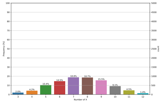
Output
The output of the above program is:
Python Pandas Programs »
Advertisement
Advertisement