Home »
Python »
Python Programs
Can Pandas plot a histogram of dates?
In this tutorial, we are going to learn how to plot histogram of date?
By Pranit Sharma Last updated : September 23, 2023
One of the important processes of data analysis is data visualisation. Data visualisation is a process of representing the statistical or categorical data in the form of charts, graphs, or any pictorial format.
Data visualisation is an important process as far as data analysis is concerned because it allows us to understand the various kinds of patterns from the data so that we can draw some useful insights from it.
How to plot the histogram of the dates?
To plot the histogram of the dates, we use the plotting.register_matplotlib_converters() method and then print the histogram. This method is used for registering pandas formatters and converters with matplotlib. Consider the following code:
pd.plotting.register_matplotlib_converters()
Let us understand with the help of an example,
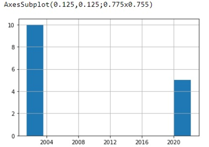
Python program to plot the histogram of the date
# Importing pandas package
import pandas as pd

# Creating a dictionary
d = {'Date':[pd.to_datetime('7/12/2001')]*10+[pd.to_datetime('2/7/2022')]*5}

# registering with converters
pd.plotting.register_matplotlib_converters()

# Creating a DataFrame
df = pd.DataFrame(d)

# Display Histogram
print(df['Date'].hist())
Output
Python Pandas Programs »
Advertisement
Advertisement