Home »
Python »
Python programs
Python | Create a Bar Graph using matplotlib.pyplot
Using matplotlib.pyplot library in python draw a bar graph with two values for comparison, using different colors.
Submitted by Ayush Sharma, on November 19, 2018
Problem statement: Using matplotlib.pyplot library in python draw a bar graph with two values for comparison, using different colors.
Program:
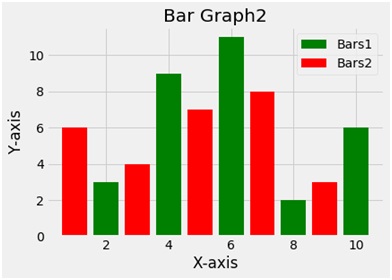
import matplotlib.pyplot as plt
x1 = [2,4,6,8,10]
y1=[3,9,11,2,6]

x2=[1,3,5,7,9]
y2=[6,4,7,8,3]

plt.bar(x1,y1,label ='Bars1', color='g')
plt.bar(x2,y2,label = 'Bars2', color='r')

plt.xlabel('X-axis')
plt.ylabel('Y-axis')
plt.title('Bar Graph2')
plt.legend()
plt.show()
Output
Explanation:
Python library matplotlib.pyplot is used to draw the above chart. Four random variables x1 y1 and x2 y2 are taken with random values. The bar function plots a bar plot. The second bar function used draws another bar plot in the same frame. The bar function takes 2 arguments i.e. x and y and a label variable gives the label to the plot. To give the title to the plot the title function is used. To show the legend the legend function is used and finally to show the plot the show function.
Advertisement
Advertisement