Home »
CSS
How to perform 3D transformations using CSS?
CSS 3D Transforms: In this tutorial, we will learn how to perform 3D transformations using CSS with the help of examples.
By Anjali Singh Last updated : July 10, 2023
Introduction
Has this ever occurred to you that while dealing with various elements in your website or web page you can use the axes for their placement? By axes what is meant here is the x-axis, y-axis, and z-axis, you might be familiar with these from your basic geometry class. But using these axes for the placement of your elements is an entirely different story.
We often use many properties when it comes to the placement of the elements on our website or web page, for example, we use float property many times, float right or float left, like that but using axes we can achieve the same. Not that you will require any typical knowledge of geometry to make use of the axes property because it is very used, the main advantage of this property is to perform 3D transformations.
So let us understand this property in a much better way.
Performing 3D transformations using CSS
Now that you are aware of the center topic of this article, so let us have a look at the formal definition.
In CSS Using 3d transforms, we can move elements to the x-axis, y-axis, and z-axis.
There three 3D transformation methods, as discussed earlier and those are,
- rotateX()
- rotateY()
- rotateZ()
Pretty obvious right? So without further adieu, let us understand these values more clearly in the upcoming sections.
1) rotateX() Method
The first and foremost value is rotateX() value, this value as the name itself suggests comes in handy when you are dealing with the X-axis, let us see how,
The rotateX() method is useful whenever you want to rotate the element around its X-axis and at any given degree.
Syntax:
    Element{
        transform:rotateX();
    }
Example
<!DOCTYPE html>

<html>

<head>
    <style>
        div {
            width: 350px;
            height: 150px;
            background-color: #f40;
            border: 1px solid #000;
            transform: rotateX(180deg);
        }
    </style>
</head>

<body>
    <h1>The rotateX() Method</h1>
    <div>
        This is rotateX method.
    </div>
</body>

</html>
Output
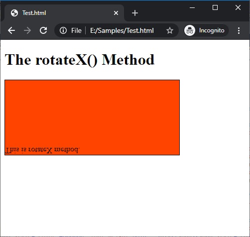
In the above example, it may look a bit weird to see but you can easily understand that the div element is rotated 180 degrees around its X-axis and thus you may get an upside-down image.
2) rotateY() Method
The second value for the discussion is the rotateY() value whose characteristics again can be derived just by looking at its name, therefore comes in handy when you are dealing with the Y-axis, have a look at the definition below.
The functionality of the rotateY() value is somewhat similar to the rotateX(), the only difference is of the axis, here the rotateY() value can prove to be useful when you want to rotate your element around its very Y-axis and at any given degree.
Syntax:
    Element{
        transform:rotateY();
    }
Example
<!DOCTYPE html>

<html>

<head>
    <style>
        div {
            width: 350px;
            height: 150px;
            background-color: #f40;
            border: 1px solid #fff;
            transform: rotateY(180deg);
        }
    </style>
</head>

<body>
    <h1>The rotateY() Method</h1>
    <div>
        This is rotateY method.
    </div>
</body>

</html>
Output
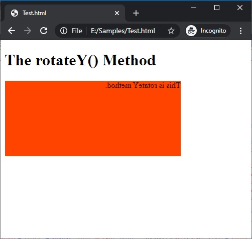
In the above example, similar to rotateX() output you can see that the image might appear to be somewhat tough to understand but to ease your curiosity what is being done here is that the div element is rotated 180 degrees around its Y-axis.
3) rotateZ() Method
The third value is rotateZ() value is very similar to the above values but here the axis at play would be the Z-axis, therefore, the rotateZ() can be used when you wish to rotate your element around its Z-axis and at any given degree. Thus, it can be easily understood that the fundamental functionalities of all three elements are the same.
Syntax:
    Element{
        transform:rotateZ();
    }
Example
<!DOCTYPE html>

<html>

<head>
    <style>
        div {
            width: 350px;
            height: 150px;
            background-color: #f40;
            border: 1px solid #fff;
            transform: rotateZ(180deg);
        }
    </style>
</head>

<body>
    <h1>The rotateZ() Method</h1>
    <div>
        This is rotateZ method.
    </div>
</body>

</html>
Output
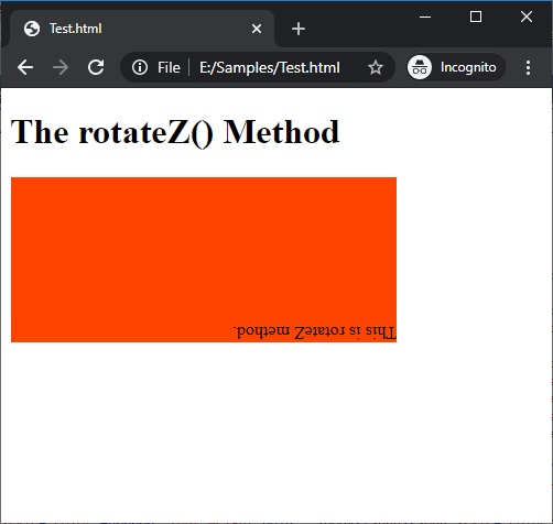
In the above example, it should not be hard to understand now that here the div element is rotated 180 degrees around its Z-axis.
CSS Examples »
Advertisement
Advertisement