Home »
CSS
Rescale font based on container width in CSS
CSS Container Queries: In this tutorial, we will learn how to rescale font based on the container width in CSS. Learn with the help of examples.
By Anjali Singh Last updated : July 10, 2023
Introduction
Dealing with fonts is a very interesting thing to do as fonts bring out the appearance of your website or a web page so you must choose the ideal fonts for your website or web page that helps in making your website or web page look amazing. But sometimes fonts can also pose many problems like rescaling which brings us to the topic at hand, rescaling the font based on the container width in CSS. The problem is very easy to solve but before we move further with the solution let us talk about fonts a little bit more.
Fonts, as said earlier, are used regularly while developing a website or a web page. So, you must be very careful while selecting the primary font for your website or web page because fonts would define how your texts are gonna look like to the users and as you are aware the texts are the most fundamental elements of any website or web page. You can choose from an array of fonts available, just preview your website or web page first while making the selection for a font. The appearance is not only dependent on the right font style but also the size of the font. You don’t want your website or web page to appear shabby, therefore you must have a uniform-sized font for your web page or website. Now let us discuss how can we rescale our font based on container width in CSS and for you will need to read a bit more.
How to rescale font based on container width in CSS?
To set the font size, you can make use of viewport "VW" unit which is also known as viewport width. The viewport is the size of your window browser and 1vw = 1% of the viewport width. By making use of this property your font size will be by the browser window size.
Syntax
element{
    font-size:length vw;
}
Example to rescale font based on container width in CSS
<!DOCTYPE html>

<html>
<meta name="viewport" content="width=device-width, initial-scale=1.0">

<head>
    <style>
        h1 {
            font-size: 5vw;
        }
    </style>
</head>

<body>
    <h1>Rescale font based on container width in CSS</h1>
    <center>
        <img src="img_forest.jpg" width="240" height="184">
    </center>
    <p>
      By making use of this property your font size will be in
      accordance with the browser window size.</p>
</body>

</html>
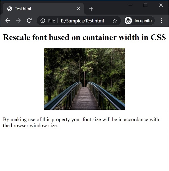
Output

In the above example, font-size vw is applied to the content inside the h1 tag.
Be wise
Easy right? All you had to do was make use of Viewport property that would help in resizing the font according to the browser window. So go ahead and start resizing your font size and start making your website or webpage stylish and ready to deploy. Make sure that you choose the appropriate font for your website or webpage as this property will change the size of your font according to the browser window, therefore, choose wisely.
CSS Examples »
Advertisement
Advertisement