Home »
Android
Android Button Customization Example
In this tutorial, we are going to learn about button customization i.e. How to display a normal button in different looks like shapes, colors?
Submitted by Shamikh Faraz, on MAY 17, 2018
Button is a widget in android performs click event on the form i.e. for to submit the data in the database or to start/close some operations, button is being used. There are different types of button widgets available in android like Normal Button, Image Button, Radio Button, Check Boxes and Toggle Button.
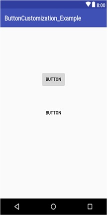
1) Normal Button
<?xml version="1.0" encoding="utf-8"?>
<android.support.constraint.ConstraintLayout xmlns:android="http://schemas.android.com/apk/res/android"
    xmlns:app="http://schemas.android.com/apk/res-auto"
    xmlns:tools="http://schemas.android.com/tools"
    android:layout_width="match_parent"
    android:layout_height="match_parent"
    tools:context="com.example.faraz.buttoncustomization_example.MainActivity">

     <Button
        android:id="@+id/button2"
        android:layout_width="wrap_content"
        android:layout_height="wrap_content"
        android:text="Button"
        tools:layout_editor_absoluteX="148dp"
        tools:layout_editor_absoluteY="131dp" />

   <Button
        android:id="@+id/button1"
        android:layout_width="wrap_content"
        android:layout_height="wrap_content"
        android:text="Button"
        tools:layout_editor_absoluteX="148dp"
        tools:layout_editor_absoluteY="231dp" />


</android.support.constraint.ConstraintLayout>
Output
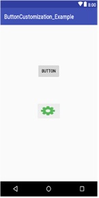
2) Image in Background of button
1) Add this line to old code
android:background="@drawable/yourimage"
2) delete this line from old code
android:text="Button"
Final Code:
<?xml version="1.0" encoding="utf-8"?>
<android.support.constraint.ConstraintLayout xmlns:android="http://schemas.android.com/apk/res/android"
    xmlns:app="http://schemas.android.com/apk/res-auto"
    xmlns:tools="http://schemas.android.com/tools"
    android:layout_width="match_parent"
    android:layout_height="match_parent"
    tools:context="com.example.faraz.buttoncustomization_example.MainActivity">

     <Button
        android:id="@+id/button2"
        android:layout_width="wrap_content"
        android:layout_height="wrap_content"
        android:text="Button"
        tools:layout_editor_absoluteX="148dp"
        tools:layout_editor_absoluteY="131dp" />

   <Button
        android:id="@+id/button1"
        android:layout_width="wrap_content"
        android:layout_height="wrap_content"
        android:background="@drawable/your_image"
        tools:layout_editor_absoluteX="148dp"
        tools:layout_editor_absoluteY="231dp" />

</android.support.constraint.ConstraintLayout>
Output - The button name will hide and image will show in place of button name
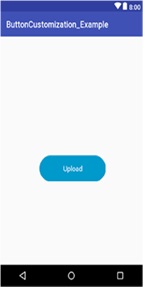
3) Changing the color of Button
Shape is changed from rectangle to oval.
<selector xmlns:android="http://schemas.android.com/apk/res/android">
<item>
    <shape android:shape="oval">
        <size android:width="100dp"
            android:height="100dp"/>
        <solid android:color="#59d5fe"/>
    </shape>
</item>
</selector>
Output
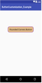
4) Button Corner Round
<?xml version="1.0" encoding="utf-8"?>
<selector xmlns:android="http://schemas.android.com/apk/res/android">
<item>
    <shape android:shape="rectangle">
        <solid android:color="#DEB887"/>
        <stroke android:color="#8A2BE2" android:width="2dp" />
        <corners android:radius="15dp" />
    </shape>
</item>
</selector>
Output
Advertisement
Advertisement