Home »
CSS »
CSS Examples
How to define two column layout using flexbox?
By IncludeHelp Last updated : November 19, 2023
To define two column layout using flexbox, there are a few simple steps -
- To create a div flexbox - Create a div element and set the display property to flex (i.e., display:flex).
- To make the column-layout - Set the flex-direction property to row (i.e., flex-direction:row).
- And, to make it a two-column layout - Use two div elements as child containers. Also, set the height and width of these div elements.
Syntax
Below is the syntax to define two-column layouts using the flexbox -
<div class="parentDiv">
  <div class="childDiv">
    <h2>Left section</h2>
  </div>
  <div class="childDiv">
    <h2>Right section</h2>
  </div>
</div>
CSS
Use the below CSS styles for the parent and child classes -
.parentDiv {
  display: flex;
  flex-direction: row;
  background-color: #ffd700;
  padding: 8px;
}

.childDiv {
  width: 50%;
  height: 100vh;
  background-color: #62dab6;
  padding: 8px;
  margin: 8px;
}
Example
Here is an example to create a two-column layout using flexbox -
<!DOCTYPE html>
<html>
  <head>
    <title>Two Column Layout</title>
    <style>
      body {
      width: 960px;
      margin: auto;
      font-family: Verdana,sans-serif;
      }
      .parentDiv {
      display: flex;
      flex-direction: row;
      background-color: #ffd700;
      padding: 8px;
      }
      .childDiv {
      width: 50%;
      height: 100vh;
      background-color: #62dab6;
      padding: 8px;
      margin: 8px;
      }
    </style>
  </head>

  <body>
    <h1>Example of two column layout using flexbox</h1>

    <div class="parentDiv">
      <div class="childDiv">
        <h2>Left section</h2>
      </div>
      <div class="childDiv">
        <h2>Right section</h2>
      </div>
    </div>

  </body>
</html>
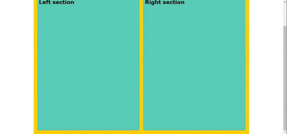
Output
The output of the above example is:
Advertisement
Advertisement