Home »
CSS
How to create a 3-column layout grid with CSS?
In this tutorial, we will learn how to create a 3-column layout grid with the help of CSS?
By Apurva Mathur Last updated : July 23, 2023
Making a column layout grid in CSS is an effortless task. Dividing a page into some major sections can be easily accomplished by using some basic CSS properties.
Creating a 3-column layout grid with CSS
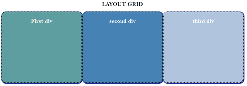
To create a 3-column layout grid with CSS, you just need to provide equal width depending upon the number of sections we want. In this article, we'll create 3-column layout grids which means a width of 33.33% should be given to every section so that they synchronize with each other. With width, it is also important to provide appropriate height and padding so that our grid and the content written inside the grid do not look awful.
Example to create a 3-column layout grid
Step 1: Make 3 DIVs and give them the suitable class which will help us to provide styling to these div containers.
<h1>LAYOUT GRID</h1>
<div class="div_1">
   <h1>First div </h1>
</div>
<div class="div_2">
   <h1> second div</h1>
</div>
<div class="div_3">
   <h1>third div</h1>
</div>
Step 2: Let's style the first div,
.div_1 {
   background-color: cadetblue;
   float: left;
   width: 33.33%;
   color: white;
   padding: 10px;
   height: 400px;
   text-align: center;
   border-radius: 25px;
   box-shadow: 2px 2px 2px 2px navy;
   border: 4px dotted black;
}
Starting 4 properties are defining the grid size and position of the grid on the page, these properties should remain the same for all the three div. Float left property will provide the coverage to other grids, if you don't apply this property our grid won't synchronize properly. Since we are making 3-column layout grids that is why the width of 33.33% should be used here, to get the equal size of grids, similarly if you want to create 4 column layout grid then we'll use the width of 25% then only our grid will be in equal size. Talking about the padding and height property it is totally up to you, the value of these properties is not fixed you can change them according to your preference.
In the same way, other div containers will be styled.
<!DOCTYPE html>

<html>
   <head>
      <meta name="viewport" content="width=device-width, initial-scale=1" />
      <style>
         body {
         font-family: "Bell MT";
         }
         * {
         box-sizing: border-box;
         }
         .div_1 {
         background-color: cadetblue;
         float: left;
         width: 33.33%;
         color: white;
         padding: 10px;
         height: 400px;
         text-align: center;
         border-radius: 25px;
         box-shadow: 2px 2px 2px 2px navy;
         border: 4px dotted black;
         }
         .div_2 {
         background-color:steelblue;
         float: left;
         width: 33.33%;
         color: white;
         padding: 10px;
         height: 400px;
         text-align: center;
         border-radius: 25px;
         box-shadow: 2px 2px 2px 2px navy;
         border: 4px dotted black;
         }
         .div_3 {
         background-color: lightsteelblue;
         float: left;
         width: 33.33%;
         color: white;
         padding: 10px;
         height: 400px;
         text-align: center;
         border-radius: 25px;
         box-shadow: 2px 2px 2px 2px navy;
         border: 4px dotted black;
         }
         h1{
         text-align: center;
         }
      </style>
   </head>
   <body>
      <h1>LAYOUT GRID</h1>
      <div class="div_1">
         <h1>First div </h1>
      </div>
      <div class="div_2">
         <h1> second div</h1>
      </div>
      <div class="div_3">
         <h1>third div</h1>
      </div>
   </body>
</html>
Output:
CSS Examples »
Advertisement
Advertisement