Home »
CSS
How can I 'disable' zoom on a mobile web page?
In this tutorial, we will learn how to disable zoom on a mobile webpage?
By Apurva Mathur Last updated : July 22, 2023
Before starting the topic let us first understand what is the need of disabling zoom on a mobile web page? Sometimes it becomes an important concept to disable zoom because when the user zooms a webpage so at times it disturbs the position of every element in the entire webpage. To prevent this situation developers/ clients usually wish to disable zoom on the mobile web page.
How to 'disable' zoom on a mobile web page?
To disable zoom on a mobile webpage, you can use HTML <meta> tag and set its user-scale attribute's value to "no". The user-scale attribute defines whether a user can zoom on a webpage or not on a mobile device. By default its zoom is on. You can set it to "0" or "no" to disable zoom on mobile.
HTML meta tag to disable zoom on a mobile
Copy and use the below meta tag statement in order to disable zoom:
<meta name="viewport" content="width=device-width, user-scalable=no">
Example to disable zoom on a mobile webpage
<!DOCTYPE html>
<html>
<head>
<title>Example of disabling zoom on mobile</title>
<meta name="viewport" content="width=device-width, initial-scale=1.0, maximum-scale=1.0, user-scalable=no" />
</head>
<body>
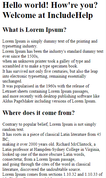
<h1>Hello world! How're you? Welcome at IncludeHelp</h1>
<h2>What is Lorem Ipsum?</h2>
<p>
Lorem Ipsum is simply dummy text of the printing and typesetting industry. <br/>
Lorem Ipsum has been the industry's standard dummy text ever since the 1500s, <br/>
when an unknown printer took a galley of type and scrambled it to make a type specimen book. <br/>
It has survived not only five centuries, but also the leap into electronic typesetting, remaining essentially unchanged. <br/>
It was popularised in the 1960s with the release of Letraset sheets containing Lorem Ipsum passages, <br/>
and more recently with desktop publishing software like Aldus PageMaker including versions of Lorem Ipsum.
</p>
<h2>Where does it come from?</h2>
<p>
Contrary to popular belief, Lorem Ipsum is not simply random text. <br/>
It has roots in a piece of classical Latin literature from 45 BC, <br/>
making it over 2000 years old. Richard McClintock, a Latin professor at Hampden-Sydney College in Virginia, <br/>
looked up one of the more obscure Latin words, consectetur, from a Lorem Ipsum passage, <br/>
and going through the cites of the word in classical literature, discovered the undoubtable source. <br/>
Lorem Ipsum comes from sections 1.10.32 and 1.10.33 of "de Finibus Bonorum et Malorum"<br/>
(The Extremes of Good and Evil) by Cicero, written in 45 BC. This book is a treatise on the theory of ethics, <br/>
very popular during the Renaissance. The first line of Lorem Ipsum, "Lorem ipsum dolor sit amet..", comes from a line in section 1.10.32.
</p>
</body>
</html>
The output of the above example is –
Learn more about HTML meta tag
HTML provides us with one special tag which helps in achieving this target. With the help of the <Meta> tag, we can disable zoom on a mobile web page.
What is the tag and how it is used in HTML?
<Meta> tag – <Meta> tag contains Meta data. Meta data is a set of data that gives information about other data; this set of data gives the entire knowledge about the webpage.
The data represented in the Meta tag is not visible on the webpage.
The most prominent work of Meta data is that it is used by search engines. The details written inside the Meta tag are used by search engines. Whenever you search anything on Google, the search engine takes keywords from that and then it searches those keywords in these meta data, and shows you the search result according to the keywords matched.
Syntax
<meta name="viewport" content="width=device-width, initial-scale=1.0">
Here,
- viewport is the content area of the web page. As we know web pages are too long and to fix the viewport in the fixed size according to the mobile screen, the entire web page is scaled down to fit the content on the screen.
- content="width=device-width", works the same as it sounds this section basically fits the width of the content according to the size of the screen.
- initial-scale=1.0, this part will set the zoom level.
In combination, these attributes help to disable the zoom on a mobile web page.
Let us see how the content will look like on a mobile page if the Meta tag is used and if the Meta tag is not used?
This is how the content will look like in mobile view when you don't use the Meta tag in a code.

And this is how your page will look in mobile view when the Meta tag is used.
You can see the difference what the Meta tag can make if it is included in the code.
Example
<!DOCTYPE html>
<html lang="en">
<head>
<meta charset="UTF-8">
<title>Title</title>
<meta name="viewport" content="width=device-width, initial-scale=1.0">
</head>
<style></style>
<body>
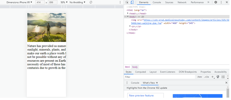
<img src="https://cdn-prod.medicalnewstoday.com/content/images/articles/325/325466/man-walking-dog.jpg" width="460" height="345">
<p style="font-size: 30px;">
Nature has provided us numerous gifts such as air, water, land, sunlight, minerals, plants, and animals. All these gifts of nature make our earth a place worth living. Existence on Earth would not be possible without any of these. Now, while these natural resources are present on Earth in plenty. Unfortunately, the necessity of most of these has increased extremely over the centuries due to growth in the human population.
</p>
</body>
</html>
Inspecting the output
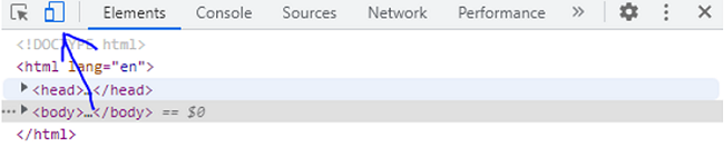
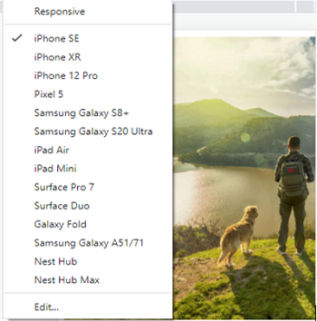
To see your content in a responsive way follow the steps:
- Run your code in the chrome, and go to inspect.
- When you'll click on inspect, the console will get open.
-
Then, go to the toggle device toolbar on the top left-most corners.
-
Select the responsive dimensions.
CSS Examples »
Advertisement
Advertisement