Home »
CSS
How to create CSS3 Rounded Corners?
In this tutorial, we will learn to create CSS3 rounded cornered with examples.
By Apurva Mathur Last updated : July 23, 2023
To create CSS3 rounded corners, you can simply use the border-radius property by specifying the radius of the borders in pixels or percentages. You can also independently define the radius for each border corner by using the constituent properties.
Syntax
Following is the syntax to create CSS3 rounded corners:
selector/element {
    border-radius: value;
}
Example
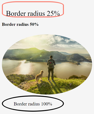
The below-given example shows how you can create CSS3 rounder corners.
<!DOCTYPE html>

<html lang="en">
   <head>
      <meta charset="UTF-8">
      <title>Title</title>
   </head>

   <style>
      .one{
      border: 4px solid salmon;
      border-radius: 25%;
      height: 60px;
      width: 20%;
      font-size: 30px;
      }
      p{
      text-align: center;
      }
      img{
      margin-top: 1%;
      border-radius: 50%;
      }
      .two{
      border: 4px solid black;
      border-radius: 100%;
      height: 60px;
      width: 20%;
      font-size: 20px;
      }
   </style>

   <body style="background-color: whitesmoke">
      <div class="one">
         <p>  Border radius 25%</p>
      </div>
      <h3>Border radius 50%</h3>
      <img src="https://cdn-prod.medicalnewstoday.com/content/images/articles/325/325466/man-walking-dog.jpg" height="10%" width="30%" >
      <div class="two">
         <p>Border radius 100%</p>
      </div>
   </body>
</html>
Output
CSS Examples »
Advertisement
Advertisement