Home »
CSS
CSS force image resize and keep aspect ratio
In this tutorial, we will learn how to force image resize and keep the aspect ratio in CSS with the help of an example?
By Apurva Mathur Last updated : July 12, 2023
How to force image resize and keep aspect ratio using CSS?
object-fit property is like a rescue to this problem. It can simply resize the image and keep the aspect ratio.
CSS object-fit property
object-fit: Basically this CSS property helps to resize the image to fit into its content box. This property reacts with the width and height of the container.
Values of CSS object-fit property
We have 5 values for this property:
- fill: This is the default value. Using this value the entire object fills in the container.
- content: It resizes the content of an element to fit into the box with an aspect ratio.
- cover: It resizes the content of an element to cover its box. It crops or hides the area of an element that is not fitted into the box.
- initial: This value sets the property to its default value.
- inherits: It inherits the property from its predecessor element.
- scale-down: The image is scaled down to the smallest version of none.
In this situation we can use over-fit: content and over-fit: cover value as they both keep the aspect ratio.
Example
<!DOCTYPE html>
<html lang="en">
<head>
<meta charset="UTF-8">
<title>Title</title>
</head>
<style>
.img {
object-fit: contain;
width: 100%;
height: 450px;
}
img{
object-fit: contain;
}
</style>
<body>
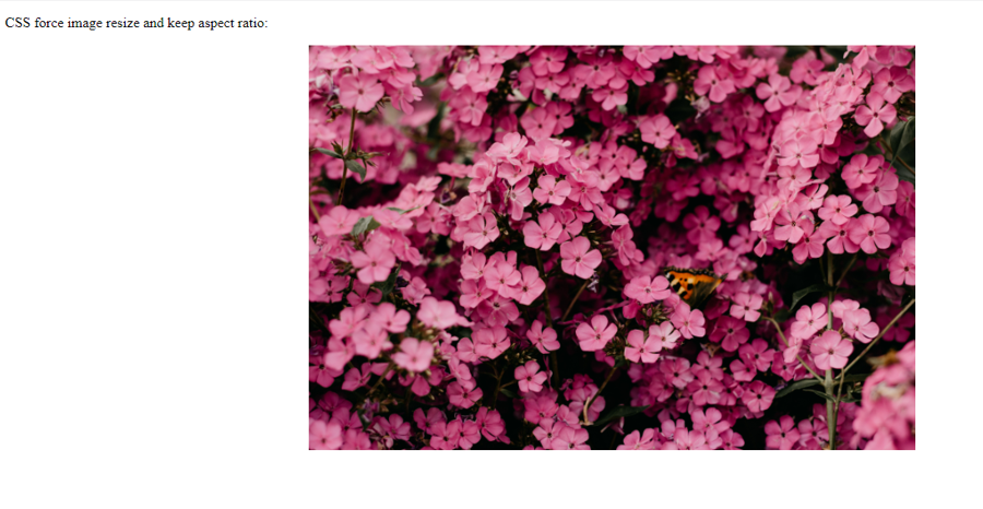
<p>CSS force image resize and keep aspect ratio:</p>
<img class="img" src="pexels-irina-iriser-1408221.jpg">
</body>
</html>
Note: height and width can be change according to the requirements.
Output
CSS Examples »
Advertisement
Advertisement